Table of Contents
Images #
About #
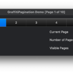
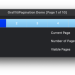
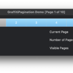
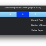
GraffitiPagination is a theme-aware pagination component. Designed to make traversing large lists of items easier for users with beautiful hover cues and native coloring on any target.
Enumerations #
| Name | Values |
|---|
This class exposes no enumerations.
Constants #
| Name | Type | Value |
|---|
This class exposes no constants.
Events #
| Definition | Description |
|---|---|
| Change() | Raised when the Value of the component has changed. |
Methods #
| Definition | Description |
|---|
This class exposes no methods.
Properties #
| Name | Type | Default Value | Description |
|---|---|---|---|
| BackgroundColor | Color | &c000000 | Color applied to the background of the component. |
| BorderColor | Color | &c000000 | Color applied to the border of the component. |
| BorderRadius | Integer | 0 | Corner radius applied to the component’s display area. |
| ButtonFirstBGColor | Color | &c000000 | Background color of the First Page button. |
| ButtonFirstBGColorHover | Color | ||
| ButtonFirstForeColor | Color | Foreground color of the First Page button. | |
| ButtonFirstForeColorHover | Color | ||
| ButtonLastBGColor | Color | Background color of the Last Page button. | |
| ButtonLastBGColorHover | Color | ||
| ButtonLastForeColor | Color | Foreground color of the Last Page button. | |
| ButtonLastForeColorHover | Color | ||
| ButtonNextBGColor | Color | Background color of the Next Page button. | |
| ButtonNextBGColorHover | Color | ||
| ButtonNextForeColor | Color | Foreground color of the Next Page button. | |
| ButtonNextForeColorHover | Color | ||
| ButtonPreviousBGColor | Color | Background color of the Previous Page button. | |
| ButtonPreviousBGColorHover | Color | ||
| ButtonPreviousForeColor | Color | Foreground color of the Previous Page button. | |
| ButtonPreviousForeColorHover | Color | ||
| CurrentPage | Integer | 0 | Currently selected page button. |
| NumberOfPages | Integer | 10 | Total number of pages to display. |
| PageBGColor | Color | &c000000 | Background color of Page # buttons. |
| PageBGColorHover | |||
| PageBGColorSelected | |||
| PageTextBold | Boolean | False | Font weight of Page # button text. |
| PageTextBoldHover | |||
| PageTextBoldSelected | |||
| PageTextColor | Color | &c000000 | Color applied to Page # button text. |
| PageTextColorHover | |||
| PageTextColorSelected | |||
| PageTextFont | String | “System” | Font face applied to Page # button text. |
| PageTextFontHover | |||
| PageTextFontSelected | |||
| PageTextItalic | Boolean | False | When True, Page # button text will be italicized. |
| PageTextItalicHover | |||
| PageTextItalicSelected | |||
| PageTextSize | Integer | 0 | Font size applied to Page # button text. |
| PageTextSizeHover | |||
| PageTextSizeSelected | |||
| PageTextUnderline | Boolean | False | When True, Page # button text will be underlined. |
| PageTextUnderlineHover | |||
| PageTextUnderlineSelected | |||
| SystemStyle | Boolean | True | When False, the component will be drawn using the custom color properties. |
| VisiblePages | Integer | 10 | Number of page buttons that are visible at any given time. |
Examples #
This class currently has no examples.
Notes #
This class currently has no notes.


