Images #
About #
GraffitiRadialProgress is a round progress indicator based on modern implementations of the concept as seen in many popular applications and websites.
Features:
- Display as percentage or Done/Total
- Fully-customizable color palettes
- Nine styles from which to choose
Enumerations #
| Name |
Values |
|
This class exposes no enumerations. |
Constants #
| Name |
Type |
Value |
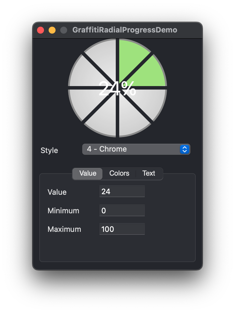
| StyleChrome |
Integer |
4 |
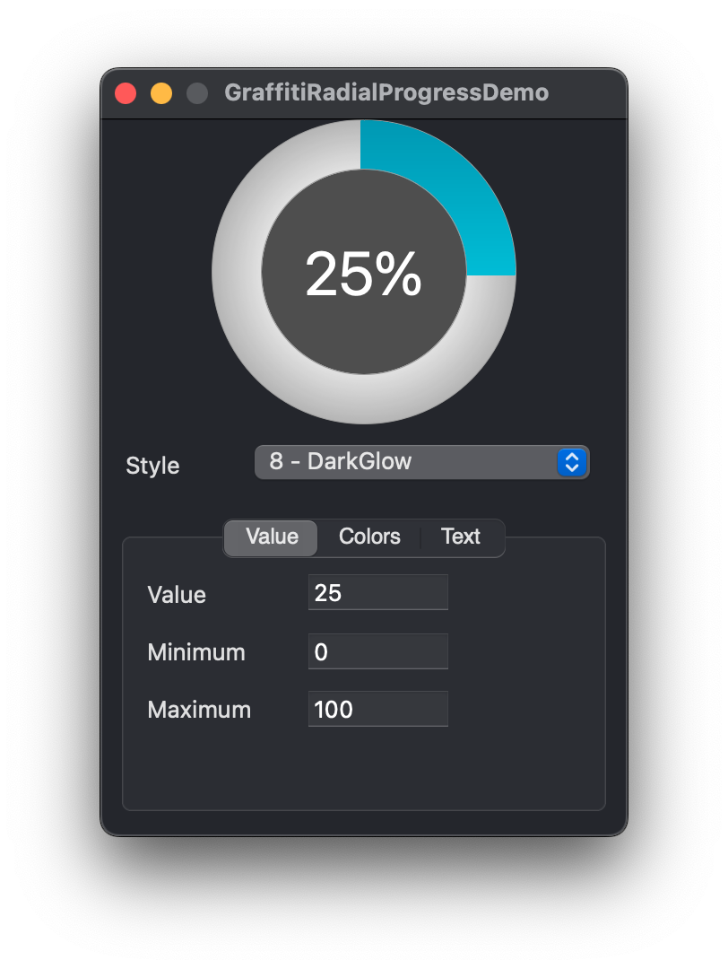
| StyleDarkGlow |
Integer |
8 |
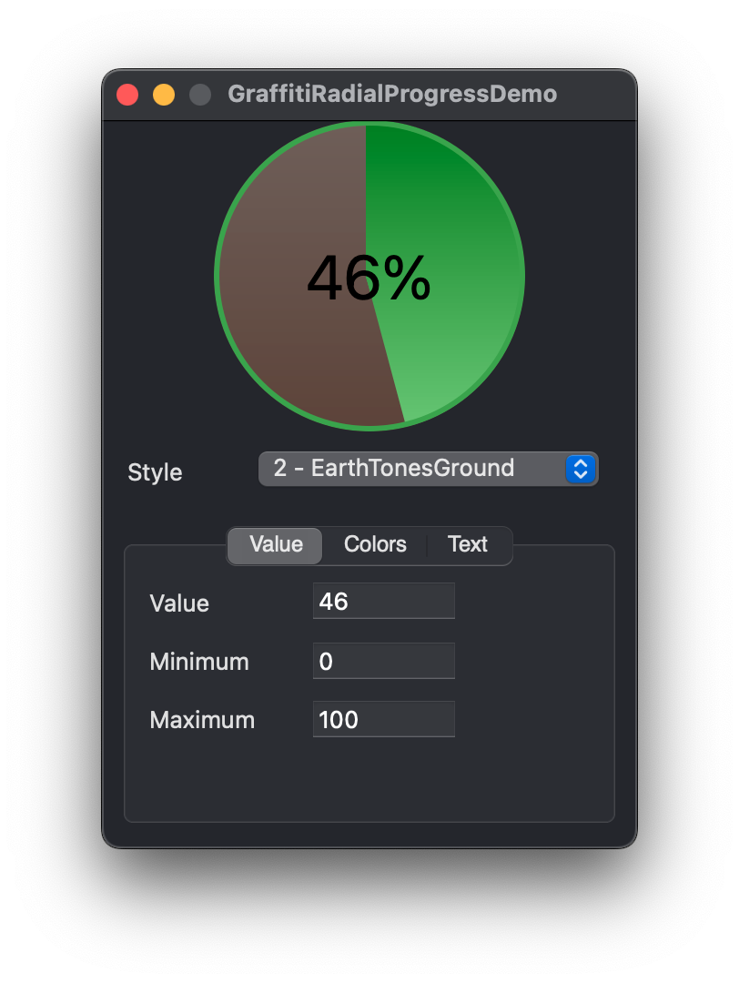
| StyleEarthTonesGround |
Integer |
2 |
| StyleEarthTonesSky |
Integer |
3 |
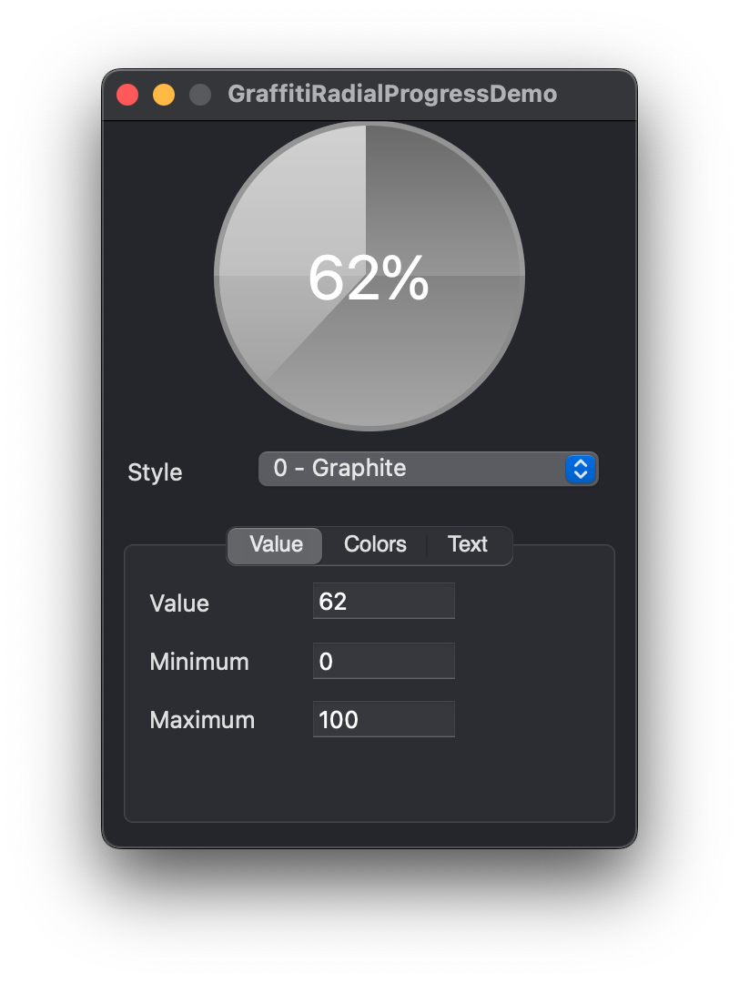
| StyleGraphite |
Integer |
0 |
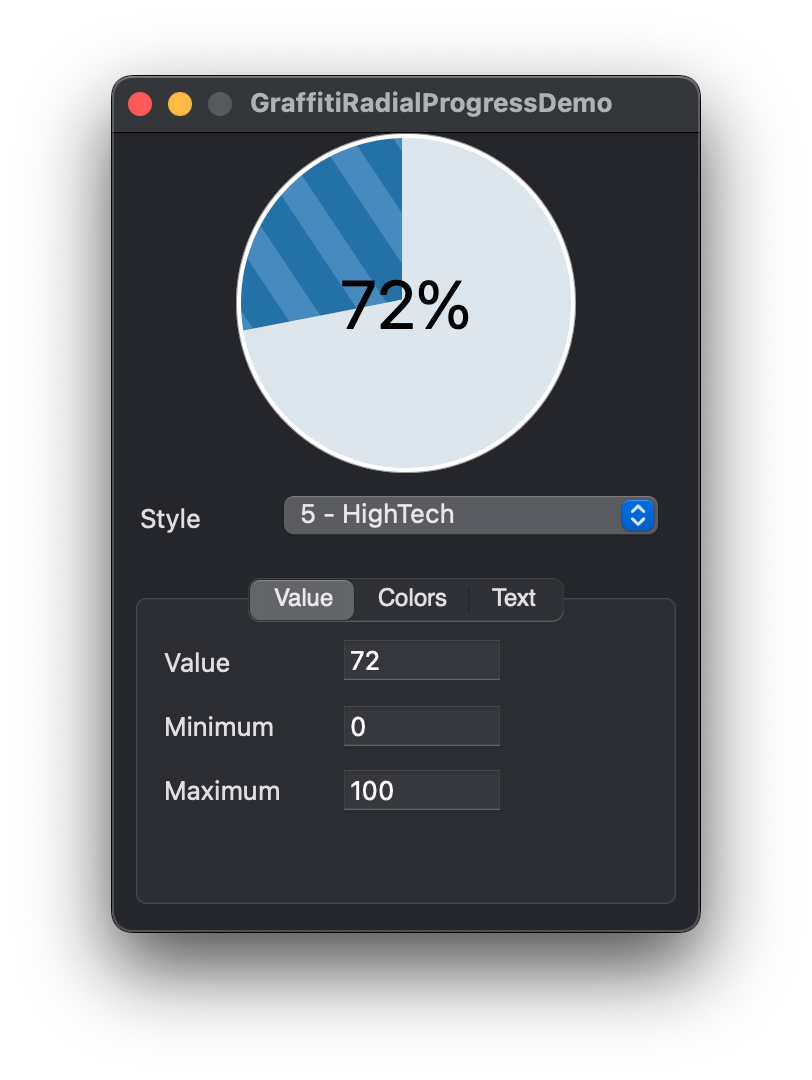
| StyleHighTech |
Integer |
5 |
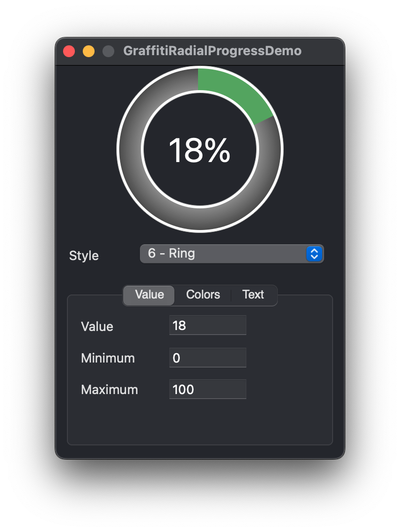
| StyleRing |
Integer |
6 |
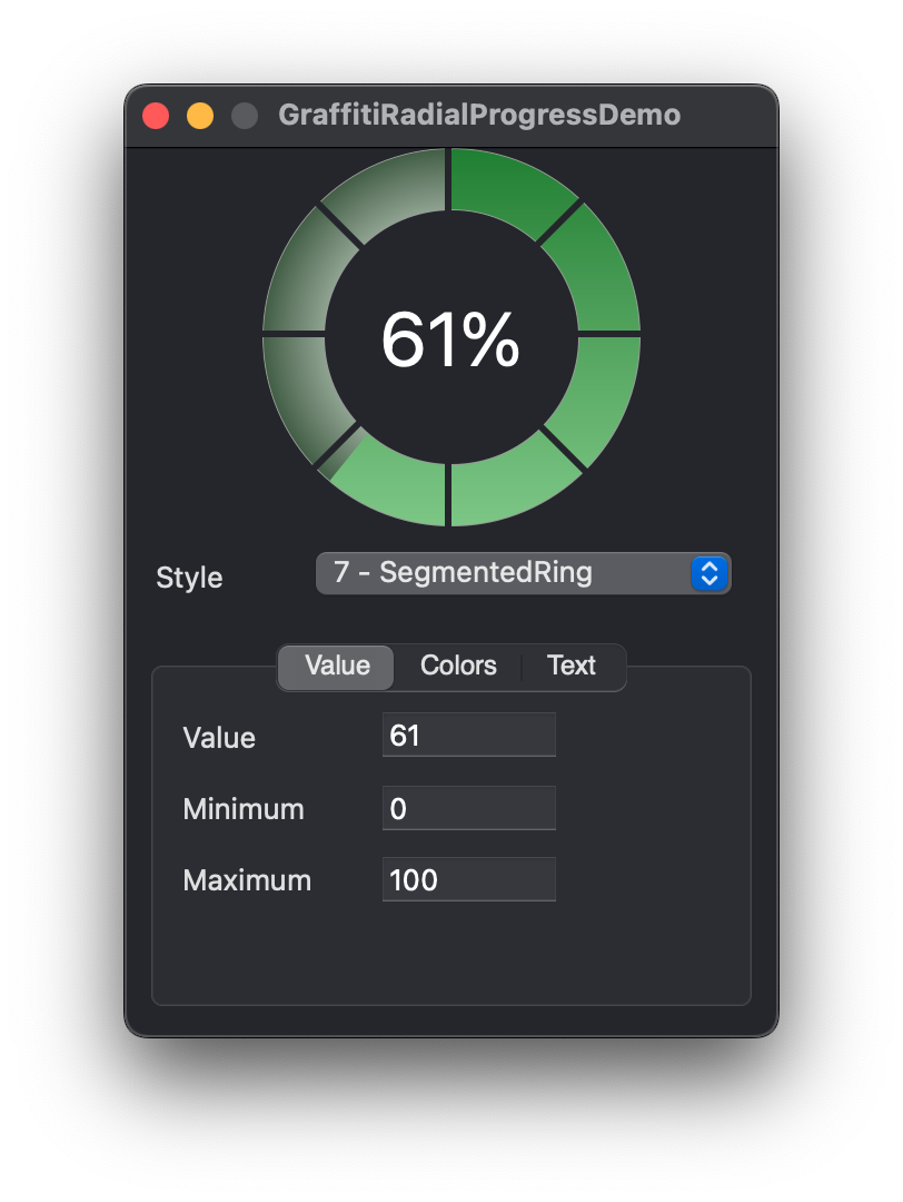
| StyleSegmentedRing |
Integer |
7 |
| StyleSimple |
Integer |
1 |
Events #
| Definition |
Description |
|
This class does not expose any events. |
Methods #
| Definition |
Description |
| StyleCount() as Integer |
Returns the number of visual styles available. |
| StyleName( Index ) as String |
Returns the name of the style represented by Index. |
Properties #
| Name |
Type |
Default Value |
Description |
| BGColor |
Color |
&c000000 |
The background color of the progress display. |
| Bold |
Boolean |
False |
Sets the font weight of the progress text. |
| BorderColor |
Color |
&c000000 |
Sets the border color for the progress display. |
| Italic |
Boolean |
False |
Determines whether the progress text is displayed in italics. |
| Maximum |
Integer |
100 |
The maximum possible value (positive or negative). |
| Minimum |
Integer |
0 |
The minimum possible value (positive or negative). |
| ShowText |
Boolean |
True |
Sets whether the progress text is visible. |
| Style |
Integer |
0 |
Sets the visual style of the progress class. |
| TextAsPercentage |
Boolean |
True |
Sets whether the progress text is presented with percent sign (IE: 100%, as opposed to 100) |
| TextColor |
Color |
&c000000 |
Sets the color of the progress text. |
| TextFont |
String |
“system” |
Sets the font of the progress text. |
| TextSize |
Integer |
-1 |
Sets the size of the progress text’s font. When Value = -1, the text of the component will automatically size to fill the progress area. |
| TextSizeConstraint |
Integer |
100 |
Will constrain the text size to the percentage specified relative to the progress area. |
| Underline |
Boolean |
False |
Determines whether the text is displayed with an underline. |
| UseCustomColors |
Boolean |
False |
Determines whether the progress area is drawn using custom colors. |
| UseCustomTextSize |
Boolean |
False |
Sets whether the progress text size is automatically calculated or custom. |
| Value |
Integer |
0 |
The current integer value. |
| ValueColor |
Color |
&c000000 |
Sets the color of the “completed” progress area when UseCustomColors is True. |
Examples #
There are currently no examples for this class.