# GraffitiNote
Class Inherits GraffitiUIControl
## About
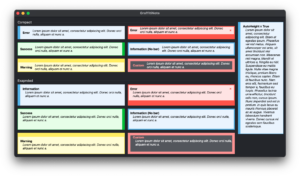
GraffitiNote is a simple yet effective class used to display information via the user interface that should draw a user’s attention. With four different pre-built note types ranging from “Information” to “Error”, and a custom type where custom colors can be applied by the developer, GraffitiNote is very versatile.
The class also supports variable height based on content, and compact or extended modes.
## Preview
Previous
Next
## Compatibility
### Framework API Version
| 1.0 | 2.0 |
| :---: | :---: |
| True | True |
### Desktop
| 32-Bit | 64-Bit |
| :---: | :---: |
| True | True |
## Attributes
| Name | Value |
| --- | --- |
| DefaultEvent | "Pressed" |
## Enumerations
| Name | Value | Description |
| --- | :---: | --- |
| NoteStyles | BarLeft <br> BarRight <br> BarTop <br> BarBottom <br> NoBar | Supported drawing styles. |
| NoteTypes | Information <br> Success <br> Warning <br> Error <br> Custom <br> System | Support informational types. |
## Event Definitions
| Name | Parameters | Return Type | Description |
| --- | :---: | :---: | --- |
| ButtonPressed | (None) | (None) | Raised when the note's button has been pressed. |
| ClosePressed | (None) | Boolean | Raised when the note's close button has been pressed by the user. |
| HeightChanged | (None) | (None) | If the AutoHeight property is set to true, this event will fire when the height has changed to fit the contents. |
| LinkPressed | index as Integer <br> content as String | (None) | Raised when a link in the note has been pressed. |
| Open | (None) | (None) | |
| Pressed | position as Point | (None) | Raised when the note has been pressed by the user. |
## Methods
| Name | Parameters | Return Type | Description |
| --- | :---: | :---: | --- |
| Sub | Constructor | (None) | Creates a new instance of the control. |
| Sub | Constructor | (None) | Creates a new instance of the control. |
| Sub | Constructor | (None) | Creates a new instance of the control. |
| Sub | Rolldown | (None) | Animate showing the note. |
| Sub | Rollup | (None) | Animate hiding the note. |
## Properties
| Name | Type | Default Value | Description |
| --- | :---: | :---: | --- |
| AnimationTime | Integer | Nil | Length of the roll aniamtion in milliseconds. |
| AutoHeight | Boolean | Nil | If True, the control will resize to fit the contents. |
| BackgroundColor | ColorGroup | Nil | Color used to draw the background when Type is set to NoteTypes.Custom |
| BarColor | ColorGroup | Nil | Color used to draw the decorative bar when Type is set to NoteTypes.Custom |
| BarSize | Integer | Nil | Size of the decorative bar when Style other than NoteStyles.NoBar |
| BorderRadius | Integer | Nil | Radius of control corners. |
| BorderSize | Integer | Nil | Size of the border drawn around the outter edge of the control, color is taken from BarColor. |
| ButtonFontBold | Boolean | Nil | Determines the font weight of the text drawn within the button. |
| ButtonFontItalic | Boolean | Nil | Determines the obliqueness of the text drawn within the button. |
| ButtonFontName | String | Nil | Determines which font face to use when drawing the button's text. |
| ButtonFontSize | Integer | Nil | Determines the size of the font used to draw the button's text. |
| ButtonFontUnderline | Boolean | Nil | Determines whether the button's text is drawn underlined. |
| ButtonText | String | Nil | Caption of the button. |
| CloseButton | Boolean | Nil | If True, will show a close button in the display which animates resizing the height to 0. |
| CloseSize | Integer | Nil | Size, in points, of the close button icon. |
| Compact | Boolean | Nil | If False, the title will be positioned on its own line with the content below. |
| Content | String | Nil | The content of the note. |
| ContentBold | Boolean | Nil | The weight of the font used for the Content. |
| ContentColor | ColorGroup | Nil | Color used to draw the note's content. |
| ContentContainer | DesktopContainer | Nil | Container that is embedded within the note. Overrides Title, Content, and Icon drawing. |
| ContentFont | String | Nil | The font used in drawing the Content. |
| ContentItalic | Boolean | Nil | If True, the content will be drawn italicized. |
| ContentSize | Integer | Nil | Size applied to the font for drawing Content. |
| ContentUnderline | Boolean | Nil | If True, the content will have an underline. |
| Icon | Picture | Nil | Icon drawn to the far left of the note. |
| IconSize | Double | Nil | Size to draw the icon. |
| LinkColor | ColorGroup | Nil | Color to use for drawing links. Uses system colors when Nil. |
| LinkColorHover | ColorGroup | Nil | Color used for drawing hovered links. Uses system colors when Nil. |
| Margin | Integer | Nil | Outside margin used for drawing Title and Content. If Compact = False, then the left margin of content = Margin*2 |
| MaxHeight | Integer | Nil | Sets a maximum height for the control to display. Added to fix a crash when the height of the component would exceed acceptable limits. |
| Private | As | Nil | |
| Private | As | Nil | |
| Private | As | = | |
| Private | As | = | |
| Private | As | = | |
| Private | As | = | |
| Private | As | Nil | |
| Private | As | = | |
| Private | As | Nil | |
| Private | As | Nil | |
| Private | As | = | |
| Private | As | = | |
| Private | As | Nil | |
| Private | As | Nil | |
| Private | As | = | |
| Private | As | Nil | |
| Private | As | = | |
| Private | As | Nil | |
| Private | As | = | |
| Private | As | Nil | |
| Private | As | Nil | |
| Private | As | Nil | |
| Private | As | Nil | |
| Private | As | Nil | |
| Private | | Dictionary | |
| Private | As | Nil | |
| Private | As | = | |
| Private | As | Nil | |
| Private | As | = | |
| Private | As | = | |
| Private | As | = | |
| Private | As | Nil | |
| Private | As | Nil | |
| Private | As | Nil | |
| Private | As | Nil | |
| Private | As | Nil | |
| Private | As | Nil | |
| Private | As | = | |
| Private | As | = | |
| Private | As | = | |
| Private | As | Nil | |
| Private | As | Nil | |
| Private | As | = | |
| Private | As | = | |
| Private | As | Nil | |
| Private | As | Nil | |
| Private | As | = | |
| Private | As | Nil | |
| Private | As | Nil | |
| Private | As | Nil | |
| Private | As | Nil | |
| Private | As | Nil | |
| Private | As | = | |
| Private | As | Nil | |
| Style | NoteStyles | Nil | Position of the decorative bar in the display. |
| Tag | Variant | Nil | Developer storage. |
| Title | String | Nil | Title of the note. |
| TitleBold | Boolean | Nil | Font weight of Title. |
| TitleColor | ColorGroup | Nil | Color applied to Title when Type = NoteTypes.Custom. |
| TitleFont | String | Nil | Font applied to Title |
| TitleItalic | Boolean | Nil | If true, Title will be drawn italicized. |
| TitleSize | Integer | Nil | Font size of Title. |
| TitleUnderline | Boolean | Nil | If true, Title will be underlined. |
| Type | NoteTypes | Nil | The drawing style of the note. |
