# GraffitiCommandBar
Class Inherits GraffitiSuite.BaseCanvas
## About
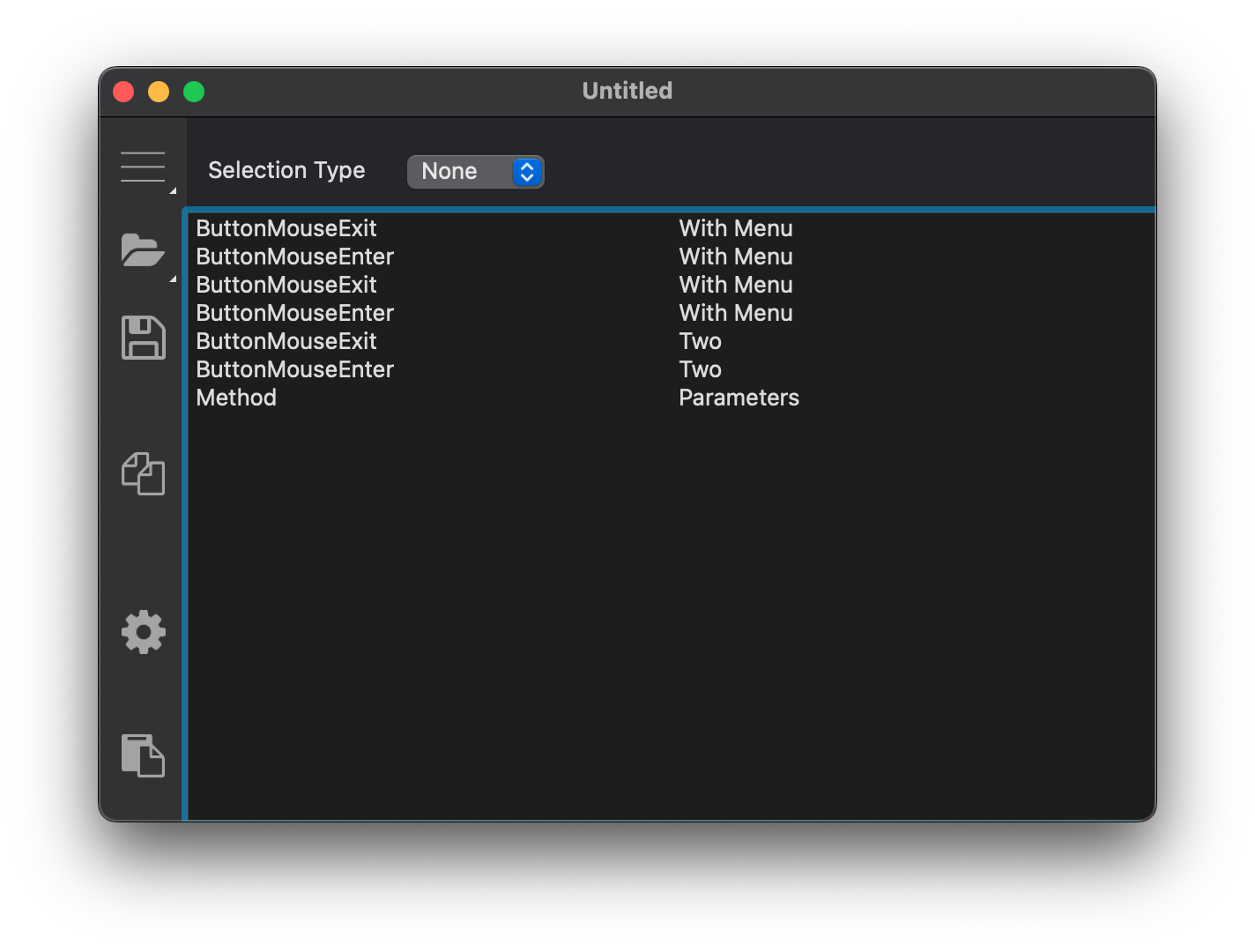
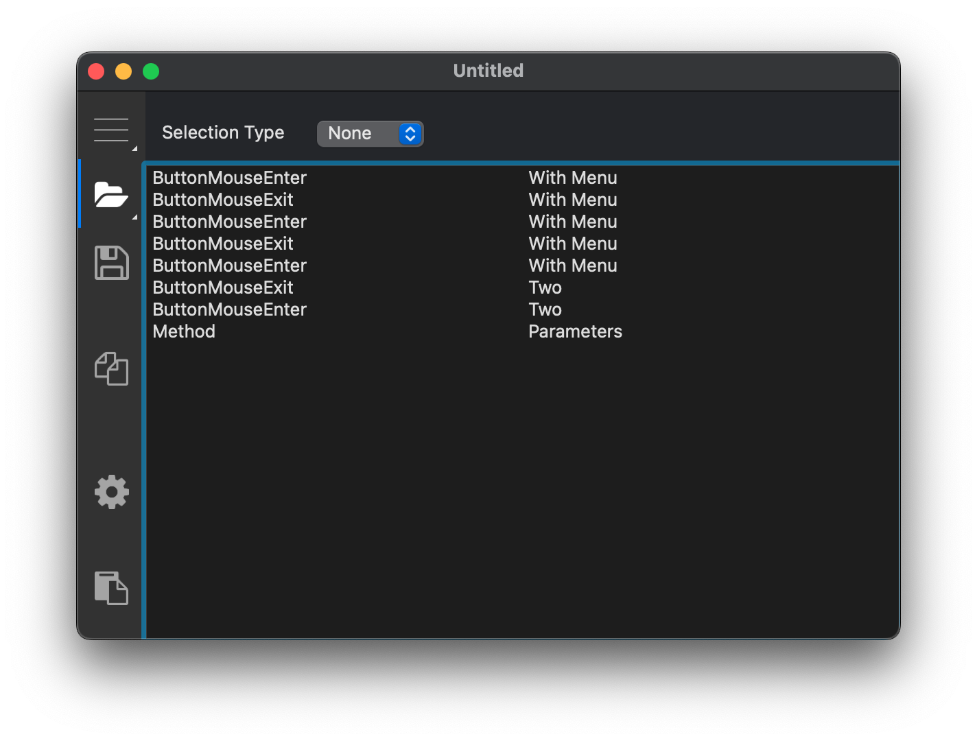
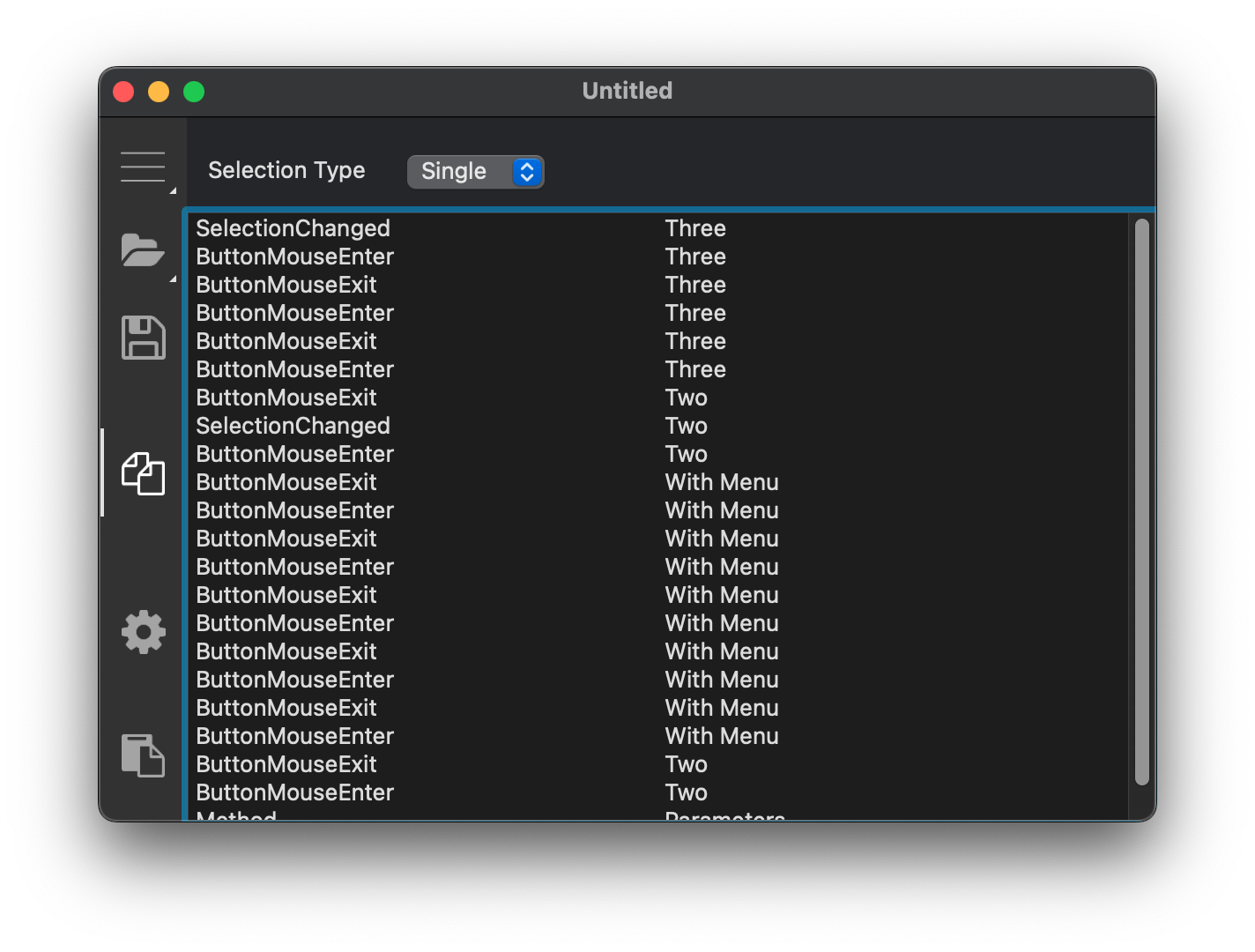
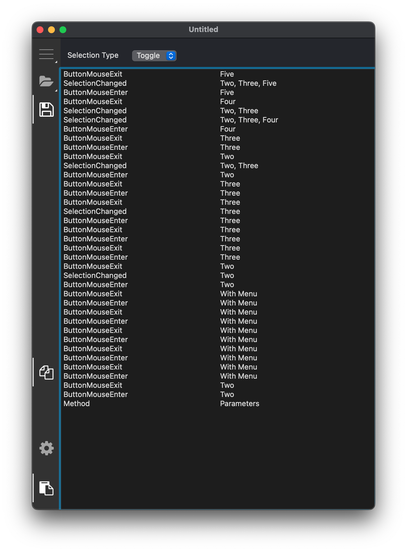
GraffitiCommandBar is a powerful vertical toolbar component that was made to emulate popular UI elements such as those found in VSCode, Visual Studio, and more.Features:
*
None, Single, Toggle selection modes
*
Menu display with signifier
*
Fixed, Flexible, and Percent spacers
## Preview

Previous
Next
## Compatibility
### Framework API Version
| 1.0 | 2.0 |
| :---: | :---: |
| True | True |
### Desktop
| 32-Bit | 64-Bit |
| :---: | :---: |
| True | True |
## Attributes
| Name | Value |
| --- | --- |
| DefaultEvent | "Opening" |
## Enumerations
| Name | Value | Description |
| --- | :---: | --- |
| Modes | None <br> SingleSelect <br> Toggle | Possible selection mode types. |
## Event Definitions
| Name | Parameters | Return Type | Description |
| --- | :---: | :---: | --- |
| ButtonMenuPressed | button as GraffitiCommandBarButton <br> menu as DesktopMenuItem | (None) | Raised when a menu assigned to a button is selected. |
| ButtonMouseEnter | button as GraffitiCommandBarButton | (None) | Raised when the user's pointer enters a button's area. |
| ButtonMouseExit | button as GraffitiCommandBarButton | (None) | Raised when the user's pointer exits a button's area. |
| ButtonPressed | button as GraffitiCommandBarButton | (None) | Raised when the user clicks a button while the Mode is set to Modes.None. |
| ButtonVisibilityChanged | button as GraffitiCommandBarButton | (None) | Raised when a button is hidden or shown based on the height of the component. |
| MenuPressed | item as DesktopMenuItem | (None) | Raised when the user selected a menu item that is a child of the Menu property. |
| Opening | (None) | (None) | |
| SelectionChanged | (None) | (None) | Raised when the component's Mode is set to SingleSelect or Toggle. |
## Methods
| Name | Parameters | Return Type | Description |
| --- | :---: | :---: | --- |
| Sub | Add | (None) | Adds the specified GraffitiCommandBarButton or GraffitiCommandBarSpacer to the component. |
| Sub | AddAt | (None) | Adds the specified GraffitiCommandBarButton or GraffitiCommandBarSpacer to the component at the specified index. |
| Sub | Constructor | (None) | Creates a new instance of the class. |
| Sub | DeselectAll | (None) | Sets all button values to False. |
| Function | Index | As | Returns the integer within the internal array where the specified item can be found. |
| Function | Item | As | Returns the item within the internal array at the specified index. |
| Sub | Remove | (None) | Removes the item at the specified index. |
| Sub | RemoveAll | (None) | Removes all items from the control. |
| Function | SelectedItems | As | Returns all currently buttons with a value of True. |
## Properties
| Name | Type | Default Value | Description |
| --- | :---: | :---: | --- |
| BackgroundColor | Color | Nil | Color applied to the control's background. |
| BorderColor | Color | Nil | Color applied to the control's border. |
| Menu | DesktopMenuItem | Nil | When assigned a valid DesktopMenuItem, the CommandBar will display a hamburger menu that, which clicked, will display that menu. |
| MenuButtonForegroundColor | Color | Nil | Color applied to menu button icons. |
| MenuButtonForegroundHoverColor | Color | Nil | Color applied to menu button icons when hovered. |
| MenuButtonIndicatorColor | Color | Nil | Color applied to the left-hand indicator for menu buttons. |
| MenuButtonTickColor | Color | Nil | Color applied to the tick that signifies a menu present. |
| MenuText | String | Nil | Tooltip to display when the user's pointer is over the hamburger menu button. |
| Mode | Modes | Nil | The current selection mode to use when the user clicks buttons. |
| OverflowBackgroundColor | Color | Nil | Color applied to the overflow button's background. |
| OverflowBackgroundHoverColor | Color | Nil | Color applied to the overflow button's background when the mouse is hovering above it. |
| OverflowForegroundColor | Color | Nil | Color applied to the overflow icon. |
| OverflowForegroundHoverColor | Color | Nil | Color applied to the overflow icon when the mouse is hovering above it. |
| OverflowTooltip | String | Nil | The tooltip to display on the ellipses button when the combined height of all items is greater than the height of the component. and some items are no longer visible. |
| Private | As | = | |
| Private | As | = | |
| Private | As | = | |
| Private | As | Nil | |
| Private | As | Nil | |
| Private | As | Nil | |
| Private | As | Nil | |
| Private | As | Nil | |
| Private | As | = | |
| Private | As | = | |
| Private | As | Nil | |
| Private | | GraffitiCommandBarItem | |
| Private | As | Nil | |
| Private | As | Nil | |
| Private | As | Nil | |
| Private | As | Nil | |
| Private | As | Nil | |
| Private | As | Nil | |
| Private | As | Nil | |
| Private | As | Nil | |
| Private | As | Nil | |
| Private | As | Nil | |
| Private | As | Nil | |
| Private | As | = | |
| Private | | GraffitiCommandBarItem | |
| Private | As | = | |
| Private | As | = | |
| Private | As | Nil | |
| UseCustomColors | Boolean | Nil | When True, the control will use the colors from the properties rather than system-detected colors. |
