GraffitiSuite Docs
Docs
Graffitiradialprogress
Loading document parsing libraries...
# GraffitiRadialProgress Class Inherits GraffitiUIControl ## About GraffitiRadialProgress provides a beautiful circular progress display control. ## Preview 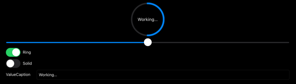 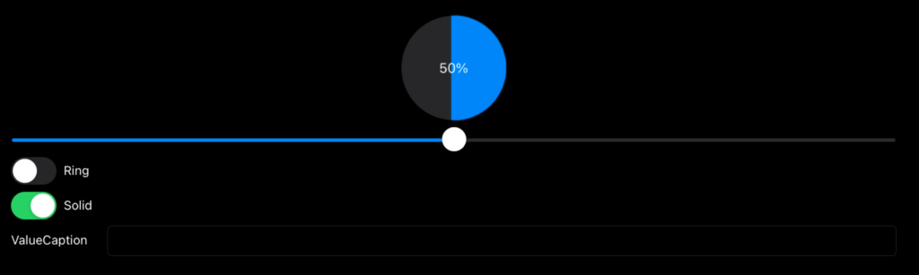 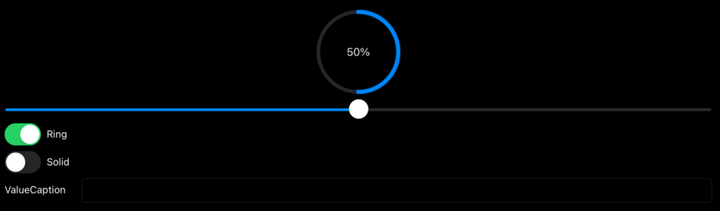 Previous Next ## Compatibility ### Framework API Version | 1.0 | 2.0 | | :---: | :---: | | False | True | ### Console | 32-Bit | 64-Bit | | :---: | :---: | | True | True | ### Desktop | 32-Bit | 64-Bit | | :---: | :---: | | True | True | ### iOS | 32-Bit | 64-Bit | | :---: | :---: | | False | True | ### Web | 32-Bit | 64-Bit | | :---: | :---: | | True | True | ## Enumerations | Name | Value | Description | | --- | :---: | --- | | Styles | Ring <br> Solid | Supported drawing styles. | ## Properties | Name | Type | Default Value | Description | | --- | :---: | :---: | --- | | BackgroundColor | ColorGroup | Nil | Color applied to the negative (non-value) area. | | FontName | String | Nil | Font name used for drawing text. | | FontSize | Integer | Nil | Size applied to font for drawing text. | | FontStyle | GraffitiUIControl.FontStyles | Nil | Font style such as Bold or Italic. | | Size | Double | Nil | Pen size used for drawing value. | | Style | GraffitiRadialProgress.Styles | Nil | Progress control appearance. | | TextColor | ColorGroup | Nil | Color used to draw text. | | Value | Double | Nil | Current progress value. | | ValueCaption | String | Nil | Text drawn to override the current progress value. | | ValueColor | ColorGroup | Nil | Color drawn to positive (value) area. |
