# GraffitiTreeView
Class Inherits GraffitiSuite.BaseCanvas
## About
An amazingly versatile and powerful TreeView control with both a modern style and a classic style.Features:
*
Drag/Drop
*
Checkboxes
*
Remove Button
*
Full color customization
## Preview
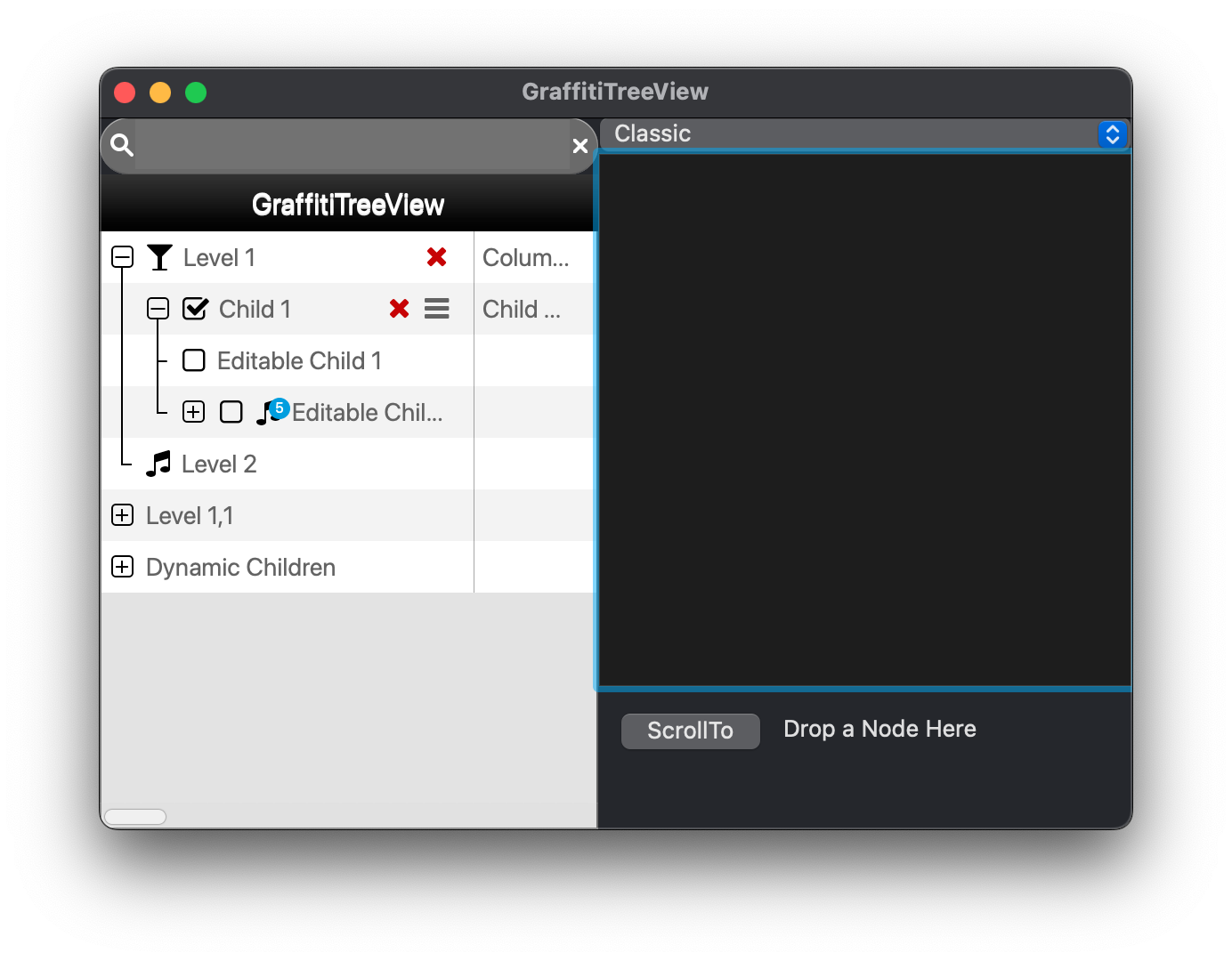
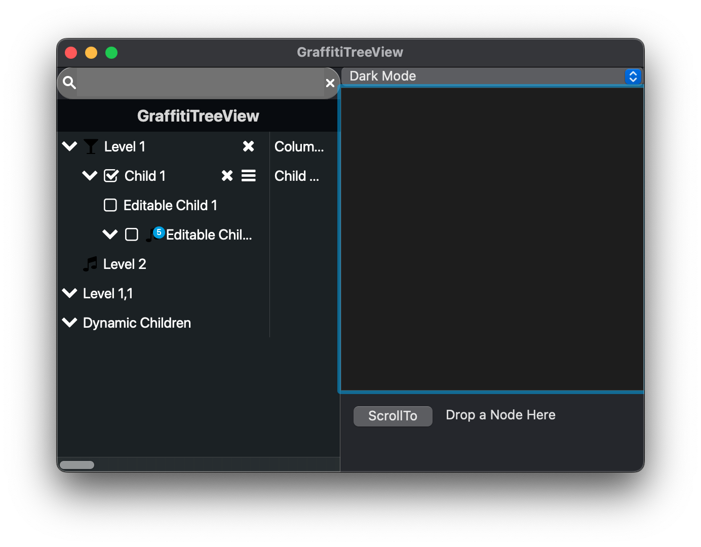
Previous
Next
## Compatibility
### Framework API Version
| 1.0 | 2.0 |
| :---: | :---: |
| True | True |
### Desktop
| 32-Bit | 64-Bit |
| :---: | :---: |
| True | True |
## Attributes
| Name | Value |
| --- | --- |
| DefaultEvent | "Opening" |
## Enumerations
| Name | Value | Description |
| --- | :---: | --- |
| Alignments | Left <br > Center <br > Right | Supported alignments. |
| DropPositions | Above <br > On <br > Below | Support drop results. |
| Styles | Modern <br > Classic <br > Dark | Supported drawing styles. |
## Delegates
| Name | Parameters | Return Type | Description |
| --- | :---: | :---: | --- |
| FromJSONCallback | node as GraffitiTreeViewNode <br> propertyName as String <br> value as Variant | Variant | Delegate function that is called when loading data from JSON for properties whose values are not supported by JSON. IE: Icon, Tag |
| ToJSONCallback | node as GraffitiTreeViewNode <br> propertyName as String | String | Delegate function that is called when writing data to JSON for properties whose values are not supported by JSON. IE: Icon, Tag |
## Event Definitions
| Name | Parameters | Return Type | Description |
| --- | :---: | :---: | --- |
| ColumnResized | index as Integer | (None) | Raised when the user resizes a column. |
| DrawNodeBackground | node as GraffitiTreeViewNode <br> g as Graphics | Boolean | Raised any time a cell background is being drawn. Return True to override default behavior. |
| DrawNodeText | node as GraffitiTreeViewNode <br> column as Integer <br> g as Graphics <br> text as String <br> x as Integer <br> y as Integer <br> maxWidth as Integer | Boolean | Raised any time a cell text is being drawn. Return True to override default behavior. |
| MouseDown | X as Integer <br> Y as Integer | Boolean | (None) |
| MouseDrag | node as GraffitiTreeViewNode <br> X as Integer <br> Y as Integer | (None) | (None) |
| MouseEnterNode | theNode as GraffitiTreeViewNode | (None) | Is fired when the mouse enters the drawable area of a GraffitiTreeViewNode. |
| MouseExitNode | theNode as GraffitiTreeViewNode | (None) | Fires when the mouse exits the drawable area of a GraffitiTreeViewNode. |
| MouseUp | X as Integer <br> Y as Integer | (None) | (None) |
| NodeCollapse | theNode as GraffitiTreeViewNode | Boolean | Signals that a TreeViewNode is to be collapsed. Return True to allow. |
| NodeDoubleClick | theNode as GraffitiTreeViewNode | (None) | Fired when a node has been double clicked. |
| NodeDrag | node as GraffitiTreeViewNode <br> target as GraffitiTreeViewNode <br> position as GraffitiTreeView.DropPositions | Boolean | Controls display of the drop indicator in node drag operations. Return True to omit drawing drop indicator. |
| NodeDrop | node as GraffitiTreeViewNode <br> target as GraffitiTreeViewNode <br> position as GraffitiTreeView.DropPositions | Boolean | Controls whether a node drop target is valid. Return True to cancel the drop operation. |
| NodeEditBegin | theNode as GraffitiTreeViewNode | (None) | This event signals that the user has clicked the edit icon on a node. |
| NodeEditCanceled | theNode as GraffitiTreeViewNode | (None) | Fires when the user cancels editing of a node. |
| NodeEditComplete | theNode as GraffitiTreeViewNode | (None) | Signals that the user has completed editing a TreeViewNode. |
| NodeExpand | theNode as GraffitiTreeViewNode | Boolean | Signals that a TreeViewNode is to been expanded. Return True to allow. |
| NodeRemove | theNode as GraffitiTreeViewNode | Boolean | Fires when the user has clicked the remove icon of a TreeViewNode. |
| NodeValueChange | theNode as GraffitiTreeViewNode | (None) | Fires to notify that the user has changed the node's boolean value. |
| Opening | (None) | (None) | (None) |
| RightClick | theNode as GraffitiTreeViewNode | (None) | Signals that the user has right-clicked theNode. |
| SelectionChanged | (None) | (None) | Raised when the selection has changed, |
## Methods
| Name | Parameters | Return Type | Description |
| --- | :---: | :---: | --- |
| AddNode | NewNode as GraffitiTreeViewNode | (None) | Adds a new top-level node. |
| AddNode | ParentNode as GraffitiTreeViewNode <br> NewNode as GraffitiTreeViewNode | (None) | Appends theNode to the display |
| CollapseNode | theNode as GraffitiTreeViewNode | (None) | Collapses the node to hide all children. |
| CollapseNode | theNodeText as String | (None) | Collapses a node by searching for text. |
| ColumnWidth | index as Integer | Integer | Returns the width of the specified column. |
| ColumnWidth | index as Integer <br> assigns width as Integer | (None) | Sets the width of the specified column. |
| DeselectAll | (None) | (None) | Deselects all nodes to N depth. |
| EditCurrentNode | (None) | (None) | Makes the currently selected node editable. |
| EditNode | theNode as GraffitiTreeViewNode | (None) | Makes the specified node editable. |
| ExpandNode | theNode as GraffitiTreeViewNode | (None) | Expands the specified node. |
| ExpandNode | theNodeText as String | (None) | Expands a node by searching for text. |
| FromJSON | data as JSONItem <br> requestCallback as FromJSONCallback = nil | (None) | Loads nodes from a JSON array. |
| GetCheckedNodes | (None) | GraffitiTreeViewNode | Returns an array of all checked nodes, regardless of depth. |
| GetCheckedNodes | ofParent as GraffitiTreeViewNode | GraffitiTreeViewNode | Returns an array of all checked nodes that are direct or indirect children of the ofParent node. |
| GetColumnFromX | X as Integer | Integer | Returns the index of the column at the specified X position. |
| GetNodeByTag | theTag as Variant | GraffitiTreeViewNode | Returns the first matching node by tag. |
| GetNodeByText | theText as String | GraffitiTreeViewNode | Returns the first matching node by text. |
| GetNodeFromXY | X as Integer <br> Y as Integer | GraffitiTreeViewNode | Gets the node that is currently drawn at (X, Y). |
| GetNodeFromY | Y as Integer | GraffitiTreeViewNode | Returns the node that is currently drawn at the specified Y position. |
| GetVisibleNodeByText | theText as String | GraffitiTreeViewNode | Returns the currently visible node with theText. |
| InsertNode | Position as Integer <br> NewNode as GraffitiTreeViewNode <br> ParentNode as GraffitiTreeViewNode = Nil | (None) | Inserts a new node. |
| LastNodeIndex | (None) | Integer | Returns the last top-level node index. |
| Node | index as Integer | GraffitiTreeViewNode | Returns the top-level node at the specified index. |
| RemoveAllNodes | fromNode as GraffitiTreeViewNode = Nil | (None) | Removes all nodes from fromNode, or top-level if ofNode = Nil. |
| RemoveNode | theNode as GraffitiTreeViewNode | (None) | Removes the specified node regardless of parent or depth. |
| RemoveNode | theIndex as Integer | (None) | Removes the top-level node at the specified index. |
| ScrollTo | node as GraffitiTreeViewNode | (None) | Scrolls the display to show the specified node. |
| SearchNodes | SearchText as String <br> PartialMatch as Boolean = True | GraffitiTreeViewNode | Returns all nodes whose text matches SearchText. |
| SelectAll | (None) | (None) | Selects all nodes regardless of depth. |
| SelectedNodes | (None) | GraffitiTreeViewNode | Returns all selected nodes, regardless of depth. |
| SetNodeChecked | NodeTextOrTag as Variant <br> IsChecked as Boolean <br> IsText as Boolean = True | (None) | Sets the checked value of the specified node. If IsText = True, then NodeTextOrTag should be the node's text. |
| SetNodeNotifications | theNode as GraffitiTreeViewNode <br> NotificationCount as Integer | (None) | Sets the notification display count on the node's icon. If >10, an exclamation point is displayed. |
| SetNodeNotifications | theIndex as Integer <br> NotificationCount as Integer | (None) | Sets the notification display count on the node's icon. If >10, an exclamation point is displayed. |
| SetNodeSelected | theNode as GraffitiTreeViewNode <br> IsSelected as Boolean | (None) | Sets the selection of the specified node. If IsText = True, then NodeTextOrTag should be the node's text. |
| SetNodeSelected | NodeTextOrTag as Variant <br> IsSelected as Boolean <br> IsText as Boolean = True | (None) | Sets the selection of the specified node. If IsText = True, then NodeTextOrTag should be the node's text. |
| ToJSON | requestCallback as ToJSONCallback = Nil | JSONItem | Converts all child nodes to JSON array for easy storage. |
## Properties
| Name | Type | Default Value | Description |
| --- | :---: | :---: | --- |
| AllowColumnResize | Boolean | (None) | Determines whether columns can be resized by the user dragging from the right edge of a column. |
| AllowDeselect | Boolean | (None) | Determines if the user is allowed to deselect all nodes by clicking outside the rows. |
| BackgroundColor | Color | (None) | Background color of the control. |
| BorderColor | Color | (None) | Border color of the control. |
| CanDrag | Boolean | (None) | Determines whether to enable functionality to drag nodes from the component to other controls. |
| CheckColor | Color | (None) | Color used to checkboxes. |
| CheckHoverColor | Color | (None) | Color used to draw checkboxes when the mouse if over them. |
| CheckSelectedColor | Color | (None) | Color used to draw checkboxes with a state of True. |
| ColumnCount | Integer | (None) | Number of columns. |
| ColumnWidthMaximum | Integer | (None) | Maximum column width as a result of resize. |
| ColumnWidthMinimum | Integer | (None) | Minimum column width as a result of resize. |
| ColumnWidths | String | (None) | String representing the columns widths. |
| CustomColors | Boolean | (None) | If the control is to use the specified custom color properties. |
| CustomPictures | Boolean | (None) | If the control is to use the specified custom picture properties. |
| Editor | DesktopTextField | (None) | TextField instance used for node editing. |
| ExpanderColor | Color | (None) | Default color for expanders when not hovered of selected. |
| ExpanderHoverColor | Color | (None) | Color for expanders when hovered. |
| ExpanderSelectedColor | Color | (None) | Color for expanders when the row is selected. |
| FullRowSelect | Boolean | (None) | Whether the control displays selections spanning the full row, or just the caption. |
| HasHeader | Boolean | (None) | Whether the control displays a large hearder. |
| HeaderAlignment | Alignments | (None) | Alignment of header text. |
| HeaderColor | Color | (None) | Background color of the header. |
| HeaderHeight | Integer | (None) | Height of the header. |
| HeaderText | String | (None) | Text to displayed in the header. |
| HeaderTextColor | Color | (None) | Color of text in the header. |
| HeaderTextFont | String | (None) | Font of text in the header. |
| HeaderTextSize | Integer | (None) | Size, in points, of the header text. |
| HorizontalScroll | DesktopScrollbar | (None) | Horizontal scrollbar. |
| IconChecked | Picture | (None) | Picture representation of node's checkbox with it's Value set to true. |
| IconCheckedHover | Picture | (None) | Picture representation of node's checkbox when hovered. |
| IconCheckedSelected | Picture | (None) | Picture representation of node's checkbox when the row is selected. |
| IconFolderCollapsed | Picture | (None) | Picture representation of node's expander when collapsed. |
| IconFolderCollapsedHover | Picture | (None) | Picture representation of node's expander when collapsed and hovered. |
| IconFolderCollapsedSelected | Picture | (None) | Picture representation of node's expander when collapsed and selected. |
| IconFolderExpanded | Picture | (None) | Picture representation of node's expander when expanded. |
| IconFolderExpandedHover | Picture | (None) | Picture representation of node's expander when expanded and hovered. |
| IconFolderExpandedSelected | Picture | (None) | Picture representation of node's expander when expanded and selected.. |
| IconRemove | Picture | (None) | Picture to show for the remove action. |
| IconRemoveHover | Picture | (None) | Picture to show when the remove button is hovered. |
| IconRemoveSelected | Picture | (None) | Picture to show when the remove button's row is selected. |
| IconReorder | Picture | (None) | Picture to show for the reorder button. |
| IconReorderHover | Picture | (None) | Picture to show for the reorder button when hovered. |
| IconReorderSelected | Picture | (None) | Picture to show for the reorder button when the row is selected. |
| IconUnchecked | Picture | (None) | Picture representation of node's checkbox with it's Value set to false. |
| IconUncheckedHover | Picture | (None) | Picture representation of node's checkbox with it's Value set to false and hoevered. |
| IconUncheckedSelected | Picture | (None) | Picture representation of node's checkbox with it's Value set to false and the row is selected. |
| ListIndex | Integer | (None) | Current selection row index. |
| LockUpdate | Boolean | (None) | (None) |
| MultiSelect | Boolean | (None) | If a user may select more than one node/row. |
| NotificationColor | Color | (None) | Background color of notification icon. |
| NotificationTextColor | Color | (None) | Text color of notification icon. |
| RemoveColor | Color | (None) | Color of remove icon. |
| RemoveHoverColor | Color | (None) | Remove icon color when hovered. |
| RemoveSelectedColor | Color | (None) | Remove icon color when selected. |
| ReorderColor | Color | (None) | Color of reorder icon. |
| ReorderHoverColor | Color | (None) | Reorder icon color when hovered. |
| ReorderSelectedColor | Color | (None) | Reorder icon color when selected. |
| RowColor | Color | (None) | Background color of rows. |
| RowColorAlt | Color | (None) | Background color of alternating rows. |
| RowHeight | Integer | (None) | Height of rows. |
| RowHoverColor | Color | (None) | Background color when row is hovered. |
| RowHoverTextColor | Color | (None) | Text color when row is hovered. |
| RowTextColor | Color | (None) | Text color of rows. |
| RowTextFont | String | (None) | Font used to display node captions. |
| RowTextSize | Integer | (None) | Text size, in points, of nodes. |
| ScrollMax | Integer | (None) | Maximum scroll position. |
| ScrollMaxH | Integer | (None) | Maximum horizontal scroll position. |
| ScrollPosition | Integer | (None) | Current scroll position. |
| ScrollPositionH | Integer | (None) | Current horizontal scroll position. |
| SelectedRowColor | Color | (None) | Background color of selected row. |
| SelectedRowTextColor | Color | (None) | Text color of selected row. |
| ShowBorder | Boolean | (None) | When True, a border is drawn around the edge of the control. |
| Style | Styles | (None) | The style to apply to the tree's drawing. |
| VerticalScroll | DesktopScrollbar | (None) | The VerticalScrollBar instance to be used. |
