# GraffitiOptionBox
Class Inherits GraffitiSuite.BaseCanvas
## About
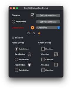
GraffitiOptionBox is a powerful CheckBox/RadioButton replacement that uses native-emulating colors and styles for superb modern drawing, and supports a multitude of customization options including:
*
Custom coloring
*
Custom value icon images
*
Custom value icon placement
## Preview
Previous
Next
## Compatibility
### Framework API Version
| 1.0 | 2.0 |
| :---: | :---: |
| True | True |
### Desktop
| 32-Bit | 64-Bit |
| :---: | :---: |
| True | True |
## Attributes
| Name | Value |
| --- | --- |
| DefaultEvent | "ValueChanged" |
## Enumerations
| Name | Value | Description |
| --- | :---: | --- |
| Positions | Left <br > Right | Supported value signifier positions. |
| Types | CheckBox <br > RadioButton <br > Custom | Supported control display types. |
| Values | Unchecked <br > Checked <br > Indeterminate | Supported values. |
## Event Definitions
| Name | Parameters | Return Type | Description |
| --- | :---: | :---: | --- |
| Clicked | (None) | (None) | Raised when the user clicks the component. |
| ValueChanged | (None) | (None) | Raised when the value of the component has changed. |
## Properties
| Name | Type | Default Value | Description |
| --- | :---: | :---: | --- |
| AllowKeyboardNavigation | Boolean | (None) | When True will allow navigation without grouped controls. |
| BackgroundColor | Color | (None) | Background color applied to the component. |
| Bold | Boolean | (None) | Font weight of the component's text. |
| BorderColor | Color | (None) | Color applied to the component's text. |
| Caption | String | (None) | Text of the component. |
| hasFocus | Boolean | (None) | (None) |
| IconChecked | Picture | (None) | Picture to draw when the value is True. Applies only when Type = Custom. |
| IconIndeterminate | Picture | (None) | Picture to draw when the value is Indeterminate. Applies only when Type = Custom. |
| IconUnchecked | Picture | (None) | Picture to draw when the value is False. Applies on when Type = Custom. |
| Italic | Boolean | (None) | When True, Caption is draw italicized. |
| RadioGroupName | String | (None) | When filled, the component will be part of a group and will scan for other members in its direct parent to change their value as its value changes. |
| ShiftValueIcons | Boolean | (None) | When True, the component will attempt to shift icons to match the current system theme. |
| SystemColors | Boolean | (None) | When False, the component will use the custom color properties for drawing. |
| TextColor | Color | (None) | Color used to draw the Caption. |
| TextFont | String | (None) | Font face used to draw the Caption. |
| TextSize | Integer | (None) | Font size used to draw the Caption. |
| Type | Types | (None) | The type of component to draw. |
| Underline | Boolean | (None) | When True, Caption will be drawn underlined. |
| Value | Values | (None) | The current Value of the component. Use Values Enumeration. |
| ValueB | Boolean | (None) | Boolean value matching Values Enumeration. |
| ValueColor | Color | (None) | Color applied to the value icon. |
| ValuePosition | Positions | (None) | Determines the position of the Value icon relative to the Caption. |
