# GraffitiPropertyList
Class Inherits GraffitiListBox
## About
GraffitiPropertyList emulates the PropertyList control seen in many software development IDEs.Features:
*
Boolean Properties
*
Single-line String Properties
*
Multi-line String Properties
*
Integer Properties
*
Image Properties
*
Color Properties
*
Read-only Properties
*
Fully customizable list properties
*
Custom Value Modification Buttons
*
Categorization
*
Cell AutoComplete
*
Save to XML
*
Load from XML
## Preview
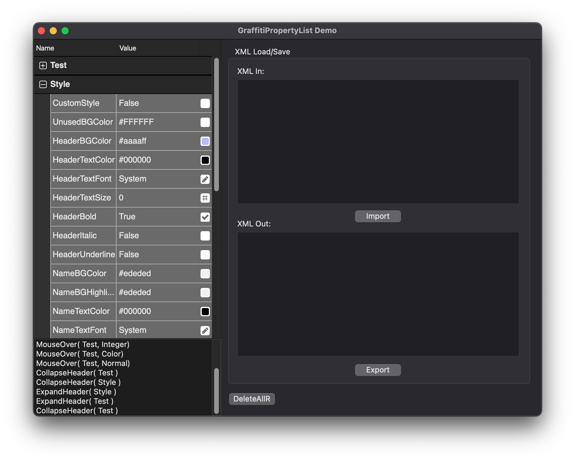
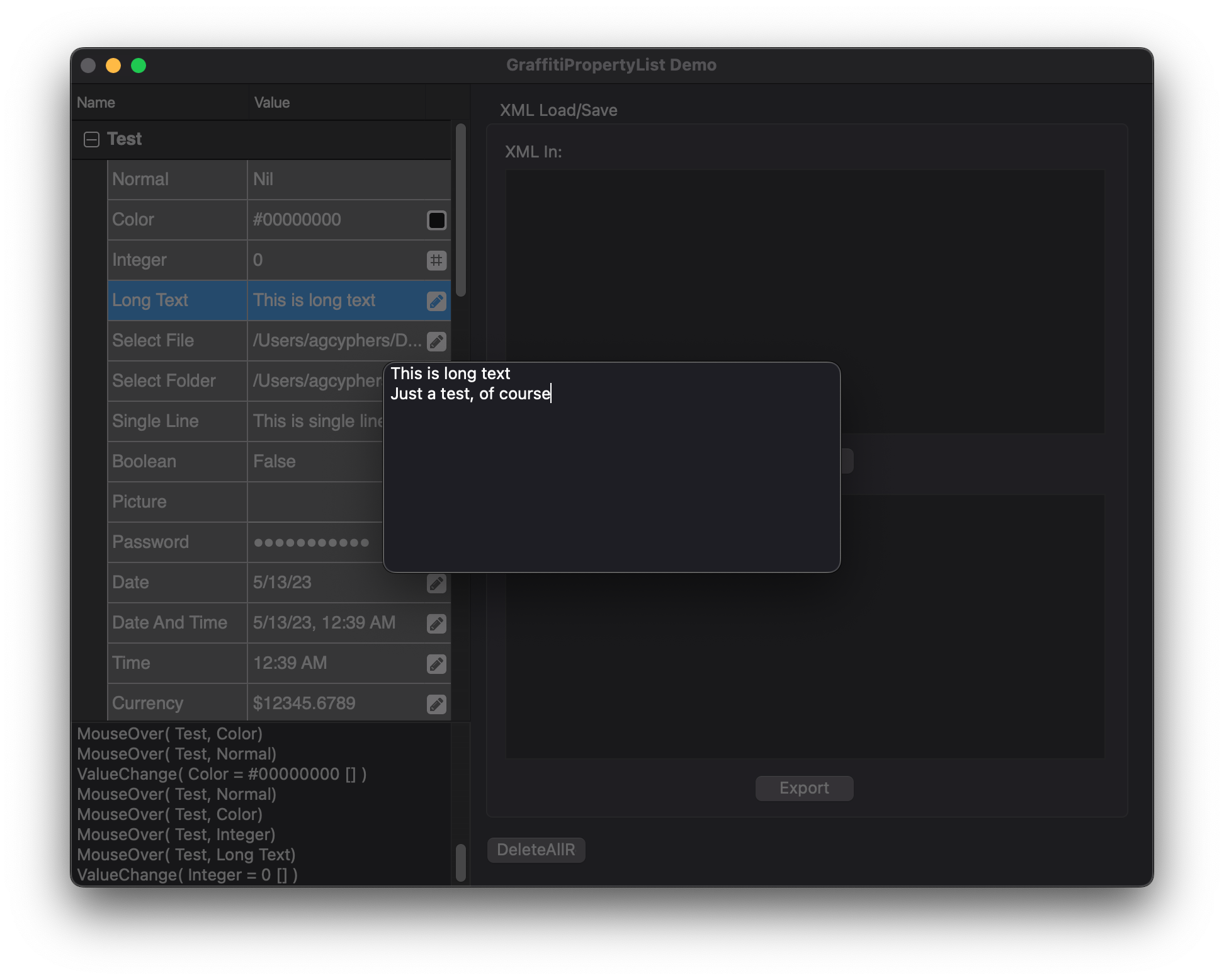
Previous
Next
## Compatibility
### Framework API Version
| 1.0 | 2.0 |
| :---: | :---: |
| True | True |
### Console
| 32-Bit | 64-Bit |
| :---: | :---: |
| True | True |
### Desktop
| 32-Bit | 64-Bit |
| :---: | :---: |
| True | True |
### iOS
| 32-Bit | 64-Bit |
| :---: | :---: |
| False | True |
### Web
| 32-Bit | 64-Bit |
| :---: | :---: |
| True | True |
## Attributes
| Name | Value |
| --- | --- |
| DefaultEvent | "ValueChange" |
## Event Definitions
| Name | Parameters | Return Type | Description |
| --- | :---: | :---: | --- |
| Closing | (None) | (None) | |
| CollapseHeader | currHeader as PropertyListheader | (None) | Fired when a header is collapsed. |
| ColorEdit | Node as PropertyListChild | Boolean | Fired when the user attempts to edit a color cell. |
| CustomCellClick | Node as PropertyListChild <br> X as Integer <br> Y as Integer | (None) | Fired when a cell of type kChildCustom is clicked. |
| CustomIconPaint | g as Graphics <br> Node as PropertyListChild | (None) | Fired when the icon is being painted for a cell of type of kChildCustom. |
| ExpandHeader | currHeader as propertyListheader | (None) | Fired when a header is expanded. |
| HeaderBackgroundPaint | g as graphics | Boolean | Fired before any background painting is carried out on headers. Return true if you draw to the graphics context. |
| MouseOver | currHeader as PropertyListheader <br> currChild as propertyListchild | (None) | Raised when the user mouses over a head or child. |
| NameBackgroundPaint | g as graphics <br> IsSelected as Boolean | Boolean | Raised before drawing is carried on child name backgrounds. Return true if you modify the graphics context. |
| Open | (None) | (None) | |
| UnusedBackgroundPaint | g as Graphics | Boolean | Triggered when the class is about to draw empty rows. Return True if you modify the graphics context. |
| ValueBackgroundPaint | g as Graphics <br> IsSelected as Boolean | Boolean | Raised when the background of a value cell is being drawn. |
| ValueChange | Node as PropertyListChild <br> Tag as String = "" | (None) | Fired when the value of a PropertyListChild has changed. |
## Methods
| Name | Parameters | Return Type | Description |
| --- | :---: | :---: | --- |
| Function | FindChild | As | Find the child matching the specified criteria. |
| Function | FindChildInHeader | As | Finds the child matching the specified criteria within a certain header. |
| Function | FindHeader | As | Find the header matching the specified criteria. |
| Function | FindHeaderByChild | As | Returns the header of the specified child. |
| Sub | FromJSON | (None) | Reloads the PropertyList instance using the JSON data provided. |
| Sub | FromXML | (None) | Populates the propertylist from an XML string. |
| Sub | LockUpdate | (None) | Prevents the UI from updating until UnlockUpdate is called. |
| Sub | Reload | (None) | Clears and rebuild the component's display. |
| Function | RemoveHeader | As | Removes a header from the display. |
| Sub | Reset | (None) | Resets the PropertyList to its default state without content. |
| Function | ToJSON | As | Exports all contained data as a JSON string. |
| Function | ToXML | As | Exports the current state to an XML string. |
| Sub | UnlockUpdate | (None) | Updates the UI of any changes carried out during the LockUpdate period. |
## Properties
| Name | Type | Default Value | Description |
| --- | :---: | :---: | --- |
| AutoEdit | Boolean | Nil | If True, clicking a value cell automatically begins editing. |
| CustomStyle | Boolean | Nil | If true, will use custom color properties for drawing. |
| ExpanderColor | Color | Nil | Color applied to the row tree expanders. |
| HeaderBGColor | Color | Nil | Background color for header items. |
| HeaderBold | Boolean | Nil | Font weight of header item text. |
| HeaderItalic | Boolean | Nil | Text decoration of header text. |
| Headers() | PropertyListHeader | Nil | Array of header items. Changes to this property will not be propagated unless you call Reload(). |
| HeaderTextColor | Color | Nil | Text color of header items. |
| HeaderTextFont | String | Nil | Text font of header items. |
| HeaderTextSize | Integer | Nil | Font size of header items. |
| HeaderUnderline | Boolean | Nil | Text decoration of header text. |
| HeadingName | String | Nil | Text displayed in the header for the name column. |
| HeadingValue | String | Nil | Text displayed in the header for the value column. |
| IconColor | Color | Nil | Color applied to the edit icons for rows' values. |
| NameBGColor | Color | Nil | Background color of child names. |
| NameBGHighlight | Color | Nil | Background highlight color of child names. |
| NameBold | Boolean | Nil | Font weight of child names. |
| NameItalic | Boolean | Nil | Italicize child names. |
| NameTextColor | Color | Nil | Text color of child names. |
| NameTextFont | String | Nil | Text font of child names. |
| NameTextSize | Integer | Nil | Font size of child names. |
| NameUnderline | Boolean | Nil | Text decoration of child names. |
| Private | As | Nil | |
| Private | As | Nil | |
| Private | As | Nil | |
| Private | As | Nil | |
| Private | As | = | |
| Private | As | = | |
| Private | As | Nil | |
| Private | As | Nil | |
| Private | As | Nil | |
| Private | As | Nil | |
| Private | As | Nil | |
| Private | As | Nil | |
| Private | As | Nil | |
| Private | As | Nil | |
| Private | As | Nil | |
| Private | As | Nil | |
| Private | As | = | |
| Private | As | Nil | |
| Private | As | Nil | |
| Private | As | Nil | |
| Private | As | Nil | |
| Private | As | Nil | |
| Private | As | Nil | |
| Private | As | Nil | |
| Private | As | Nil | |
| Private | As | Nil | |
| Private | As | Nil | |
| Private | As | Nil | |
| Private | As | Nil | |
| Private | As | Nil | |
| Private | As | Nil | |
| Private | As | Nil | |
| Private | As | Nil | |
| Private | As | = | |
| Private | As | Nil | |
| Private | As | Nil | |
| Private | As | Nil | |
| Private | As | = | |
| Private | As | Nil | |
| Private | As | = | |
| Private | As | = | |
| Private | As | = | |
| Private | As | Nil | |
| Private | As | Nil | |
| Private | As | Nil | |
| Private | As | Nil | |
| Private | As | Nil | |
| Private | As | Nil | |
| ResizeColumns | Boolean | Nil | Allow users to resize columns. |
| RowHeight | Integer | Nil | The height of each row. |
| UnusedBGColor | Color | Nil | Color used to fill unused area of the control. |
| ValueBGColor | Color | Nil | Background color of child values. |
| ValueBGHighlight | Color | Nil | Background highlight color of child values. |
| ValueBold | Boolean | Nil | Font weight of child values. |
| ValueItalic | Boolean | Nil | Italicize child values. |
| ValueTextColor | Color | Nil | Text color of child values. |
| ValueTextFont | String | Nil | Text font of child values. |
| ValueTextSize | Integer | Nil | Font size of child values. |
| ValueUnderline | Boolean | Nil | Text decoration of child values. |
