# GraffitiPopupMenu
Class Inherits GraffitiSuite.BaseCanvas
## About
GraffitiPopupMenu is a drop-in replacement for the standard Xojo popupmenu control that supports custom-drawing events for rows and the currently selected value, multiple columns, and has a beautiful platform- and theme-aware design to make it look and feel at home in any UI.
## Preview
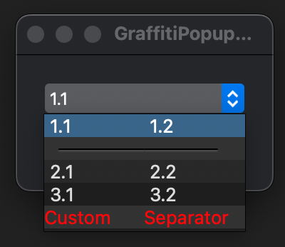

Previous
Next
## Compatibility
### Framework API Version
| 1.0 | 2.0 |
| :---: | :---: |
| True | True |
### Desktop
| 32-Bit | 64-Bit |
| :---: | :---: |
| True | True |
## Attributes
| Name | Value |
| --- | --- |
| DefaultEvent | "Change" |
## Constants
| Name | Type | Default Value | Description |
| --- | :---: | :---: | --- |
| SeparatorText | String | - | Text to use for creating a separator item. |
## Event Definitions
| Name | Parameters | Return Type | Description |
| --- | :---: | :---: | --- |
| CellBackgroundPaint | g as Graphics <br> row as Integer <br> column as Integer | Boolean | Raised when the cell's background is being drawn. |
| CellTextPaint | g as Graphics <br> row as Integer <br> column as Integer <br> x as Integer <br> y as Integer | Boolean | Raise when the cell's text is being drawn. |
| Change | (None) | (None) | Raised when the user makes a selection. |
| KeyDown | Key as String | Boolean | Raised when the user presses a key on their keyboard while the component has focus. |
| Opening | (None) | (None) | (None) |
| SeparatorPaint | g as Graphics <br> row as Integer <br> column as Integer | Boolean | Raised when a separator is being drawn. |
| ShowMenu | (None) | (None) | Raised when the menu is shown. |
| ValuePaint | g as Graphics <br> byRef bounds as Xojo.Rect | Boolean | Raised when drawing the value in the primary display area. |
## Methods
| Name | Parameters | Return Type | Description |
| --- | :---: | :---: | --- |
| AddRow | ParamArray Item as String | (None) | Adds a row of content. |
| Cell | rowIndex as Integer <br> colIndex as Integer | String | Returns the content of the specified cell. |
| Cell | rowIndex as Integer <br> colIndex as Integer <br> assigns newValue as String | (None) | Returns the content of the specified cell. |
| CellTag | rowIndex as Integer <br> colIndex as Integer | Variant | Returns the content of the specified cell. |
| CellTag | rowIndex as Integer <br> colIndex as Integer <br> assigns newValue as Variant | (None) | Returns the content of the specified cell. |
| Constructor | (None) | (None) | Creates a new instance of the class. |
| Heading | colIndex as Integer | String | Returns the current text assigned to the column header at the specified index. |
| Heading | colIndex as Integer <br> assigns newValue as String | (None) | Returns the current text assigned to the column header at the specified index. |
| InsertRow | atIndex as Integer <br> rowText as String <br> Indent as Integer = 0 | (None) | Inserts the specified text at the provided index. |
| LastIndex | (None) | Integer | Returns the last row's index. |
| ListCount | (None) | Integer | Returns the number of items added. |
| PopUp | (None) | (None) | Shows the menu. |
| RemoveAllRows | (None) | (None) | Removes all rows from the control. |
| RemoveRow | rowIndex as Integer | (None) | Removes the specified row. |
| Row | rowIndex as Integer | String | Returns the content of the specified cell. |
| Row | rowIndex as Integer <br> assigns newValue as String | (None) | Returns the content of the specified cell. |
| RowTag | rowIndex as Integer | Variant | Returns the content of the specified cell. |
| RowTag | rowIndex as Integer <br> assigns newValue as Variant | (None) | Returns the content of the specified cell. |
| Text | (None) | String | Returns the currently drawn item text within the display. |
| Text | assigns value as String | (None) | Returns the currently drawn item text within the display. |
## Properties
| Name | Type | Default Value | Description |
| --- | :---: | :---: | --- |
| Bold | Boolean | (None) | Font weight. |
| ColumnCount | Integer | (None) | Number of columns in dropdown list. |
| ColumnWidths | String | (None) | Widths of columns in dropdown list. |
| HasHeading | Boolean | (None) | Header in dropdown list. |
| HeaderHeight | Integer | (None) | Header height in dropdown list. |
| InitialValue | String | (None) | Default values; columns separated by Tab character, rows by EndOfLine. |
| Italic | Boolean | (None) | Font obliqueness. |
| ListIndex | Integer | (None) | Currently selected index. |
| ListIndexHover | Integer | (None) | Currently hovered index. |
| MenuHeight | Integer | (None) | (None) |
| MenuHeightMax | Integer | (None) | (None) |
| menuListbox | GraffitiListbox | (None) | (None) |
| MenuWidth | Integer | (None) | (None) |
| menuWindow | GraffitiMenuWindow | (None) | (None) |
| mListIndex | Integer | (None) | (None) |
| RowHeight | Integer | (None) | Row height in dropdown list. |
| TextFont | String | (None) | Font used to draw value. |
| TextSize | Integer | (None) | Font size used to draw value. |
| TextUnit | REALbasic.FontUnits | (None) | (None) |
| Underline | Boolean | (None) | Text decoration used to draw value. |
