# GraffitiSlider
Class Inherits GraffitiSuite.BaseCanvas
## About
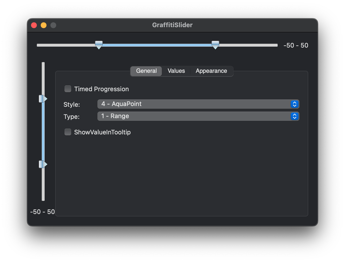
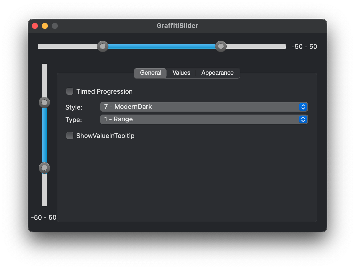
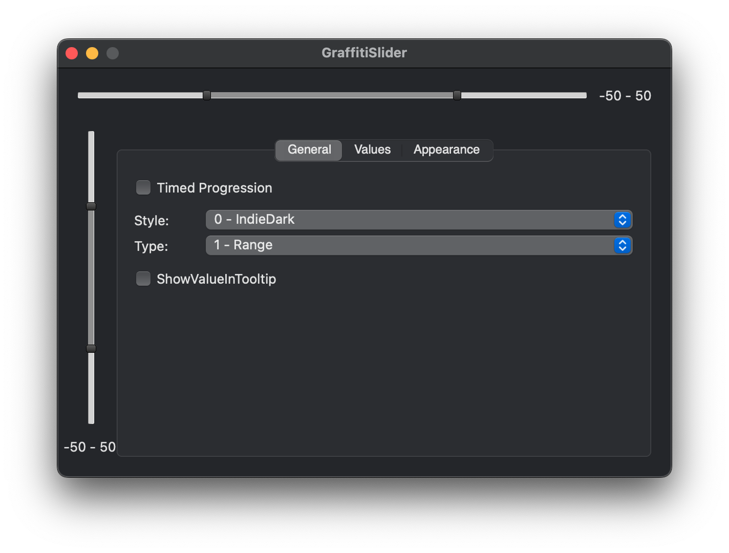
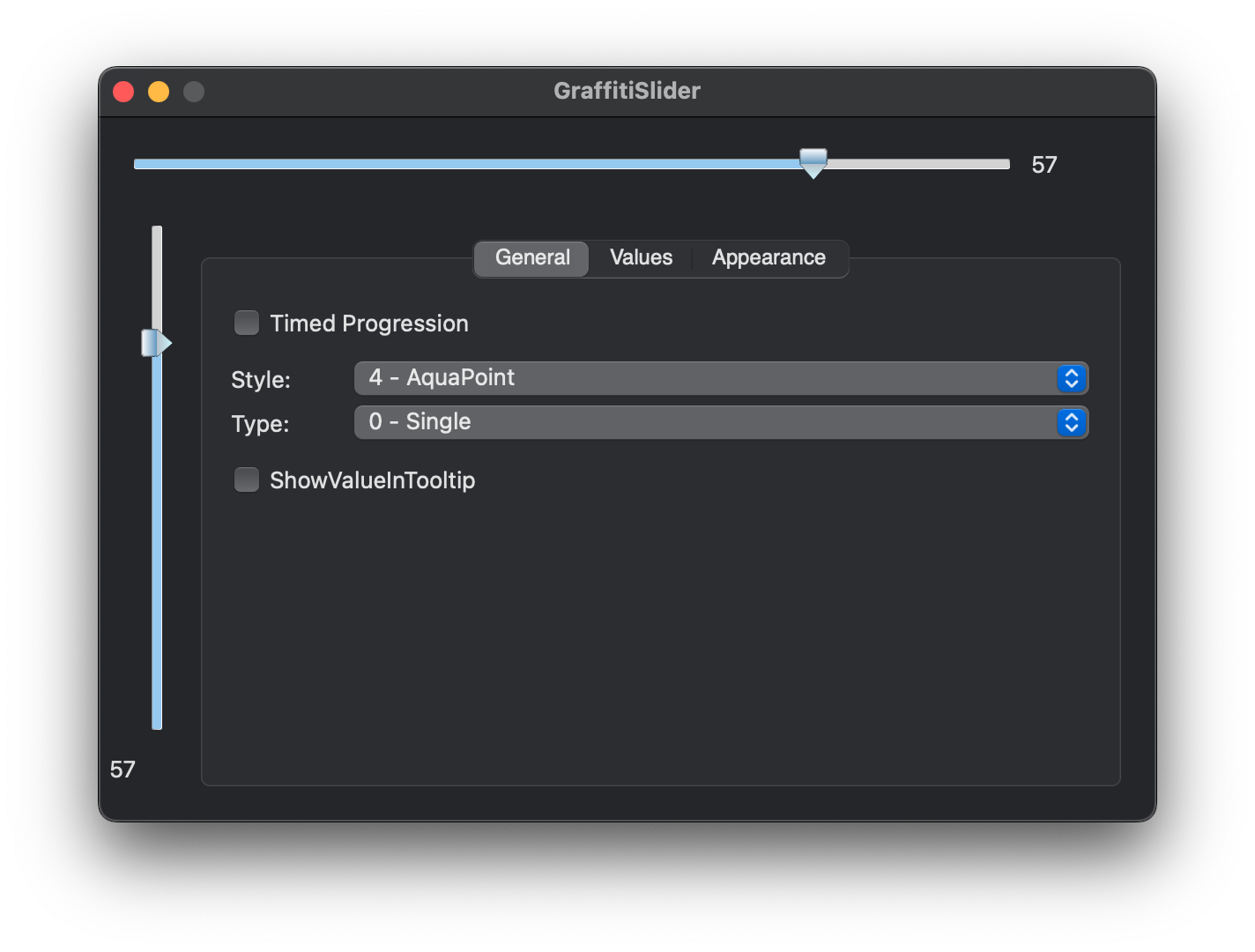
GraffitiSlider is a custom slider control that supports both single and ranged values with 10 different styles.
**
Features
**
*
10 different styles to choose from
*
Single or Ranged Value Selection
*
Maximum and Minimum Properties for Variable Values
*
Custom Colors Support
## Preview
Previous
Next
## Compatibility
### Framework API Version
| 1.0 | 2.0 |
| :---: | :---: |
| True | True |
### Desktop
| 32-Bit | 64-Bit |
| :---: | :---: |
| True | True |
## Attributes
| Name | Value |
| --- | --- |
| DefaultEvent | "ValueChange" |
## Enumerations
| Name | Value | Description |
| --- | :---: | --- |
| Styles | IndieDark <br > Softer <br > AquaRound <br > GraphiteRound <br > AquaPoint <br > GraphitePoint <br > LightHandles <br > ModernDark <br > BlueSky | Supported drawing styles. |
| Types | Single <br > Range | Supported value selection models. |
## Event Definitions
| Name | Parameters | Return Type | Description |
| --- | :---: | :---: | --- |
| ValueChange | (None) | (None) | Triggered when the user has changed the value. |
## Methods
| Name | Parameters | Return Type | Description |
| --- | :---: | :---: | --- |
| StyleCount | (None) | Integer | Returns a count (Ubound + 1) of all available styles. |
| StyleName | intIndex as Integer | String | Returns the name of a given style. |
## Properties
| Name | Type | Default Value | Description |
| --- | :---: | :---: | --- |
| LargeChange | Integer | (None) | Value to increase/decrease when the user clicks on the slider track. |
| lastMousePosition | Xojo.Point | (None) | (None) |
| Maximum | Integer | (None) | Maximum slider value. |
| Minimum | Integer | (None) | Minimum slider value. |
| ShowValueInTooltip | Boolean | (None) | Displays the current value in a tooltip that is centered near the control, with position depending on orientation. |
| SliderBGColor | Color | (None) | Background color of the slider knob. |
| SliderBorderColor | Color | (None) | Border color of the slider knob. |
| SmallChange | Integer | (None) | Amount to increase/decrease value on small changes. |
| Style | Styles | (None) | The current drawing style of the slider. |
| TrackBGColor | Color | (None) | Background color of the slider track. |
| TrackBorderColor | Color | (None) | Border color of the slider track. |
| Type | Types | (None) | The type of slider this is, Single or Ranged values. |
| UseDefaultColors | Boolean | (None) | Use the colors corresponding to the styles, rather than those set in properties when True. |
| Value | Integer | (None) | The current slider value (when Type = Types.Single). |
| ValueColor | Color | (None) | Color used to draw the value area. |
| ValueHigh | Integer | (None) | The current high value (when Type = Types.Range). |
| ValueLow | Integer | (None) | The current low value (when Type = Types.Range). |
| _VisualTracking | Boolean | (None) | (None) |
