# GraffitiTourCard
Class Inherits GraffitiUIControl
## About
GraffitiTourCard is a UI component devoted to assisting in the development of the GraffitiTour component, but is a worthy card component in its right that can take the place of many other components your user interface designs to improve user experience.
## Preview
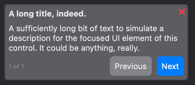
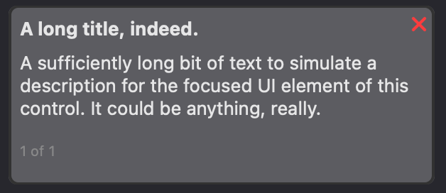
Previous
Next
## Attributes
| Name | Value |
| --- | --- |
| DefaultEvent | "Pressed" |
## Event Definitions
| Name | Parameters | Return Type | Description |
| --- | :---: | :---: | --- |
| ClosePressed | (None) | (None) | Raised when the user has pressed the close icon. |
| HeightChanged | (None) | (None) | Raised when the card's height has changed in response to adapting to the content. |
| LeftButtonPressed | (None) | (None) | Raised when the user has pressed the left (or "Previous) button. |
| LinkPressed | index as Integer <br> content as String | (None) | Raised when the user has pressed a link within the message. Parameters indicate which link was pressed. |
| Pressed | (None) | (None) | Raised when the user has pressed an area of the card that is not a button. |
| RightButtonPressed | (None) | (None) | Raised when the user has pressed the right (or "Next") button. |
## Methods
| Name | Parameters | Return Type | Description |
| --- | :---: | :---: | --- |
| Constructor | (None) | (None) | Returns a new instance of the class. |
| Constructor | title as String <br> message as String | (None) | Returns a new instance of the class. |
## Properties
| Name | Type | Default Value | Description |
| --- | :---: | :---: | --- |
| BackgroundColor | ColorGroup | (None) | Colors applied to the background of the control. |
| BorderColor | ColorGroup | (None) | Color used for drawing the border of the control. |
| BorderRadius | Double | (None) | Corner radius of the control. |
| ButtonLeftCaption | String | (None) | Caption for the left button. |
| ButtonLeftColor | ColorGroup | (None) | Color applied to the background of the left button. |
| ButtonLeftEnabled | Boolean | (None) | Determines whether the user can interact with or set focus to the left button. |
| ButtonLeftTextColor | ColorGroup | (None) | Color applied to the text of the left button. |
| ButtonLeftVisible | Boolean | (None) | Determines whether the left button is visible. |
| ButtonRightCaption | String | (None) | Caption for the right button. |
| ButtonRightColor | ColorGroup | (None) | Color applied to the background of the right button. |
| ButtonRightEnabled | Boolean | (None) | Determines whether the user can interact with or set focus to the right button. |
| ButtonRightTextColor | ColorGroup | (None) | Color applied to the text of the right button. |
| ButtonRightVisible | Boolean | (None) | Determines whether the right button is visible. |
| CloseButtonColor | ColorGroup | (None) | Color applied to the close icon of the card. |
| CloseButtonVisible | Boolean | (None) | Determines whether the close button is displayed. |
| HasCustomColors | Boolean | (None) | Set to True when providing custom color values to any ColorGroup properties. |
| Margin | Double | (None) | Spacing between the outside edge of the card and the elements within, as well as between contained elements. |
| MessageFontBold | Boolean | (None) | Determines weight of the text drawn for this element. |
| MessageFontColor | ColorGroup | (None) | Determines color(s) used to draw the text of this element. |
| MessageFontItalic | Boolean | (None) | Determines whether text of this element is drawn oblique. |
| MessageFontName | String | (None) | Determines the font used to draw the text of this element. |
| MessageFontSize | Integer | (None) | Determines the size of the font used to draw the text of this element. |
| MessageFontUnderline | Boolean | (None) | Determines whether the underline text decoration is applied to this element. |
| MessageLinkColor | ColorGroup | (None) | Color used to draw links in message text. |
| MessageLinkColorHover | ColorGroup | (None) | Color used to draw links in message text when hovered. |
| MessageText | String | (None) | Text drawn for this element. |
| RestrictFocus | Boolean | True | Determines whether users can shift focus outside the control, once it has focus, by pressing the Tab key, after internal focus progression is complete. |
| StepFontBold | Boolean | (None) | Determines weight of the text drawn for this element. |
| StepFontColor | ColorGroup | (None) | Determines color(s) used to draw the text of this element. |
| StepFontItalic | Boolean | (None) | Determines whether text of this element is drawn oblique. |
| StepFontName | String | (None) | Determines the font used to draw the text of this element. |
| StepFontSize | Integer | (None) | Determines the size of the font used to draw the text of this element. |
| StepFontUnderline | Boolean | (None) | Determines whether the underline text decoration is applied to this element. |
| StepText | String | (None) | Text drawn for this element. |
| Tag | Variant | (None) | Developer storage. |
| TitleFontBold | Boolean | (None) | Determines weight of the text drawn for this element. |
| TitleFontColor | ColorGroup | (None) | Determines color(s) used to draw the text of this element. |
| TitleFontItalic | Boolean | (None) | Determines whether text of this element is drawn oblique. |
| TitleFontName | String | (None) | Determines the font used to draw the text of this element. |
| TitleFontSize | Integer | (None) | Determines the size of the font used to draw the text of this element. |
| TitleFontUnderline | Boolean | (None) | Determines whether the underline text decoration is applied to this element. |
| TitleText | String | (None) | Text drawn for this element. |
