# GraffitiActionBar
Class Inherits GraffitiSuite.BaseCanvas
## About
GraffitiActionBar is a recreation of a popular OS X UI element which provides easy access to common actions and interface manipulation.
**
Features:
**
*
Left-side window splitting
*
Right-side window splitting
*
Automatic determination of controls to resize by parent and position
*
Events for Hover, Click, and Resize
## Preview
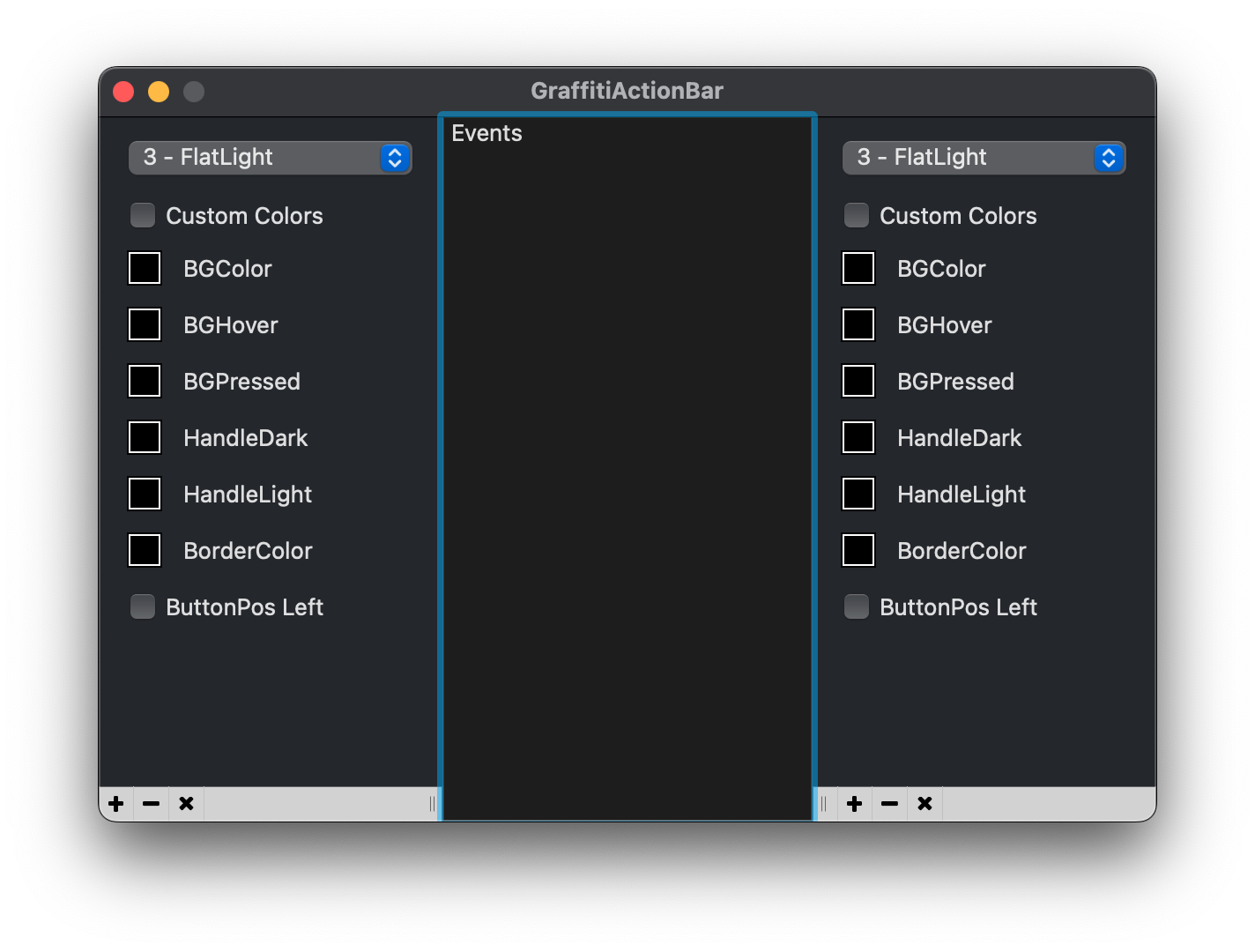
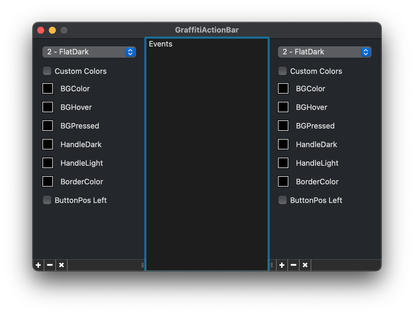
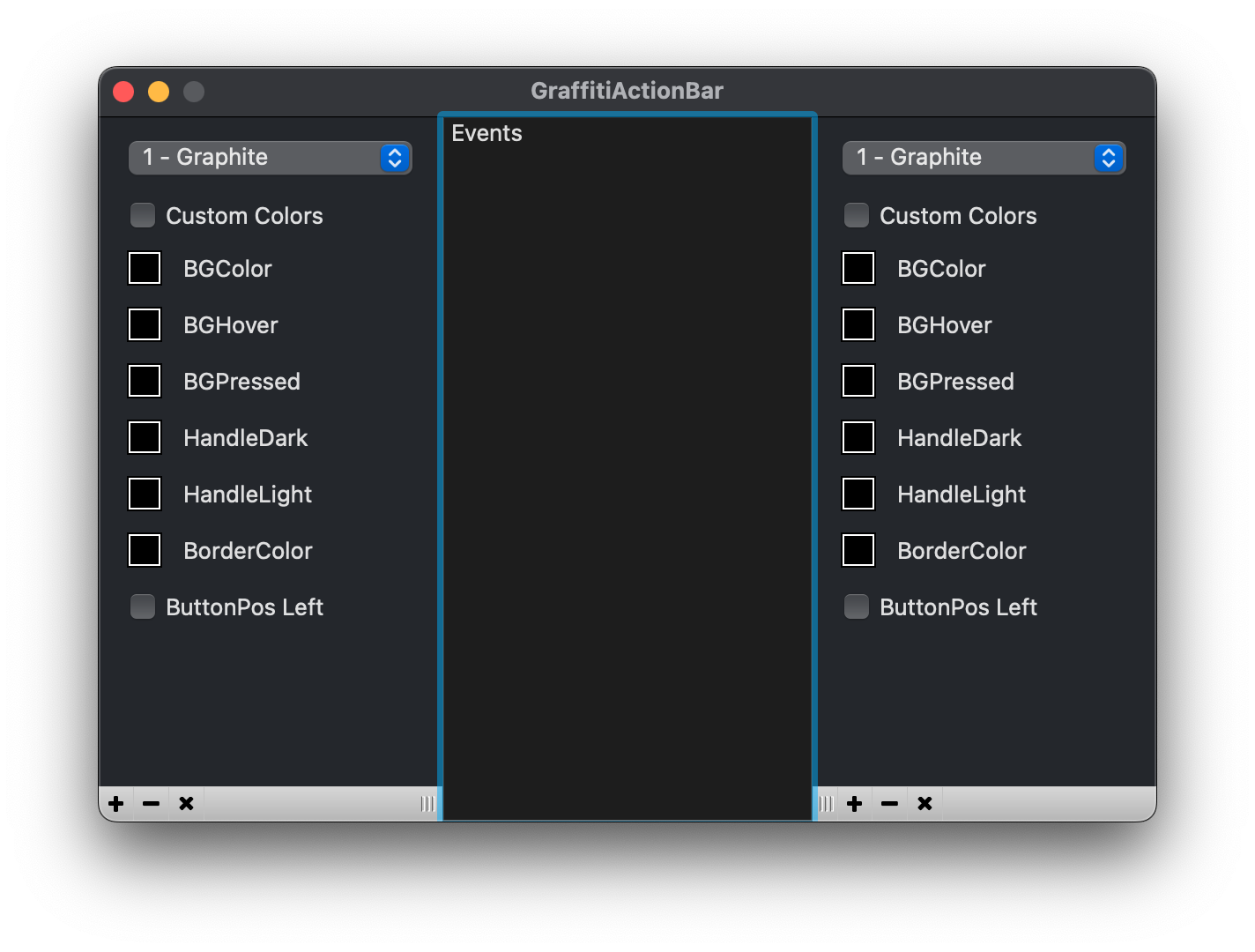
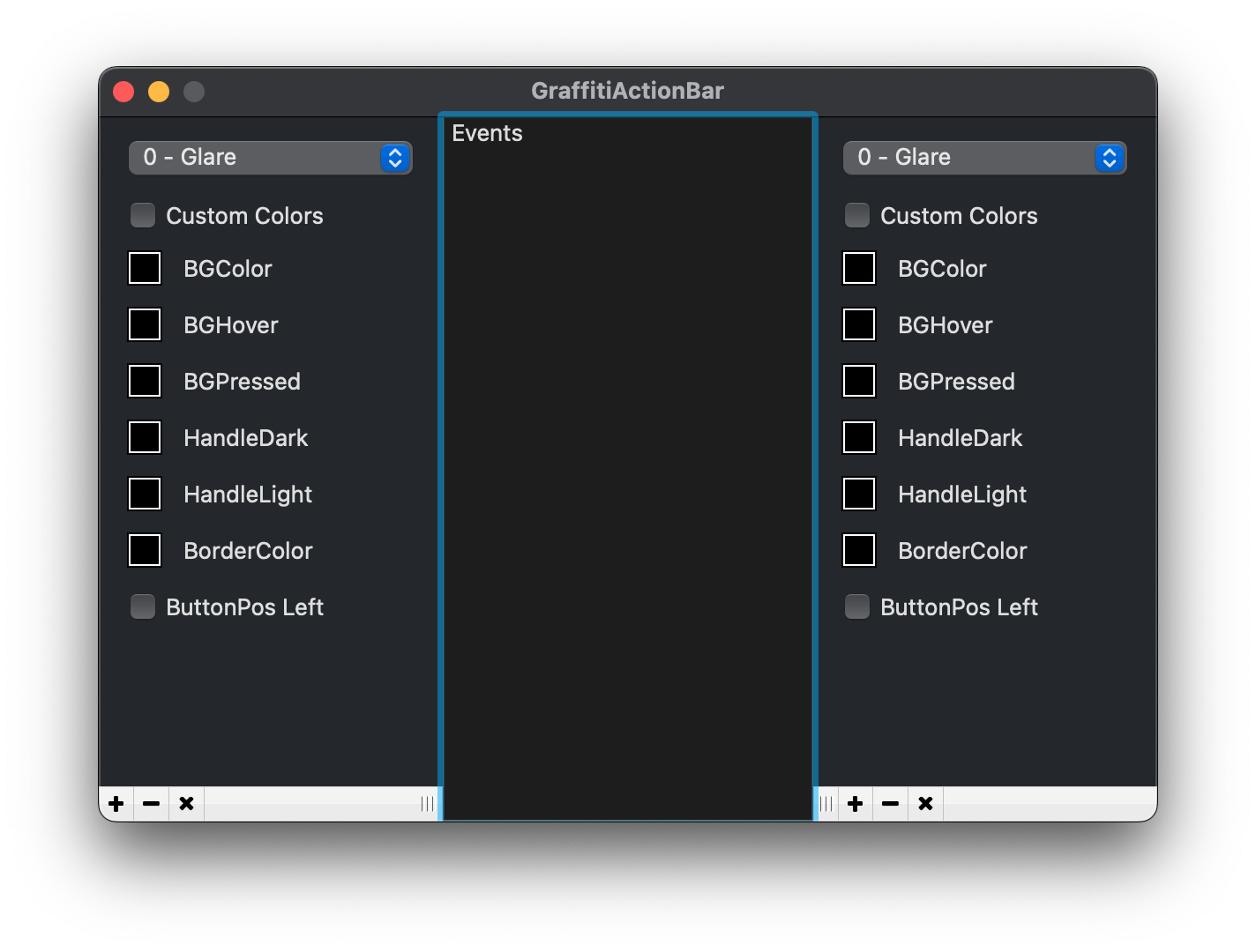
Previous
Next
## Compatibility
### Framework API Version
| 1.0 | 2.0 |
| :---: | :---: |
| True | True |
### Desktop
| 32-Bit | 64-Bit |
| :---: | :---: |
| True | True |
## Attributes
| Name | Value |
| --- | --- |
| DefaultEvent | "ButtonClick" |
## Enumerations
| Name | Value | Description |
| --- | :---: | --- |
| Alignments | Left <br > Right | Alignment of item within control. |
| HandlePositions | Right <br > Left <br > None | Location of splitter handle. |
| Styles | Glare <br > Graphite <br > FlatDark <br > FlatLight | Available drawing styles. |
## Event Definitions
| Name | Parameters | Return Type | Description |
| --- | :---: | :---: | --- |
| ButtonClick | ButtonIndex as Integer <br> ButtonPicture as Picture | (None) | Fired when a button has been clicked. |
| ButtonHover | ButtonIndex as Integer <br> ButtonPicture as Picture | (None) | Fired when the mouse is over a button. |
| Resized | (None) | (None) | Fired when the resize handle is used. |
## Methods
| Name | Parameters | Return Type | Description |
| --- | :---: | :---: | --- |
| AddButton | picButton as Picture | (None) | Adds a button to the ActionBar. |
| ButtonCount | (None) | Integer | Returns the count of buttons currently added to the ActionBar (subtract one for iteration). |
| GetButton | ButtonIndex as Integer | Picture | Returns the picture of the button at Index. |
| RemoveAll | (None) | (None) | Removes all items. |
| RemoveButton | ButtonIndex as Integer | (None) | Remove the specified button from the ActionBar. |
## Properties
| Name | Type | Default Value | Description |
| --- | :---: | :---: | --- |
| BGColor | Color | (None) | The background color of the items and UseCustomColors is True. |
| BGHover | Color | (None) | The background color of the items when the mouse is hovering over them and UseCustomColors is True. |
| BGPressed | Color | (None) | The background color of the items when the mouse is pressed on them and UseCustomColors is True. |
| BorderColor | Color | (None) | The border color of the buttons and class when UseCustomColors is True. |
| ButtonPosition | Alignments | (None) | Determines the placement of the buttons in the control's display area. |
| HandleColorDark | Color | (None) | The dark color of the resize handle when UseCustomColors is True. |
| HandleColorLight | Color | (None) | The light color of the resize handle when UseCustomColors is True. |
| HandlePosition | Integer | (None) | The position of the resize handle on the control. |
| MinimumLeft | Integer | (None) | The minimum remaining width to the left of the control on resize. |
| MinimumRight | Integer | (None) | The maximum remaining width to the right of the control on resize. |
| Style | Integer | (None) | The appearance of the class and buttons. |
| UseCustomColors | Boolean | (None) | Draws items using the defined colors in the class’s properties. |
