# GraffitiGrid
Class Inherits GraffitiSuite.BaseCanvas
## About
GraffitiGrid is a fully-custom listbox control complete with custom cell types and events for drawing the most complex list of data you can dream up. Supports embedding controls and containers, custom row and header rendering, and much more.
## Preview
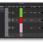
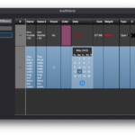
Previous
Next
## Compatibility
### Framework API Version
| 1.0 | 2.0 |
| :---: | :---: |
| True | True |
### Desktop
| 32-Bit | 64-Bit |
| :---: | :---: |
| True | True |
## Enumerations
| Name | Value | Description |
| --- | :---: | --- |
| SelectionModes | Single <br > Multiple | Supported selection modes. |
## Event Definitions
| Name | Parameters | Return Type | Description |
| --- | :---: | :---: | --- |
| BeforeEdit | column as GraffitiGridColumn <br> row as GraffitiGridRow <br> bounds as Xojo.Rect | Boolean | Raised before an edit operation is set to begin. Return True to cancel. |
| CellClick | theRow as GraffitiGridRow <br> theColumn as GraffitiGridColumn | Boolean | Fired when the user clicks a cell. |
| CellDoubleClick | theRow as GraffitiGridRow <br> theColumn as GraffitiGridColumn | (None) | Fired when the user double-clicks a cell. |
| ColumnReorder | theColumn as GraffitiGridColumn <br> oldIndex as Integer <br> newIndex as Integer | (None) | Fires when the user drags a column to a new position |
| ColumnResize | theColumn as GraffitiGridColumn <br> newWidth as Integer | (None) | Fires when the user resizes a column |
| ContextClick | column as GraffitiGridColumn <br> row as GraffitiGridRow <br> x as Integer <br> y as Integer | (None) | Raised when the user right-clicks the control. Row will be Nil if context-clicking a header. |
| DrawCellBackground | theRow as GraffitiGridRow <br> theColumn as GraffitiGridColumn <br> g as Graphics | Boolean | This event is raised before a cell's background is drawn and provides the opportunity to override the class's behavior. Return True if you draw to the graphics property here. |
| DrawCellText | theRow as GraffitiGridRow <br> theColumn as GraffitiGridColumn <br> g as Graphics | Boolean | This event is raised before a cell's text is drawn and provides the opportunity to override the class's behavior. Return True if you draw to the graphics property here. |
| DrawHeaderBackground | theColumn as GraffitiGridColumn <br> g as Graphics | Boolean | This event is raised before a header's background is drawn and provides the opportunity to override the class's behavior. Return True if you draw to the graphics property here. |
| DrawHeaderText | theColumn as GraffitiGridColumn <br> g as Graphics | Boolean | This event is raised before a header's text is drawn and provides the opportunity to override the class's behavior. Return True if you draw to the graphics property here. |
| EditBegun | row as GraffitiGridRow <br> column as GraffitiGridColumn | (None) | Raised when an edit operation has been started and the UI is completely ready. |
| EditCanceled | row as GraffitiGridRow <br> column as GraffitiGridColumn | (None) | Raised when the user has canceled an edit operation. |
| EditCommitted | row as GraffitiGridRow <br> column as GraffitiGridColumn | (None) | Raised when the user has committed a change to the cell being edited. |
| EditKeyDown | key as String | Boolean | Raised when the user presses a key in the cell editor. Return True if handled. |
| FocusLost | (None) | (None) | (None) |
| FormatCellValue | g as Graphics <br> theRow as GraffitiGridRow <br> theColumn as GraffitiGridColumn <br> theValue as Variant <br> byRef formattedValue as String | Boolean | This event allows you to change the look and content of the text that will be drawn to the cell. |
| HeaderClick | theColumn as GraffitiGridColumn | Boolean | Raised when the user clicks a header. Return True to cancel built-in functionality. |
| MouseMove | X as Integer <br> Y as Integer <br> Row as GraffitiGridRow <br> Column as GraffitiGridColumn | Boolean | This event is raised when the mouse is moved. |
| MouseWheel | x as Integer <br> y as Integer <br> deltaX as Integer <br> deltaY as Integer | Boolean | Raised when the user has attempted to scroll the display using the mouse wheel. Return True to cancel default scroll operations. |
| Opening | (None) | (None) | (None) |
| RowClick | theRow as GraffitiGridRow | (None) | Raised when the user clicks a row. |
| RowDrop | StartIndex as Integer <br> EndIndex as Integer | (None) | Raised when the user moves a row in the display by dragging. |
| Scroll | (None) | (None) | Raised when the user scrolls the display. |
| SelectionChanged | (None) | (None) | Raised when the selection has changed. |
| Sorted | Column as GraffitiGridColumn | (None) | Raised when the user sorts a column. |
## Methods
| Name | Parameters | Return Type | Description |
| --- | :---: | :---: | --- |
| AddColumn | theColumn as GraffitiGridColumn | (None) | Adds a column to the grid. |
| AddRow | theRow as GraffitiGridRow | (None) | Adds a row to the grid. |
| AddRows | rows() as GraffitiGridRow | (None) | Adds the specified rows to the grid. |
| Column | Index as Integer | GraffitiGridColumn | Returns the column at the specified index. |
| ColumnCount | (None) | Integer | Returns the number of columns added to the Grid. |
| DeselectAllRows | (None) | (None) | Deselect all currently selected rows. |
| DeselectRow | theRow as GraffitiGridRow | (None) | Deselect a specific row. |
| DeselectRow | atIndex as Integer | (None) | Deselect a specific row. |
| DrawCellBackground | g as Graphics <br> theRow as GraffitiGridRow <br> theColumn as GraffitiGridColumn | (None) | Used to draw the default cell background. |
| DrawCellMenu | g as Graphics <br> theRow as GraffitiGridRow <br> theColumn as GraffitiGridColumn | (None) | Used to draw the cell background for popup style cells. |
| DrawCellProgress | g as Graphics <br> theRow as GraffitiGridRow <br> theColumn as GraffitiGridColumn | (None) | Used to draw the progress indicator for progress type cells. |
| DrawCellProgress_Mac | g as Graphics <br> theRow as GraffitiGridRow <br> theColumn as GraffitiGridColumn <br> theValue as Integer | (None) | Used to draw the progress indicator for progress type cells. |
| DrawCellProgress_Win | g as Graphics <br> theRow as GraffitiGridRow <br> theColumn as GraffitiGridColumn <br> theValue as Integer | (None) | Used to draw the progress indicator for progress type cells. |
| EditCancel | (None) | (None) | Cancel the current edit operation. |
| EditCell | theRow as GraffitiGridRow <br> theColumn as GraffitiGridColumn | (None) | Begin editing of the specified row. |
| EditCell | theRow as Integer <br> theColumn as Integer | (None) | Begin editing of the specified row. |
| EditCommit | newValue as Variant | (None) | Commit the current edit operation. |
| GetColumnByID | theID as String | GraffitiGridColumn | Search for a column with the ID of theID. |
| GetColumnIndex | theCol as GraffitiGridColumn | Integer | Search for the column index of the supplied column. |
| GetColumnLeft | theCol as GraffitiGridColumn | Integer | Get the X position of the supplied column. |
| GetColumnLeft | theIndex as Integer | Integer | Get the X position of the supplied column. |
| GetColumnWidth | theCol as GraffitiGridColumn | Integer | Get width of the supplied column. |
| GetColumnWidth | theIndex as Integer | Integer | Get width of the supplied column. |
| GetRow | atIndex as Integer | GraffitiGridRow | Retrieve the dictionary instance for the supplied row. |
| GetRowByTag | theTag as Variant | GraffitiGridRow | Retrieve the dictionary instance that has a RowTag equal to theTag. |
| GetRowIndex | theRow as GraffitiGridRow | Integer | Return the current index of the supplied row. |
| GetRowTop | theRow as GraffitiGridRow | Integer | Get the Y position of the specified row. |
| GetRowTop | theIndex as Integer | Integer | Get the Y position of the specified row. |
| InsertColumn | atIndex as Integer <br> theColumn as GraffitiGridColumn | (None) | Inserts a new column at atIndex. |
| InsertRow | atIndex as Integer <br> theRow as GraffitiGridRow | (None) | Inserts a new row at atIndex. |
| InvalidateAllRows | (None) | (None) | Force all rows to redrawn, regardless of their previous state. |
| InvalidateRow | atIndex as Integer | (None) | Force the row at atIndex to be redrawn, regardless of previous state. |
| IsEditingCell | row as GraffitiGridRow <br> column as GraffitiGridColumn | Boolean | Returns a boolean indicating if the specified cell is currently being edited. |
| IsRowSelected | theRow as GraffitiGridRow | Boolean | Returns True if the specified row is currently selected. |
| IsRowSelected | rowIndex as Integer | Boolean | Returns True if the specified row is currently selected. |
| ListIndex | (None) | Integer | Returns the currently selected row index. |
| MoveRow | StartIndex as Integer <br> NewIndex as Integer | (None) | Moves the row at the specified index to a new position. |
| RemoveAllRows | (None) | (None) | Removes all rows from the Grid. |
| RemoveColumn | theColumn as GraffitiGridColumn | (None) | Removes the specified column from the display. |
| RemoveColumn | atIndex as Integer | (None) | Removes the specified column from the display. |
| RemoveRow | theRow as GraffitiGridRow | (None) | Remove the specified row. |
| RemoveRow | atIndex as Integer | (None) | Remove the specified row. |
| RowCount | (None) | Integer | Returns a count of all the rows in the Grid. |
| RowTag | theRow as GraffitiGridRow | Variant | Retrieves the RowTag of the specified row. |
| RowTag | theRow as GraffitiGridRow <br> Assigns newTag as Variant | (None) | Retrieves the RowTag of the specified row. |
| RowTag | theRow as Integer | Variant | Retrieves the RowTag of the specified row. |
| RowTag | theRow as Integer <br> Assigns newTag as Variant | (None) | Retrieves the RowTag of the specified row. |
| ScrollIntoView | theRow as GraffitiGridRow | (None) | Scrolls the specified row in to view. |
| ScrollIntoView | theIndex as Integer | (None) | Scrolls the specified row in to view. |
| ScrollTo | X as Integer <br> Y as Integer | (None) | Scrolls the display to the specified position. |
| SelectAllRows | (None) | (None) | Select all rows. |
| SelectedRows | (None) | GraffitiGridRow | Returns an array containing the currently selected rows. |
| SelectRow | theRow as GraffitiGridRow | (None) | Select the specified row. |
| SelectRow | atIndex as Integer | (None) | Select the specified row. |
| ShowMenu | theMenu as DesktopMenuItem <br> theRow as GraffitiGridRow <br> theColumn as GraffitiGridColumn | DesktopMenuItem | Shows a DesktopMenuItem at the specified cell. |
| SortData | theCol as GraffitiGridColumn | (None) | Causes the grid to re-sort the data in the provided column. |
| UpdateCell | theRow as GraffitiGridRow <br> theColumn as GraffitiGridColumn <br> newValue as Variant | (None) | Update the cell value specified and redraw the row. |
| UpdateRows | (None) | (None) | Invalidate all rows, causing them to be redrawn. |
## Properties
| Name | Type | Default Value | Description |
| --- | :---: | :---: | --- |
| BackgroundColor | Color | (None) | The color applied to the background of the entire grid. |
| Border | Boolean | (None) | Draw a border around the grid. |
| BorderColor | Color | (None) | The color of the border. |
| CellBorder | Boolean | (None) | Border around cells. |
| ColumnResize | Boolean | (None) | Allow user to resize columns. |
| CursorIndex | Integer | (None) | Current position of navigation cursor within the grid, a row index. |
| CustomColors | Boolean | (None) | Draw using custom color properties. |
| DragReorder | Boolean | (None) | Allow user to reorder columns by dragging. |
| DragReorderRows | Boolean | (None) | Allow user to reorder rows by dragging. |
| EditField | DesktopTextArea | (None) | Control used for text editing operations. |
| EditingColumn | GraffitiGridColumn | (None) | Column of current edit operation. Nil if not currently editing. |
| EditingRow | GraffitiGridRow | (None) | Row of current edit operation. Nil is not currently editing. |
| GradientFills | Boolean | (None) | When true, the grid will use subtle gradients instead of solid colors to draw components. |
| HasScrollbars | Boolean | (None) | Determines whether scrollbars are displayed. |
| HeaderBorder | Boolean | (None) | When true, draw a border around all column headers. |
| HeaderColor | Color | (None) | Background color of the header items when not hovered. |
| HeaderDividerColor | Color | (None) | Color of border between column headers, as well as between the header and the viewport. |
| HeaderDividerLineSize | Integer | (None) | The width of the divider between column headers. |
| HeaderHeight | Integer | (None) | The height of the header row. |
| HeaderHoverColor | Color | (None) | The background color of the header when hovered. |
| HeaderHoverTextColor | Color | (None) | The text color of the header when hovered. |
| HeaderTextBold | Boolean | (None) | Font weight of the header text. |
| HeaderTextColor | Color | (None) | Text color of the headers. |
| HeaderTextFont | String | (None) | Font used to draw headers. |
| HeaderTextItalic | Boolean | (None) | Determines the obliqueness of the header text. |
| HeaderTextSize | Integer | (None) | Font size of headers. |
| HeaderTextUnderline | Boolean | (None) | Applies the underline text decoration. |
| LastDrawTime | Double | (None) | How long, in seconds, the last redraw took. |
| LockUpdate | Boolean | (None) | When true, the grid will not redraw while making changes. Set to false again to update display. |
| MinimumColumnWidth | Integer | (None) | The smallest a column can be. |
| RowColor | Color | (None) | Background color of even-numbered rows. |
| RowColorOdd | Color | (None) | Background color of odd-numbered rows. |
| RowDividerColor | Color | (None) | Color of the divider between rows. |
| RowDividerLineSize | Integer | (None) | Height of the divider between rows. |
| RowHeight | Integer | (None) | Height of rows. |
| RowHoverColor | Color | (None) | Background color of rows when mouse is over them. |
| RowHoverTextColor | Color | (None) | Foreground color of rows when mouse is over them. |
| RowSelectedColor | Color | (None) | Background color of rows when selected. |
| RowSelectedTextColor | Color | (None) | Foreground color of rows when selected. |
| RowTextBold | Boolean | (None) | Font weight of rows. |
| RowTextColor | Color | (None) | Text color of rows. |
| RowTextFont | String | (None) | Font used to display row text. |
| RowTextItalic | Boolean | (None) | Italicize row text. |
| RowTextSize | Integer | (None) | Size to draw text. |
| RowTextUnderline | Boolean | (None) | Text decoration. |
| ScrollbarHorizontal | DesktopScrollbar | (None) | The control that is used as a horizontal scrollbar. |
| ScrollbarVertical | DesktopScrollbar | (None) | The control that is used as a vertical scrollbar. |
| ScrollPositionX | Integer | (None) | Current horizontal scroll position. |
| ScrollPositionY | Integer | (None) | Current vertical scroll position. |
| SelectionMode | SelectionModes | (None) | Selection type. |
| SortIconColor | Color | (None) | Color applied to the sort icon. |
| SortIconHoverColor | Color | (None) | Color applied to the sort icon on mouse over. |
| SystemColors | Boolean | (None) | When True, attempts to match the colors and UI style used by the system. Dark mode adaptive. |
| WrapCellText | Boolean | (None) | When True, string values will wrap when too long to fit horizontally within their cell. |
