# GraffitiSearchField
Class Inherits GraffitiUIControl
## About
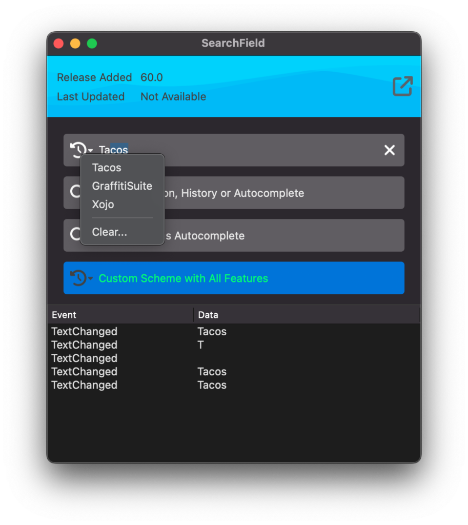
GraffitiSearchField is a customizable and highly-capable search textfield component that's designed to be both powerful and visually appealing.
Features:
*
History
*
Autocomplete
*
Clear Button
*
Customizable Appearance
## Preview
Previous
Next
## Attributes
| Name | Value |
| --- | --- |
| DefaultEvent | "EnterPressed" |
## Event Definitions
| Name | Parameters | Return Type | Description |
| --- | :---: | :---: | --- |
| Closing | (None) | (None) | |
| EnterPressed | (None) | (None) | Raised when the user presses the Enter key. |
| FocusLost | (None) | (None) | |
| FocusReceived | (None) | (None) | |
| HistoryCleared | (None) | (None) | Raised when the user clears the history using the "Clear" item in the history menu. |
| Opening | (None) | (None) | |
| TextChanged | (None) | (None) | Raised when the user has changed the text content of the search field. |
| TextCleared | (None) | (None) | Raised when the user has cleared the field's value by clicking the clear icon. |
## Methods
| Name | Parameters | Return Type | Description |
| --- | :---: | :---: | --- |
| Sub | AddHistory | (None) | Adds the items() array items to the history. |
| Sub | AddHistory | (None) | Adds the items() array items to the history. |
| Sub | ClearHistory | (None) | Removes all history. |
| Function | History | As | Returns a comma separated list of history items. |
| Sub | History | (None) | Returns a comma separated list of history items. |
| Sub | RemoveHistory | (None) | Removes the specified item from the history. |
## Properties
| Name | Type | Default Value | Description |
| --- | :---: | :---: | --- |
| AddSearchesToHistory | Boolean | Nil | Adds new searches to the internal history. Searches are added on EnterPressed. |
| Autocomplete | Boolean | Nil | When True, the control will attempt to autocomplete from the added history values by extending the text to display a matching result. |
| BackgroundColor | ColorGroup | Nil | Color applied to the component's background. |
| BorderRadius | Integer | Nil | Radius of the component's corners. |
| ClearButtonColor | ColorGroup | Nil | Color applied to the clear button. |
| HasClearButton | Boolean | Nil | Control display and function of the clear button. |
| HasHistory | Boolean | Nil | Controls display and function of the history icon, which replaces the magnifier icon when this property value is True. |
| Hint | String | Nil | Placeholder text when the field has no text value. |
| HistoryClearText | String | Nil | Text displayed in the history menu for the item used to clear history. |
| InitialHistory | String | Nil | Supports an initial comma separated string for adding default history items. |
| MagnifierColor | ColorGroup | Nil | Color applied to the magnifier or history icons. |
| Private | As | = | |
| Private | As | Nil | |
| Private | As | = | |
| Private | As | Nil | |
| Private | As | = | |
| Private | As | Nil | |
| Private | As | Nil | |
| Private | As | Nil | |
| Private | As | = | |
| Private | As | Nil | |
| Private | As | = | |
| Private | As | = | |
| Private | As | = | |
| Private | As | = | |
| Private | As | Nil | |
| Private | As | Nil | |
| Private | As | = | |
| Private | As | Nil | |
| Private | As | Nil | |
| Private | As | Nil | |
| Private | As | Nil | |
| Private | | String | |
| Private | As | Nil | |
| Private | As | Nil | |
| Private | As | Nil | |
| Private | As | = | |
| Text | String | Nil | Current field text. |
| TextBold | Boolean | Nil | Determines the font weight of the field text. |
| TextColor | ColorGroup | Nil | Color applied to the text. |
| TextFont | String | Nil | Font face applied to the text. |
| TextItalic | Boolean | Nil | Controls the obliqueness of the text. |
| TextSize | Integer | Nil | Size of the text displayed within the component. |
| TextUnderline | Boolean | Nil | Controls the underline text decoration effect. |
| UseCustomColors | Boolean | Nil | Determines whether the component will draw itself using the various Color properties rather than the defaults. |
