# GraffitiLineiconsButton
Class Inherits GraffitiUIControl
## About
GraffitiLineiconsButton provides an easy to use button control for displaying interactive Lineicons icons.
## Preview
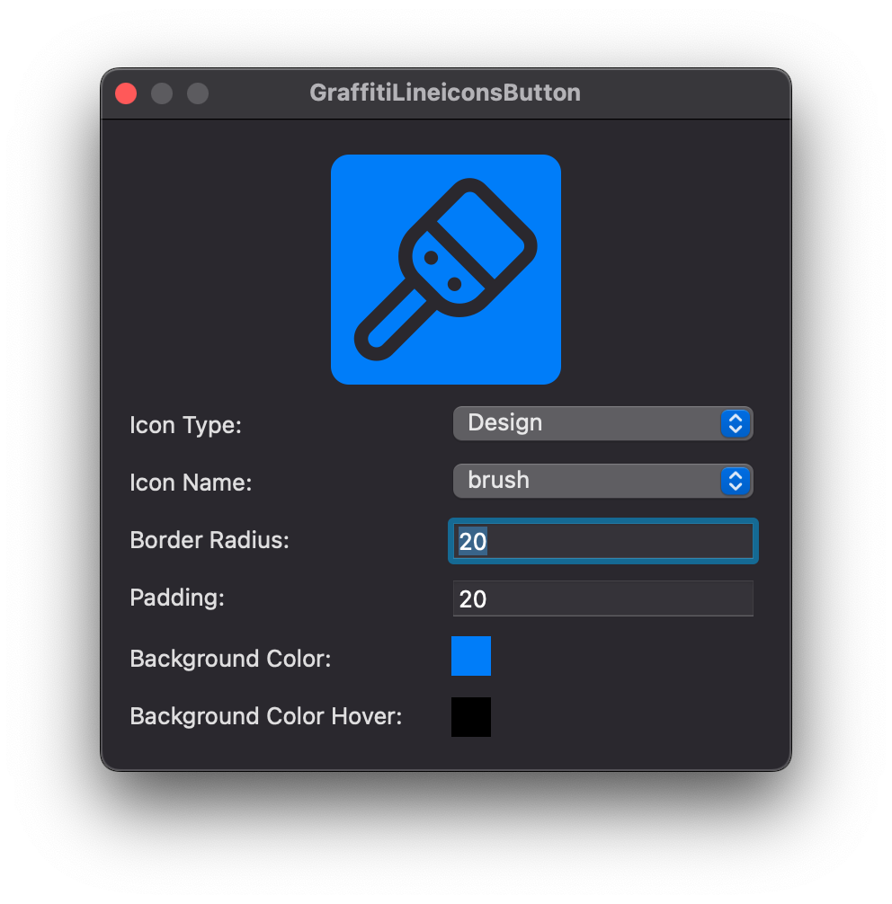
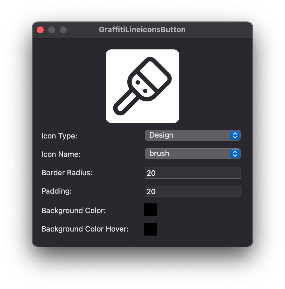
Previous
Next
## Warnings
### Linux Support
Support varies by Linux distribution and installed libwebkit library and version.
### Windows Support
Requires the presence of an HTMLViewer on a window or container within the project.
## Attributes
| Name | Value |
| --- | --- |
| DefaultEvent | "Pressed" |
## Event Definitions
| Name | Parameters | Return Type | Description |
| --- | :---: | :---: | --- |
| Closing | (None) | (None) | (None) |
| Opening | (None) | (None) | (None) |
| Pressed | (None) | (None) | Raised when the user has pressed the button. |
## Properties
| Name | Type | Default Value | Description |
| --- | :---: | :---: | --- |
| BackgroundColor | ColorGroup | (None) | ColorGroup used for drawing the button's face. When Nil, system colors are used. |
| BackgroundColorHover | ColorGroup | (None) | ColorGroup used for drawing the button's face while hovered. When Nil, system colors are used. |
| BorderRadius | Integer | (None) | Radius of the button's corners. |
| Cancel | Boolean | (None) | When True, pressing the Escape key on this control's window will raise the Pressed event. |
| Default | Boolean | (None) | When True, pressing the Enter key on this control's window will raise the Pressed event. |
| IconName | String | (None) | Name of the Lineicons icon to be drawn within the button. |
| IconType | GraffitiLineicons.IconTypes | (None) | Icon set containing the IconName representation. |
| Padding | Integer | (None) | Padding between the icon and the outer edge. |
