GraffitiSuite Docs
Docs
Graffitibutton
Loading document parsing libraries...
# GraffitiButton Class Inherits GraffitiUIControl ## About GraffitiBadge is a simple yet powerful addition to your UI toolkit. Display responsively-sized badges anywhere and everywhere without worrying about font sizes. Features: * ColorGroup support * Gradient fill support * Icons with positioning ## Preview 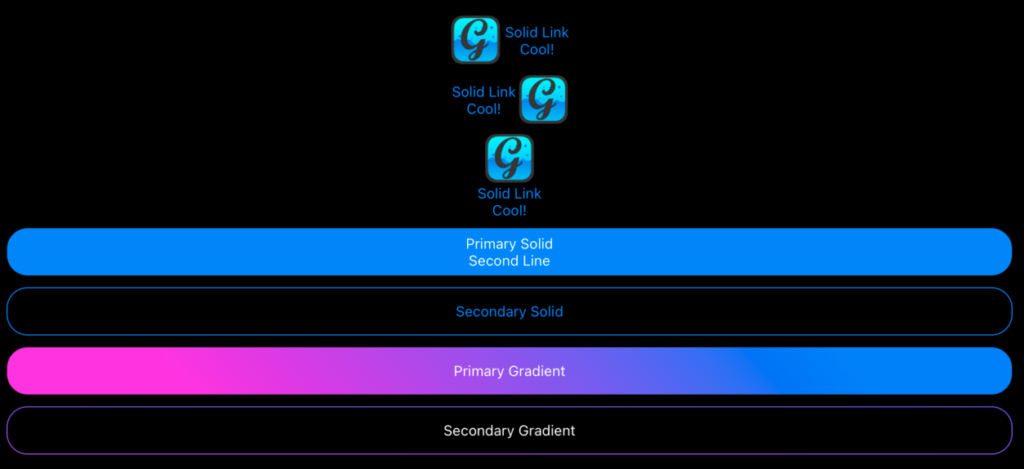 Previous Next ## Compatibility ### Framework API Version | 1.0 | 2.0 | | :---: | :---: | | False | True | ### Console | 32-Bit | 64-Bit | | :---: | :---: | | True | True | ### Desktop | 32-Bit | 64-Bit | | :---: | :---: | | True | True | ### iOS | 32-Bit | 64-Bit | | :---: | :---: | | False | True | ### Web | 32-Bit | 64-Bit | | :---: | :---: | | True | True | ## Enumerations | Name | Value | Description | | --- | :---: | --- | | IconPositions | Left <br > Center <br > Right | Supported icon positions relative to text. | | Styles | Primary <br > Secondary <br > Link | Supported button styles. | ## Event Definitions | Name | Parameters | Return Type | Description | | --- | :---: | :---: | --- | | DoublePressed | (None) | (None) | Raised when the element is double-pressed via touch. | | LongPressed | (None) | (None) | Raise when the user holds their finger down on the element. | | Pressed | (None) | (None) | Raised when the element is pressed via touch. | ## Properties | Name | Type | Default Value | Description | | --- | :---: | :---: | --- | | BorderRadius | Integer | (None) | Height and width of rounded display for component corners. | | Caption | String | (None) | Text displayed within the button. | | Colors() | GraffitiScaledColor | (None) | Colors used to draw gradient background or border. | | ColorsPressed() | GraffitiScaledColor | (None) | Colors used to draw gradient background or border when the user presses the component. | | FontSize | Double | (None) | Size of font used to draw the button's Caption. | | GradientAngle | Double | (None) | Angle used for drawing the Colors. | | Icon | Picture | (None) | Icon drawn in the button's face. | | IconPosition | IconPositions | (None) | Location of the icon relative to the Caption. | | Style | Styles | (None) | Drawing style applied to the button's face. | | TextColor | ColorGroup | (None) | Color applied to the button's Caption. | | TextColorPressed | ColorGroup | (None) | Color applied to the button's Caption when the user presses it. |
