# GraffitiRating
Class Inherits GraffitiSuite.BaseCanvas
## About
GraffitiRating is an animated rating display or prompt control for easily providing your users with a way to review from within your application.
## Preview
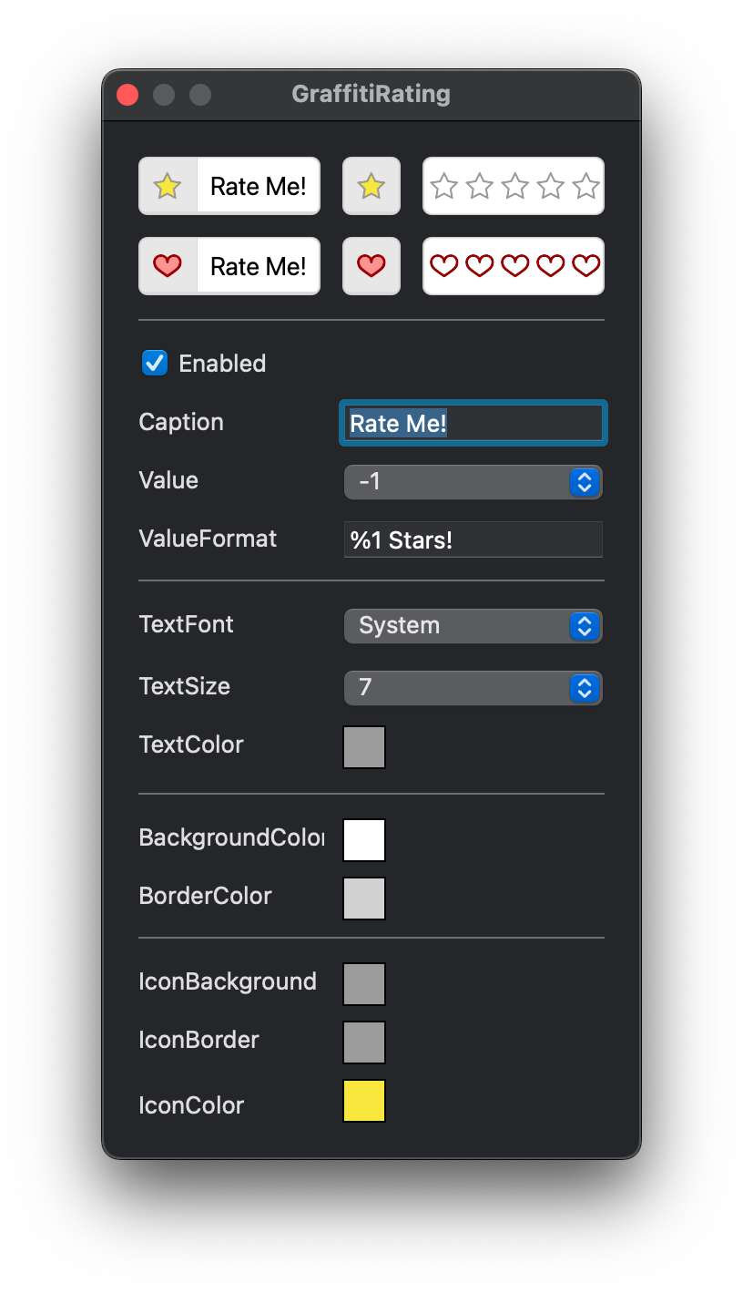
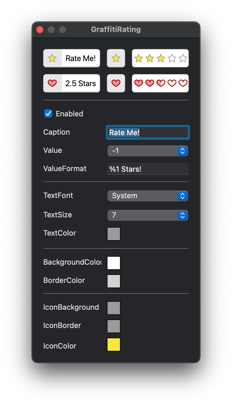
Previous
Next
## Compatibility
### Framework API Version
| 1.0 | 2.0 |
| :---: | :---: |
| True | True |
### Desktop
| 32-Bit | 64-Bit |
| :---: | :---: |
| True | True |
## Attributes
| Name | Value |
| --- | --- |
| DefaultEvent | "ValueChange" |
## Enumerations
| Name | Value | Description |
| --- | :---: | --- |
| Styles | Star <br> Heart | Supported value drawing styles. |
| Views | ButtonCaption <br> ButtonIconOnly <br> RatingBar | Supported view styles. |
## Event Definitions
| Name | Parameters | Return Type | Description |
| --- | :---: | :---: | --- |
| Resized | (None) | (None) | Raised when the class has completed a resize operation. |
| Resizing | (None) | (None) | Fired at each step of a resize operation. |
| ValueChange | (None) | (None) | Signifies that the user has changed the value by selecting a new rating. |
## Properties
| Name | Type | Default Value | Description |
| --- | :---: | :---: | --- |
| BackgroundColor | Color | Nil | Color applied to the background behind the rating selection icons. |
| BorderColor | Color | Nil | Color applied to the border around the control. |
| Caption | String | Nil | String to display in the button. Blank for rating double value. |
| IconBackground | Color | Nil | The color displayed behind the icon in button modes. |
| IconBorder | Color | Nil | Color applied to the border of the icons. |
| IconColor | Color | Nil | Color used to draw the background color of the individual icons. |
| Private | As | Nil | |
| Private | As | Nil | |
| Private | As | Nil | |
| Private | As | = | |
| Private | As | = | |
| Private | As | = | |
| Private | As | = | |
| Private | As | Nil | |
| Private | As | Nil | |
| Private | As | Nil | |
| Private | As | Nil | |
| Private | As | = | |
| Private | As | = | |
| Private | As | Nil | |
| Private | As | Nil | |
| Private | As | Nil | |
| Private | As | Nil | |
| Private | As | Nil | |
| Private | As | Nil | |
| Private | As | Nil | |
| Private | As | Nil | |
| Private | As | Nil | |
| Private | As | Nil | |
| Private | As | = | |
| Private | As | = | |
| Style | Styles | Nil | The style of the rating icon. |
| TextColor | Color | Nil | Color applied to text in the button modes. |
| TextFont | String | Nil | Font face applied to text. |
| TextSize | Integer | Nil | Size of font face. |
| Value | Double | Nil | Current rating value. |
| ValueFormat | String | Nil | Format applied to Value for display. %1 will be replaced with the double value. |
| View | Views | Nil | Controls the current display mode. |
