# GraffitiBadge
Class Inherits GraffitiSuite.BaseCanvas
## About
GraffitiBadge is a simple yet powerful addition to your UI toolkit. Display responsively-size badges anywhere and everywhere without worrying about font sizes.
Features:
*
Automatic text sizing
*
Custom background color
*
Custom text color
*
ColorGroup support
*
Button functionality
*
Pill display mode
## Preview
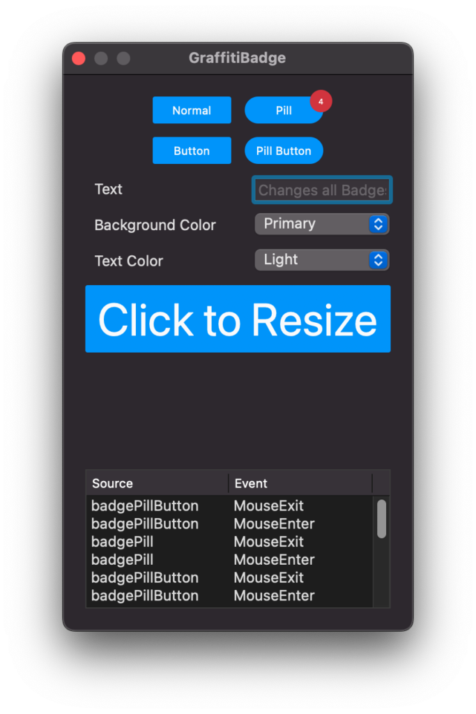
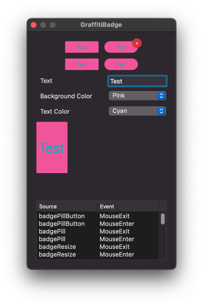
Previous
Next
## Attributes
| Name | Value |
| --- | --- |
| DefaultEvent | "Pressed" |
## Event Definitions
| Name | Parameters | Return Type | Description |
| --- | :---: | :---: | --- |
| DoublePressed | (None) | (None) | Raised when the badge is double-clicked or double-pressed. |
| MouseEnter | (None) | (None) | (None) |
| MouseExit | (None) | (None) | (None) |
| Pressed | (None) | (None) | Raised when the badge is clicked or pressed via touch. |
## Properties
| Name | Type | Default Value | Description |
| --- | :---: | :---: | --- |
| BackgroundColor | ColorGroup | (None) | Color set applied to the badge's background. |
| Bold | Boolean | (None) | Determines the weight of the font used. |
| BorderRadius | Integer | (None) | Corner radius. Value is overridden if IsPill = True. |
| IsButton | Boolean | (None) | When True, the badge will respond visually to mouse actions. |
| IsPill | Boolean | (None) | When True, the badge displays with more rounded corners. |
| Italic | Boolean | (None) | Determines the obliqueness of the text. |
| Text | String | (None) | Text to display within the badge. |
| TextColor | ColorGroup | (None) | Color set applied to the badge's foreground. |
| TextFont | String | (None) | Font face used for text display. |
| TextPadding | Integer | (None) | Additional padding added when TextFontSize = -1. |
| Underline | Boolean | (None) | When True, the text will be displayed with the underline decoration. |
