# GraffitiTabBar
Class Inherits GraffitiUIControl
## About
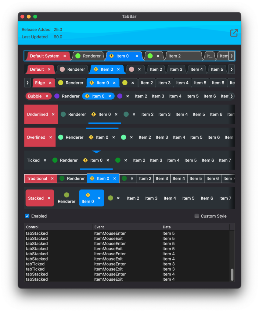
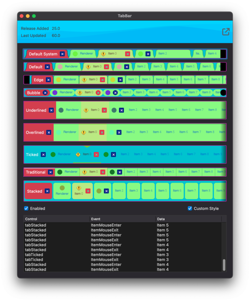
GraffitiTabBar is a powerful and customizable tab bar implementation.
Features:
*
Styling via custom object of properties to apply
*
Custom renderers built using subclasses
*
Default, Hover, and Pressed states
*
Multiple Overflow types built-in
*
Drag reordering
*
Keyboard navigation
*
Mouse wheel scrolling
## Preview
Previous
Next
## Attributes
| Name | Value |
| --- | --- |
| DefaultEvent | "SelectionChanged" |
## Enumerations
| Name | Value | Description |
| --- | :---: | --- |
| OverflowTypes | Shadowed <br> ButtonsEnd <br> ButtonsStart <br> ButtonsBoth | Supported left and right overflow button models. |
## Event Definitions
| Name | Parameters | Return Type | Description |
| --- | :---: | :---: | --- |
| CancelSelectionChange | item as GraffitiTabBarItem | Boolean | Raised when the user attempts to select a new tab. Return True to cancel change. |
| DisallowReorder | item as GraffitiTabBarItem <br> beforeItem as GraffitiTabBarItem | Boolean | Raised during reorder operations. Return True to disallow the reorder operation. |
| ItemCancelClose | item as GraffitiTabBarItem | Boolean | Raised when the user attempts to close a tab. Return True to cancel. |
| ItemMouseEnter | item as GraffitiTabBarItem | (None) | Raised when the user's cursor enters a TabBarItem's area. |
| ItemMouseExit | item as GraffitiTabBarItem | (None) | Raised when the user's cursor exits a TabBarItem's area. |
| ItemReordered | item as GraffitiTabBarItem <br> newIndex as Integer | (None) | Raised when the user has drag reordered a TabBarItem. |
| MouseEnter | (None) | (None) | |
| MouseExit | (None) | (None) | |
| Opening | (None) | (None) | |
| SelectionChanged | (None) | (None) | Selected tag has changed. |
## Methods
| Name | Parameters | Return Type | Description |
| --- | :---: | :---: | --- |
| Sub | Add | (None) | Adds a new TabBarItem. |
| Sub | AddAt | (None) | Adds a new TabBarItem at the specified index. |
| Function | IndexOf | As | Returns the index of the specified item. |
| Function | ItemAt | As | Returns the item at the specified index. |
| Function | LastIndex | As | Returns the last index of the items array. |
| Sub | Remove | (None) | Removes the specified item. |
| Sub | RemoveAll | (None) | Removes all items from the component. |
| Sub | RemoveAt | (None) | Removes the item at the specified index. |
| Sub | ScrollTo | (None) | Scrolls the display to show the specified item. |
## Properties
| Name | Type | Default Value | Description |
| --- | :---: | :---: | --- |
| AllowDragReordering | Boolean | Nil | Controls whether users may drag items to reorder them. |
| AllowKeyboardNavigation | Boolean | True | Determines whether users can change the currently selected item by using their keyboard's arrow keys. |
| AllowMouseWheelScrolling | Boolean | True | Determines whether the control responds to the mouse wheel. |
| Attributes | mSelectedItem | GraffitiTabBarItem | |
| Attributes | mhoverItem | GraffitiTabBarItem | |
| HoverItem | GraffitiTabBarItem | Nil | The currently hovered item. |
| InitialValue | String | Nil | Comma separated list of items to add by default from the IDE's inspector. |
| OverflowType | OverflowTypes | Nil | Determines how the display signals users that there are more items than are currently visible. |
| Private | As | = | |
| Private | As | Nil | |
| Private | As | Nil | |
| Private | As | Nil | |
| Private | As | = | |
| Private | As | Nil | |
| Private | As | = | |
| Private | As | = | |
| Private | | GraffitiTabBarItem | |
| Private | As | = | |
| Private | As | = | |
| Private | As | Nil | |
| Private | As | = | |
| Private | As | Nil | |
| Private | As | Nil | |
| Private | As | Nil | |
| Private | As | Nil | |
| Private | As | = | |
| Private | As | Nil | |
| Private | As | Nil | |
| Private | As | Nil | |
| Private | As | = | |
| Private | As | Nil | |
| Private | As | Nil | |
| Renderer | GraffitiTabBarRenderer | Nil | Custom renderer object used for drawing all aspects of the control. |
| SelectedIndex | Integer | Nil | Currently selected item's index. |
| SelectedItem | GraffitiTabBarItem | Nil | Currently selected item. |
| Style | GraffitiTabBarStyle | Nil | Style object from which the GraffitiTabBarRenderer should draw its properties. If implementing a custom renderer, this may not be needed. |
