# GraffitiStepBar
Class Inherits GraffitiSuite.BaseCanvas
## About
A display for integral actions, such as movement through a wizard. Uses custom icons and allows clicks, so it may double as a simple toolbar.
Features:
*
Clickable steps
*
Define custom point width
*
Define custom colors
## Preview
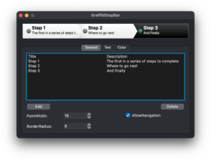
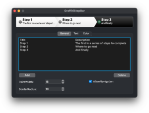
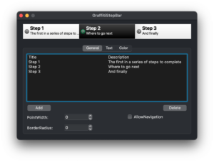
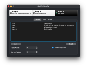
Previous
Next
## Compatibility
### Framework API Version
| 1.0 | 2.0 |
| :---: | :---: |
| True | True |
### Desktop
| 32-Bit | 64-Bit |
| :---: | :---: |
| True | True |
## Attributes
| Name | Value |
| --- | --- |
| DefaultEvent | "SelectionChanged" |
## Event Definitions
| Name | Parameters | Return Type | Description |
| --- | :---: | :---: | --- |
| MouseEnterItem | item as GraffitiStepBarItem | (None) | Raised when the mouse enters a step item. |
| MouseExitItem | item as GraffitiStepBarItem | (None) | Raised when the mouse exits a step item. |
| SelectionChanged | (None) | (None) | Raised when the currently selected step item has been changed. |
| StepClicked | ItemClicked as GraffitiStepBarItem <br> ItemIndex as Integer | Boolean | A step on the StepBar has been clicked, return False to cancel navigation. |
## Methods
| Name | Parameters | Return Type | Description |
| --- | :---: | :---: | --- |
| Add | item as GraffitiStepBarItem | (None) | Adds a step item. |
| AddAt | index as Integer <br> item as GraffitiStepBarItem | (None) | Inserts a step item. |
| IndexOf | item as GraffitiStepBarItem | Integer | Returns the index of the specified step item. |
| ItemAt | index as Integer | GraffitiStepBarItem | Returns the step item at the specified index. |
| LastIndex | (None) | Integer | Returns the index of the final step item. |
| RemoveAll | (None) | (None) | Removes all step items. |
| RemoveAt | index as Integer | (None) | Removes the step item at the specified index. |
## Properties
| Name | Type | Default Value | Description |
| --- | :---: | :---: | --- |
| AllowNavigation | Boolean | (None) | Allow the user to change the value of the StepBar by clicking steps. |
| BGColorActive | ColorGroup | (None) | Item background color when active. |
| BGColorInactive | ColorGroup | (None) | Item background color when inactive. |
| BorderColor | ColorGroup | (None) | Sets the dark border color when UseCustomColors is True. |
| BorderRadius | Integer | (None) | The radius of the control’s corners, in pixels. |
| DescriptionBold | Boolean | (None) | Determines the font weight of the description text. |
| DescriptionColorActive | ColorGroup | (None) | Determines the color for active description text. |
| DescriptionColorInactive | ColorGroup | (None) | Determines the color for inactive description text. |
| DescriptionItalic | Boolean | (None) | Determines whether the description text is displayed in italics. |
| DescriptionTextFont | String | (None) | Sets the font face for the description text. |
| DescriptionTextSize | Integer | (None) | Sets the font size for the description text. |
| DescriptionUnderline | Boolean | (None) | Determines whether the description text is displayed with an underline. |
| PointWidth | Integer | (None) | The width, in pixels, of the point for each step. |
| SelectedItem | Integer | (None) | Returns the index of the currently selected StepBarItem. |
| TitleBold | Boolean | (None) | Sets whether the title is displayed in bold. |
| TitleColorActive | ColorGroup | (None) | Determines the color of the active items title. |
| TitleColorInactive | ColorGroup | (None) | Determines the color of inactive items title. |
| TitleItalic | Boolean | (None) | Sets whether titles are displayed in italics. |
| TitleTextFont | String | (None) | The font face used to display titles. |
| TitleTextSize | Integer | (None) | The font size used to display titles. |
| TitleUnderline | Boolean | (None) | Determines whether the item titles are displayed with an underline. |
| UseCustomColors | Boolean | (None) | Determines whether the class is drawn with the custom defined colors. |
