# GraffitiDrillMenu
Class Inherits GraffitiSuite.BaseCanvas
## About
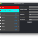
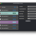
GraffitiDrillMenu is a beautiful, animated alternative to tree-style UI components.
Features:
*
Animated traversal
*
Infinite number of levels
*
Per-item notification counts
*
Global custom styling properties
*
Per-item custom styling properties
## Preview
Previous
Next
## Compatibility
### Framework API Version
| 1.0 | 2.0 |
| :---: | :---: |
| True | True |
### Desktop
| 32-Bit | 64-Bit |
| :---: | :---: |
| True | True |
## Attributes
| Name | Value |
| --- | --- |
| DefaultEvent | "ItemClick" |
## Event Definitions
| Name | Parameters | Return Type | Description |
| --- | :---: | :---: | --- |
| ContextClick | (None) | (None) | Triggered when the user right-clicks. |
| DrawBackBackground | g as Graphics <br> Hover as Boolean | Boolean | Raised when the background of the Back is being drawn. |
| DrawBackExpandWidget | g as Graphics <br> bounds as Xojo.Rect <br> Hover as Boolean | Boolean | Raised when the Back expand icon is being drawn. |
| DrawBackText | g as Graphics <br> byRef bounds as Xojo.Rect <br> Hover as Boolean | Boolean | Raised when the text of the Back item is being drawn. |
| DrawItemBackground | g as Graphics <br> item as GraffitiDrillMenuItem <br> Hover as Boolean | Boolean | Raise when drawing the background of an item. |
| DrawItemExpandWidget | g as graphics <br> item as GraffitiDrillMenuItem <br> bounds as Xojo.Rect <br> Hover as Boolean | Boolean | Raised when drawing the expand icon of an item. |
| DrawItemIcon | g as graphics <br> item as GraffitiDrillMenuItem <br> bounds as Xojo.Rect <br> Hover as Boolean | Boolean | Raised when draw the icon of an item. |
| DrawItemNotification | g as Graphics <br> item as GraffitiDrillMenuItem <br> Hover as Boolean | Boolean | Raise when drawing the Notification area of an item. |
| DrawItemText | g as Graphics <br> item as GraffitiDrillMenuItem <br> bounds as Xojo.Rect <br> Hover as Boolean | Boolean | Raised when drawing the text of an item. |
| ItemClick | item as GraffitiDrillMenuItem | (None) | Raise when the user clicks an item. |
| ItemContextClick | item as GraffitiDrillMenuItem | (None) | Raised when the user context clicks and item. |
| ItemDoubleClick | item as GraffitiDrillMenuItem | (None) | Raised when the user double-clicks and item. |
| ItemExpand | item as GraffitiDrillMenuItem | Boolean | Triggered when an item is expanded (or, more appropriately, when thee display shifts to display an item's children). |
| Opening | (None) | (None) | (None) |
| ScrollChange | (None) | (None) | Raised when the display has been scrolled. |
| ViewChange | item as GraffitiDrillMenuItem | (None) | Raised when the display is changed to display a different set of items. |
## Methods
| Name | Parameters | Return Type | Description |
| --- | :---: | :---: | --- |
| AddItem | item as GraffitiDrillMenuItem | (None) | Adds a new top-level item. |
| getItemIndex | item as GraffitiDrillMenuItem | Integer | Returns the index of the specified item. |
| InsertItem | atIndex as Integer <br> item as GraffitiDrillMenuItem | (None) | Inserts the provided item at the specified index. |
| Item | atIndex as Integer | GraffitiDrillMenuItem | Returns the item at the specified index. |
| ItemCount | (None) | Integer | Returns the number of top-level items currently added to the control. |
| RemoveAll | (None) | (None) | Removes all top-level items. |
| RemoveItem | atIndex as Integer | (None) | Removes the item at the specified index. |
| ScrollTo | item as GraffitiDrillMenuItem <br> selectItem as Boolean = False | (None) | Scrolls to the specified item. |
## Properties
| Name | Type | Default Value | Description |
| --- | :---: | :---: | --- |
| Animated | Boolean | (None) | When True the display will animate while switching. |
| Attributes | Items | (None) | (None) |
| BackItemText | String | (None) | Text used in the Back item at the top of sub-item views. |
| BackItemTextBold | Boolean | (None) | Font weight of Back item text. |
| BackItemTextBoldHover | Boolean | (None) | Font weight of the back item's text when hovered. |
| BackItemTextColor | Color | (None) | Color used to draw Back item text. |
| BackItemTextColorHover | Color | (None) | Text color of the back item when hovered. |
| BackItemTextFont | String | (None) | Font face of Back item text. |
| BackItemTextFontHover | String | (None) | Font of the back item text when hovered. |
| BackItemTextItalic | Boolean | (None) | When True, Back item text is italicized. |
| BackItemTextItalicHover | Boolean | (None) | Obliqueness of the back item text when hovered. |
| BackItemTextSize | Integer | (None) | Text size of Back item. |
| BackItemTextSizeHover | Integer | (None) | Size of the back item text when hovered. |
| BackItemTextUnderline | Boolean | (None) | Controls the underline decoration of the back item text. |
| BackItemTextUnderlineHover | Boolean | (None) | Controls the underline decoration of the back item text on hover. |
| BGColor | Color | (None) | Background color of component display. |
| BorderColor | Color | (None) | Border color of component display. |
| BorderRadius | Integer | (None) | Corner radius of component display. |
| CurrentView | GraffitiDrillMenuItem | (None) | Current item being viewed. Nil for top-level. |
| CustomColors | Boolean | (None) | When True, custom color properties will be applied to drawing. |
| ExpandOnDoubleClick | Boolean | False | When True, component will only change view when the user double-clicks an item with children. |
| ItemBGColor | Color | (None) | Background color of items. |
| ItemBGColorHover | Color | (None) | Item background color when hovered. |
| ItemBGColorSelected | Color | (None) | Item background color when selected. |
| ItemBorderColor | Color | (None) | Border color of items. |
| ItemBorderColorHover | Color | (None) | Item border color when hovered. |
| ItemBorderColorSelected | Color | (None) | Item border color when selected. |
| LockUpdate | Boolean | (None) | Set to True when populating large amounts of items to defer drawing until you then set LockUpdate to False. |
| NotificationBGColor | Color | (None) | Background color of notification areas. |
| NotificationBGColorHover | Color | (None) | Notification badge background color when hovered. |
| NotificationBGColorSelected | Color | (None) | Notification badge background color when selected. |
| ReverseDragScrollDirection | Boolean | False | Controls the scroll direction when dragging. |
| RowHeight | Integer | (None) | Height of each row. |
| ScrollOnDrag | Boolean | True | When True, the display can be scrolled by dragging with the cursor. |
| SelectedItem | GraffitiDrillMenuItem | (None) | The currently selected item. |
| TextBold | Boolean | (None) | Font weight of items. |
| TextBoldHover | Boolean | (None) | Item text weight when hovered. |
| TextBoldSelected | Boolean | (None) | Item text weight when selected. |
| TextColor | Color | (None) | Color of item text. |
| TextColorHover | Color | (None) | Item text color when hovered. |
| TextColorSelected | Color | (None) | Item text color when selected. |
| TextFont | String | (None) | Font face of items. |
| TextFontHover | String | (None) | Item text font when hovered. |
| TextFontSelected | String | (None) | Item text font when selected. |
| TextItalic | Boolean | (None) | When True, item text will be italicized. |
| TextItalicHover | Boolean | (None) | Obliqueness of item text when hovered. |
| TextItalicSelected | Boolean | (None) | Obliqueness of item text when selected. |
| TextSize | Integer | (None) | Font size applied to item text. |
| TextSizeHover | Integer | (None) | Item text size when hovered. |
| TextSizeSelected | Integer | (None) | Item text size when selected. |
| TextUnderline | Boolean | (None) | When True, item text will be underlined. |
| TextUnderlineHover | Boolean | (None) | Item text decoration when hovered. |
| TextUnderlineSelected | Boolean | (None) | Item text decoration when selected. |
