# GraffitiStepBar
Class Inherits GraffitiUIControl
## About
GraffitiStepBar allows developers to present a flow display and control mechanism to their users.
## Preview
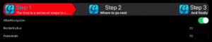
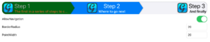
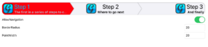
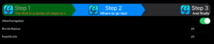
Previous
Next
## Compatibility
### Framework API Version
| 1.0 | 2.0 |
| :---: | :---: |
| False | True |
### Console
| 32-Bit | 64-Bit |
| :---: | :---: |
| True | True |
### Desktop
| 32-Bit | 64-Bit |
| :---: | :---: |
| True | True |
### iOS
| 32-Bit | 64-Bit |
| :---: | :---: |
| False | True |
### Web
| 32-Bit | 64-Bit |
| :---: | :---: |
| True | True |
## Event Definitions
| Name | Parameters | Return Type | Description |
| --- | :---: | :---: | --- |
| SelectionChanged | (None) | (None) | Raised after the user has pressed a step and the change is drawn. |
| StepPressed | item as GraffitiStepBarItem <br> index as Integer | Boolean | Raised when the user has pressed a step. Return True to cancel the change. |
## Methods
| Name | Parameters | Return Type | Description |
| --- | :---: | :---: | --- |
| Add | item as GraffitiStepBarItem | (None) | Adds a new step to the control. |
| AddAt | index as Integer <br> item as GraffitiStepBarItem | (None) | Adds a new item to the control at the specified index. |
| IndexOf | item as GraffitiStepBarItem | Integer | Returns the index of the specified item within the control's internal array. |
| ItemAt | index as Integer | GraffitiStepBarItem | Returns the item as the specified index within the control's internal array. |
| LastIndex | (None) | Integer | Returns the index of the last item within the control's internal array. |
| RemoveAll | (None) | (None) | Removes all items. |
| RemoveAt | index as Integer | (None) | Removes the item at the specified index. |
## Properties
| Name | Type | Default Value | Description |
| --- | :---: | :---: | --- |
| AllowNavigation | Boolean | (None) | Determines whether use presses are processed. |
| BackgroundColorActive | ColorGroup | (None) | Customize the background color of items that are selected. |
| BackgroundColorInactive | ColorGroup | (None) | Customize the background color of items that are not selected. |
| BorderColor | ColorGroup | (None) | Color used to draw the border of the control. |
| BorderRadius | Integer | (None) | Radius of the control's outside corners. Automatically corrects to (Max(Width, Height) / 2) - 1 is a value too large has been supplied. |
| BorderSize | Integer | (None) | Pen size used to draw the control's border. |
| DescriptionColorActive | ColorGroup | (None) | Color applied to the DescriptionText of steps that are selected. |
| DescriptionColorInactive | ColorGroup | (None) | Color applied to the DescritpionText of steps that are not selected. |
| DescriptionTextFont | String | (None) | Font face used to draw DescriptionText of steps. |
| DescriptionTextSize | Integer | (None) | Font size used to draw DescriptionText of steps. |
| DescriptionTextStyle | GraffitiUIControl.FontStyles | (None) | Style of font used (regular, bold, italic). |
| HasBorder | Boolean | (None) | Determines whether a border is drawn around the outsize of the control. |
| ItemsHaveShadow | Boolean | (None) | Determines whether a shadow is drawn to the right of items to better differentiate steps. |
| PointWidth | Integer | (None) | Width of the point at the right edge of steps. |
| SelectedItem | Integer | (None) | Index of the currently selected item. |
| TitleColorActive | ColorGroup | (None) | Color applied to the TitleText of steps when they are selected. |
| TitleColorInactive | ColorGroup | (None) | Color applied to the TitleText of steps when they are not selected. |
| TitleTextFont | String | (None) | Font face used to draw the TitleText of steps. |
| TitleTextSize | Integer | (None) | Font size used to draw the TitleText of steps. |
| TitleTextStyle | GraffitiUIControl.FontStyles | (None) | Style of font used (regular, bold, italic). |
