# GraffitiTaskList
Class Inherits GraffitiSuite.BaseCanvas
## About
A class that emulates popular tag selection fields.Has an excellent built-in search, and many customization options.
## Preview
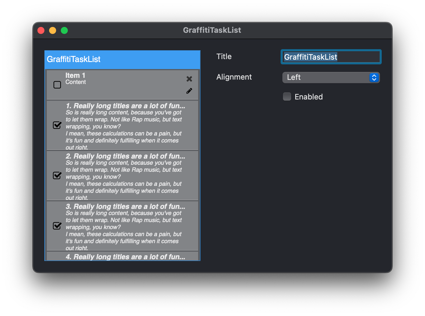
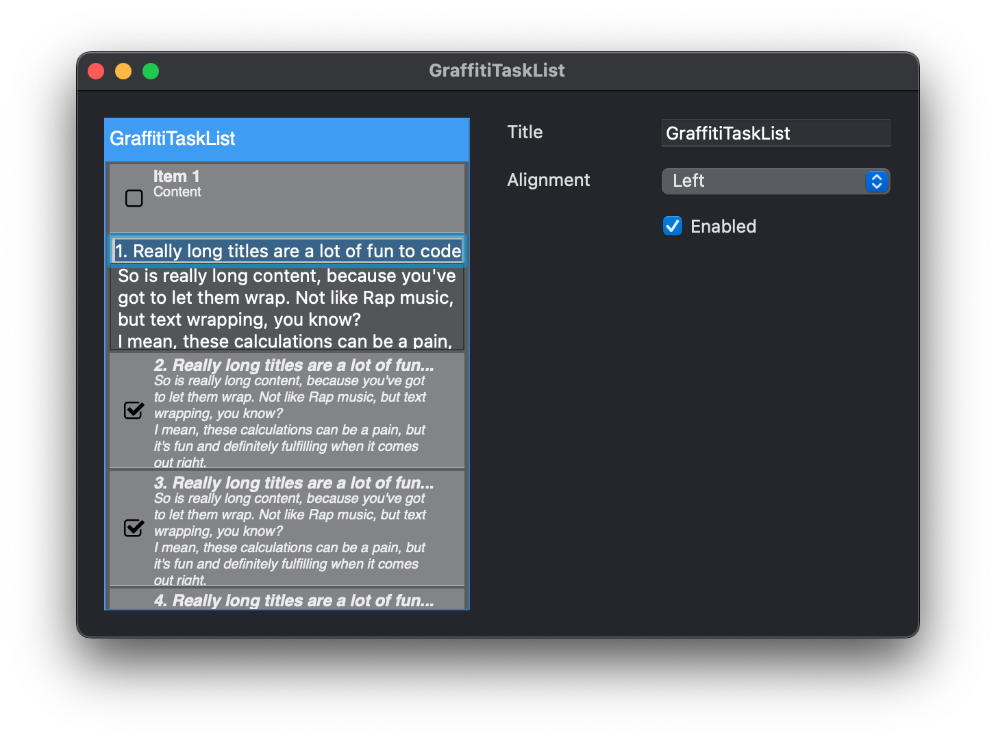
Previous
Next
## Compatibility
### Framework API Version
| 1.0 | 2.0 |
| :---: | :---: |
| True | True |
### Desktop
| 32-Bit | 64-Bit |
| :---: | :---: |
| True | True |
## Attributes
| Name | Value |
| --- | --- |
| DefaultEvent | "ItemClick" |
## Enumerations
| Name | Value | Description |
| --- | :---: | --- |
| Alignments | Left <br> Center <br> Right | Supported text alignments. |
## Event Definitions
| Name | Parameters | Return Type | Description |
| --- | :---: | :---: | --- |
| ClickClose | (None) | (None) | Raised when the user clicks the x in the titlebar of the control. |
| ClickEdit | (None) | (None) | Raised when the user clicks the pencil icon in the titlebar of the control. |
| ItemClick | Item as GraffitiTaskListItem | (None) | User has clicked on an item. |
| ItemClickClose | Item as GraffitiTaskListItem | Boolean | User has clicked the x icon in an item. Return True to cancel removal. |
| ItemClickEdit | Item as GraffitiTaskListItem | Boolean | User has clicked the pencil icon in an item. Return True to cancel the default edit operations. |
| ItemMenuAction | Item as GraffitiTaskListItem <br> m as DesktopMenuItem | (None) | User has clicked the menu chevron in an item. Return True to cancel showing the item's defined menu. |
| ItemValueChange | Item as GraffitiTaskListItem | (None) | Raised when the user modifies the boolean Value of an item bu clicking on the item's checkbox. |
| MenuAction | m as DesktopMenuItem | (None) | Raised when the user selects a menuitem from the menu chevron in the titlebar. |
| ScrollChange | Current as Integer <br> Maximum as Integer | (None) | Fired when the user scrolls the viewable area with the mouse wheel. |
## Methods
| Name | Parameters | Return Type | Description |
| --- | :---: | :---: | --- |
| Sub | AddItem | (None) | Adds a new item to the display. |
| Sub | InsertItem | (None) | Inserts a new item at atIndex . |
| Function | Item | As | Returns the item at atIndex . |
| Function | ItemIndex | As | Returns the index of the item Item . |
| Sub | RemoveAll | (None) | Removes all items from the display. |
| Sub | RemoveItem | (None) | Removes the item at atIndex . |
| Sub | RemoveItem | (None) | Removes the item at atIndex . |
## Properties
| Name | Type | Default Value | Description |
| --- | :---: | :---: | --- |
| BackgroundColor | Color | Nil | Background color drawn in the component's empty space. |
| BorderColor | Color | Nil | Border color of the component. |
| CanClose | Boolean | Nil | Determines the display of the x icon in the titlebar and associated behavior. |
| CustomColors | Boolean | Nil | When True, the color properties will be used to style the component. |
| Editable | Boolean | Nil | Determines the display of the pencil icon in the titlebar and associated behavior. |
| editItem | GraffitiTaskListItem | Nil | |
| HideOnComplete | Boolean | Nil | When True, if a user sets an item's checkbox value to True, the item will be hidden from the display. |
| Menu | DesktopMenuItem | Nil | The menu displayed when the user clicks on the disclosure chevron in the titlebar. |
| Private | As | Nil | |
| Private | | GraffitiTaskListItem | |
| Private | As | Nil | |
| Private | As | = | |
| Private | As | Nil | |
| Private | As | Nil | |
| Private | As | = | |
| Private | As | Nil | |
| Private | As | = | |
| Private | As | = | |
| Private | As | = | |
| Private | As | = | |
| Private | As | = | |
| Private | As | = | |
| Private | As | = | |
| Private | As | = | |
| Private | As | = | |
| Private | As | = | |
| Private | As | Nil | |
| Private | As | Nil | |
| Private | As | Nil | |
| Private | As | Nil | |
| Private | As | = | |
| Private | As | = | |
| Private | As | = | |
| Private | As | Nil | |
| Private | As | Nil | |
| Private | As | = | |
| Private | As | Nil | |
| ScrollPosition | Integer | Nil | The current scroll position on the component's item view. |
| Title | String | Nil | Text displayed in the titlebar area. |
| TitlebarColor | Color | Nil | Color used to draw the titlebar. |
| TitlebarTextBold | Boolean | Nil | Bold style of the titlebar text. |
| TitlebarTextColor | Color | Nil | Color used to draw the titlebar. |
| TitlebarTextFont | String | Nil | Font face used to draw the titlebar's text. |
| TitlebarTextItalic | Boolean | Nil | Italic style of the titlebar text. |
| TitlebarTextSize | Integer | Nil | Size of the titlebar's text. |
| TitlebarTextUnderline | Boolean | Nil | Underline style of the titlebar text. |
| TitleTextAlignment | Alignments | Nil | Alignment of the titlebar text. |
