# GraffitiTextField
Class Inherits GraffitiSuite.BaseCanvas
## About
GraffitiTextField is an enhanced functionality TextField and TextArea host control that provides the following advanced functionality:
*
Unfocused text alignment
*
Autocomplete
*
Extensive custom colorization
*
Embedded icon
*
Embedded clear button
*
Dropdown menu support
*
Animated pulsing for drawing users' attention
*
Unvalidated, Valid, and Invalid state displays
*
Bordered or Solid display types
*
And more...
## Preview
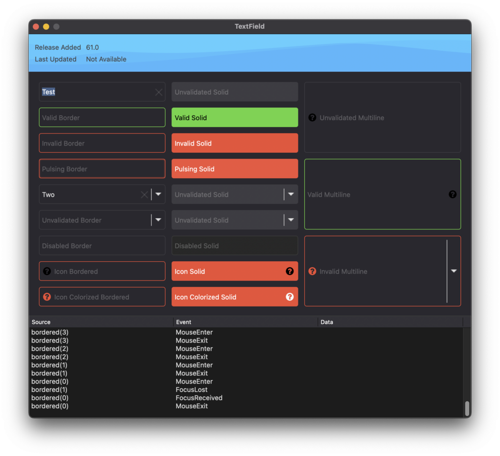
Previous
Next
## Attributes
| Name | Value |
| --- | --- |
| DefaultEvent | "Changed" |
## Enumerations
| Name | Value | Description |
| --- | :---: | --- |
| IconPositions | Left <br > Right | Supported icon placement positions. |
| States | Unvalidated <br > Valid <br > Invalid | Supported validation states. |
| Types | Bordered <br > Solid | Supported drawing styles. |
## Event Definitions
| Name | Parameters | Return Type | Description |
| --- | :---: | :---: | --- |
| ClearPressed | (None) | Boolean | Raised when the user presses the clear button. |
| Closing | (None) | (None) | (None) |
| ConstructContextualMenu | base as DesktopMenuItem <br> x as Integer <br> y as Integer | Boolean | (None) |
| ContextualMenuItemSelected | HitItem as DesktopMenuItem | Boolean | (None) |
| FocusLost | (None) | (None) | (None) |
| FocusReceived | (None) | (None) | (None) |
| IconPressed | (None) | (None) | Raised when the user presses the icon. |
| KeyDown | key as String | Boolean | (None) |
| KeyUp | key as String | (None) | (None) |
| MenuItemSelected | item as DesktopMenuItem | (None) | Raised when the user selects an item from the dropdown menu. |
| MouseEnter | (None) | (None) | (None) |
| MouseExit | (None) | (None) | (None) |
| Opening | (None) | (None) | (None) |
| TextChanged | (None) | (None) | Raised when the content of the input control has changed. |
## Methods
| Name | Parameters | Return Type | Description |
| --- | :---: | :---: | --- |
| Constructor | (None) | (None) | Creates a new instance of the class. |
## Properties
| Name | Type | Default Value | Description |
| --- | :---: | :---: | --- |
| Alignment | TextAlignments | (None) | Alignment of the text relative to the outer bounds of the control. |
| Attributes | isActivated | Boolean | (None) |
| Autocomplete | Boolean | (None) | When enabled and values are provided to the AutocompleteValues property, the control will attempt to autocomplete user input based on those values. |
| AutocompleteValues | String | (None) | Values to use for autocompletion. |
| BackgroundColor | ColorGroup | (None) | Custom background color. |
| BorderColor | ColorGroup | (None) | Custom border color. |
| BorderRadius | Integer | (None) | Size, in points, of the border's corner radii. |
| BorderSize | Integer | (None) | Size, in points, of the border. |
| ClearButtonColor | ColorGroup | (None) | Custom clear button color. |
| ClearButtonSize | Integer | (None) | Dimensions used to draw the clear button. |
| FontFace | String | (None) | Font used for drawing the text and applied to the hosted DesktopTextControl. |
| FontSize | Integer | (None) | Size of font used for drawing. |
| Format | String | (None) | Format string applied to text value. |
| HasBorder | Boolean | (None) | Controls the visibility of the border. |
| HasClearButton | Boolean | (None) | Controls the visibility of the clear button when the hosted control does not have focus. |
| Hint | String | (None) | Placeholder text that is drawn when the hosted control does not have focus and has no text value. |
| HintColor | ColorGroup | (None) | Custom color used to draw the Hint text. |
| Icon | Picture | (None) | Icon picture to be drawn within the control. |
| IconColor | ColorGroup | (None) | Custom color overlaid on Icon when IconColorized = True. |
| IconColorized | Boolean | (None) | When True, the icon will be colorized to match the content or using the IconColor property value. |
| IconPosition | IconPositions | (None) | Location of the icon within the display. |
| IconSize | Integer | (None) | Size, in points, to use when drawing the icon. |
| InputControl | DesktopTextControl | (None) | Returns a reference to the currently active, hosted control. Either DesktopTextArea or DesktopTextField. |
| IsPulsing | Boolean | (None) | Control will display a pulsing animation when True. Useful for drawing users' attention to the control. |
| MaximumCharactersAllowed | Integer | (None) | (None) |
| Menu | DesktopMenuItem | (None) | The parent DesktopMenuItem of all items that the developer wishes to display in the menu dropdown. |
| MenuIconSize | Integer | (None) | Size, in points, to use when drawing the menu icon. |
| Multiline | Boolean | (None) | Controls various aspects of display and functionality. |
| ReadOnly | Boolean | (None) | When True, users will not be able to modify the value of the control by direct input. |
| State | States | (None) | Controls the displayed validation state. |
| StateInvalidColor | ColorGroup | (None) | Custom color to use when drawing the Invalid state. |
| StateUnvalidatedColor | ColorGroup | (None) | Custom color to use when drawing the Unvalidated state. |
| StateValidColor | ColorGroup | (None) | Custom color to use when drawing the Valid state. |
| Text | String | (None) | Text value of the control. |
| TextColor | ColorGroup | (None) | Custom text color when editing the control's value or when a value exists and the control does not have focus. |
| Type | Types | (None) | Controls how the component is drawn. |
| UseCustomColors | Boolean | (None) | When True, color properties will override default drawing. |
