# GraffitiFieldLabelContainer
Class Inherits GraffitiSuite.BaseCanvas
## About
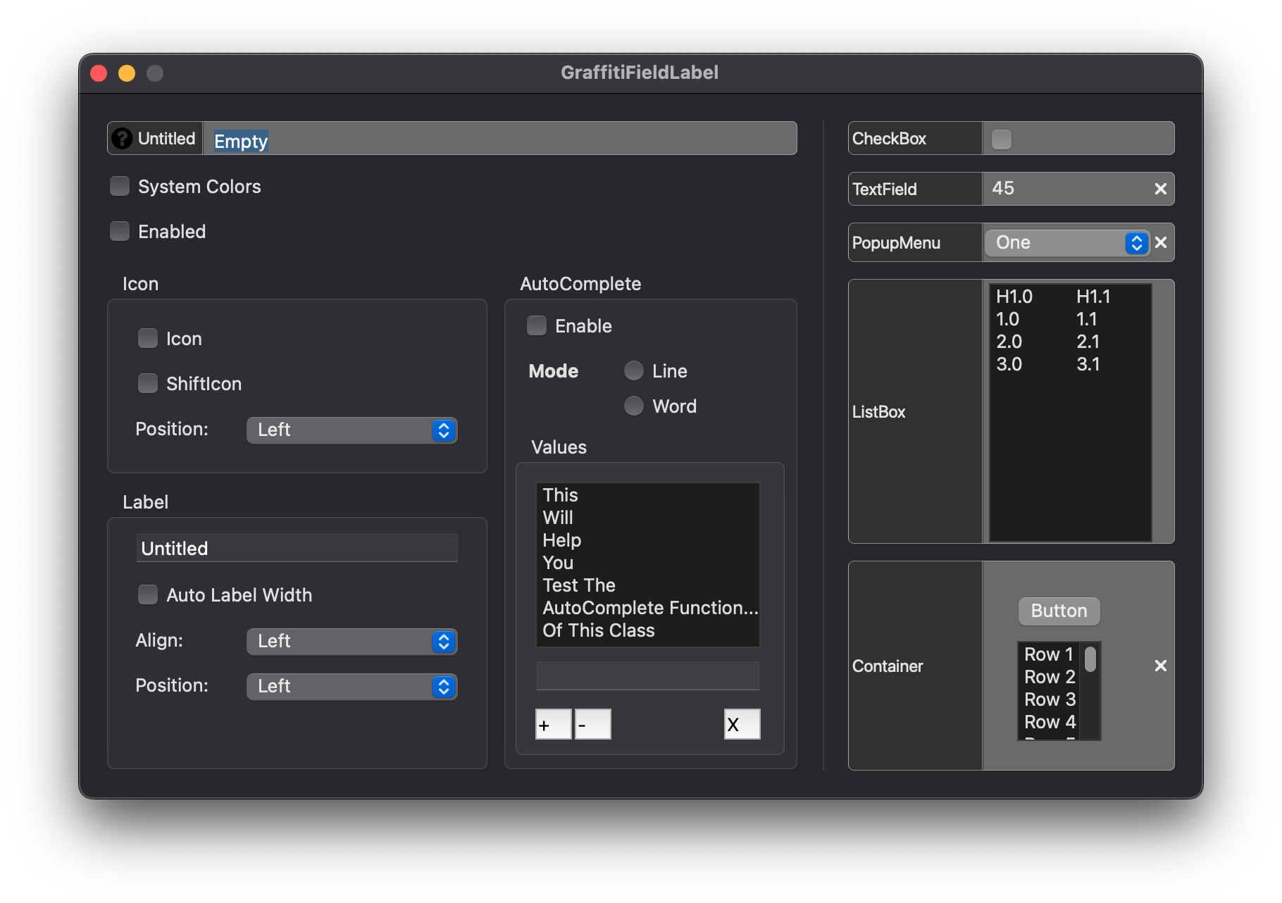
GraffitiFieldLabel is a TextField parent designed to make your forms both easier to manage and look great! With a wide array of features, you can accomplish many things that would take hundreds or thousands of hours to code and implement yourself!Features:
1.
Autocomplete by Line
2.
Autocomplete by Word
3.
Label positioning left or right
4.
Automatic or static label width
5.
Clear button
6.
Icon support in Label
GraffitiFieldLabelContainer embed containers within a similar UI to GraffitiFieldLabel for consistent representation across your project.
## Preview

Previous
Next
## Compatibility
### Framework API Version
| 1.0 | 2.0 |
| :---: | :---: |
| True | True |
### Desktop
| 32-Bit | 64-Bit |
| :---: | :---: |
| True | True |
## Enumerations
| Name | Value | Description |
| --- | :---: | --- |
| Alignments | Left <br > Center <br > Right | (None) |
| Positions | Left <br > Right | (None) |
## Constants
| Name | Type | Default Value | Description |
| --- | :---: | :---: | --- |
| kModeLine | Double | 0 | Autocomplete mode by line. |
| kModeWord | Double | 1 | Autocomplete mode by word. |
## Event Definitions
| Name | Parameters | Return Type | Description |
| --- | :---: | :---: | --- |
| ClearClicked | (None) | (None) | Fired when the user clicks the clear button. |
| DoSearch | SearchFor as String | (None) | Fired when the users presses Enter or Return in the field. |
| LabelClicked | (None) | (None) | Fired when the user clicks the label. |
| PositionControl | byRef position as Xojo.Rect | (None) | Raised when the control is being positioned. |
| TextChanged | (None) | (None) | (None) |
## Properties
| Name | Type | Default Value | Description |
| --- | :---: | :---: | --- |
| BorderColor | Color | (None) | Color used to draw the border of the component when SystemColors = False. |
| BorderRadius | Double | (None) | Radius of control corners. |
| ClearIcon | Picture | (None) | Icon used for drawing the clear button. |
| Enabled | Boolean | (None) | (None) |
| Field | DesktopContainer | (None) | The UI element instance to incorporate. |
| FieldBackColor | Color | (None) | Color used to draw the backcolor of the component and apply to the TextField when SystemColors = False. |
| FieldTextColor | Color | (None) | Color applied to the TextField's text when SystemColors = False. |
| FieldTextFont | String | (None) | Font applied to the TextField's text. |
| FieldTextSize | Integer | (None) | Size of the text in the TextField. |
| Icon | Picture | (None) | Icon draw in the label portion. |
| IconPosition | Positions | (None) | Position of icon in the label. |
| Label | String | (None) | Label text. |
| LabelBackColor | Color | (None) | Color applied to the label segment when SystemColors = False. |
| LabelPosition | Positions | (None) | Position of the label in relation to the TextField. |
| LabelTextAlignment | Alignments | (None) | Position of the label's content. |
| LabelTextBold | Boolean | (None) | Font weight of the label text. |
| LabelTextColor | Color | (None) | Color applied to the label text when SystemColors = False. |
| LabelTextFont | String | (None) | Text font applied to the label. |
| LabelTextItalic | Boolean | (None) | Determines whether the label's text will be drawn italicized. |
| LabelTextSize | Integer | (None) | Font size of label text. |
| LabelTextUnderline | Boolean | (None) | Underline decoration for label text. |
| LabelWidth | Integer | (None) | Width of the label area. Use -1 for auto. |
| ResizeFieldHeight | Boolean | True | Determines whether the field control should be resized to fill the height. |
| ResizeFieldWidth | Boolean | True | Determines whether the field control should be resized to fill the width. |
| ShiftClearIcon | Boolean | (None) | When True, the control will shift the color off the clear icon to match the system theme. |
| ShiftIcon | Boolean | (None) | When True, the component will attempt to shift the icon's colors. Use transparent icons for best effect. |
| ShowClearButton | Boolean | (None) | If True, the clear button x will be shown in the field on the opposite side of the TextField from the label. |
| SystemColors | Boolean | (None) | When False, the component will use the colors assigned to the various properties. When True, the control attempts to use the system defined colors. Dark Mode adaptive. |
