Loading document parsing libraries...
# GraffitiChart
Class Inherits GraffitiWebUIControl
## About
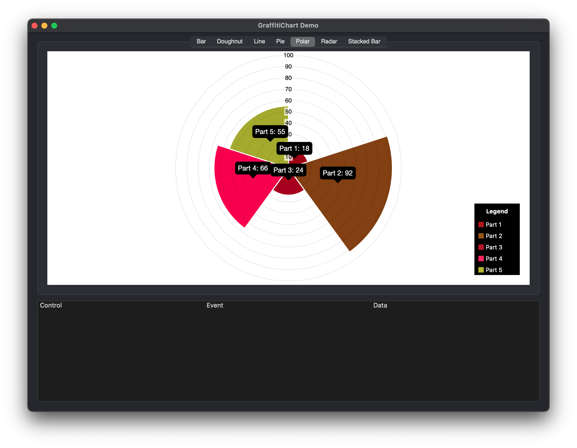
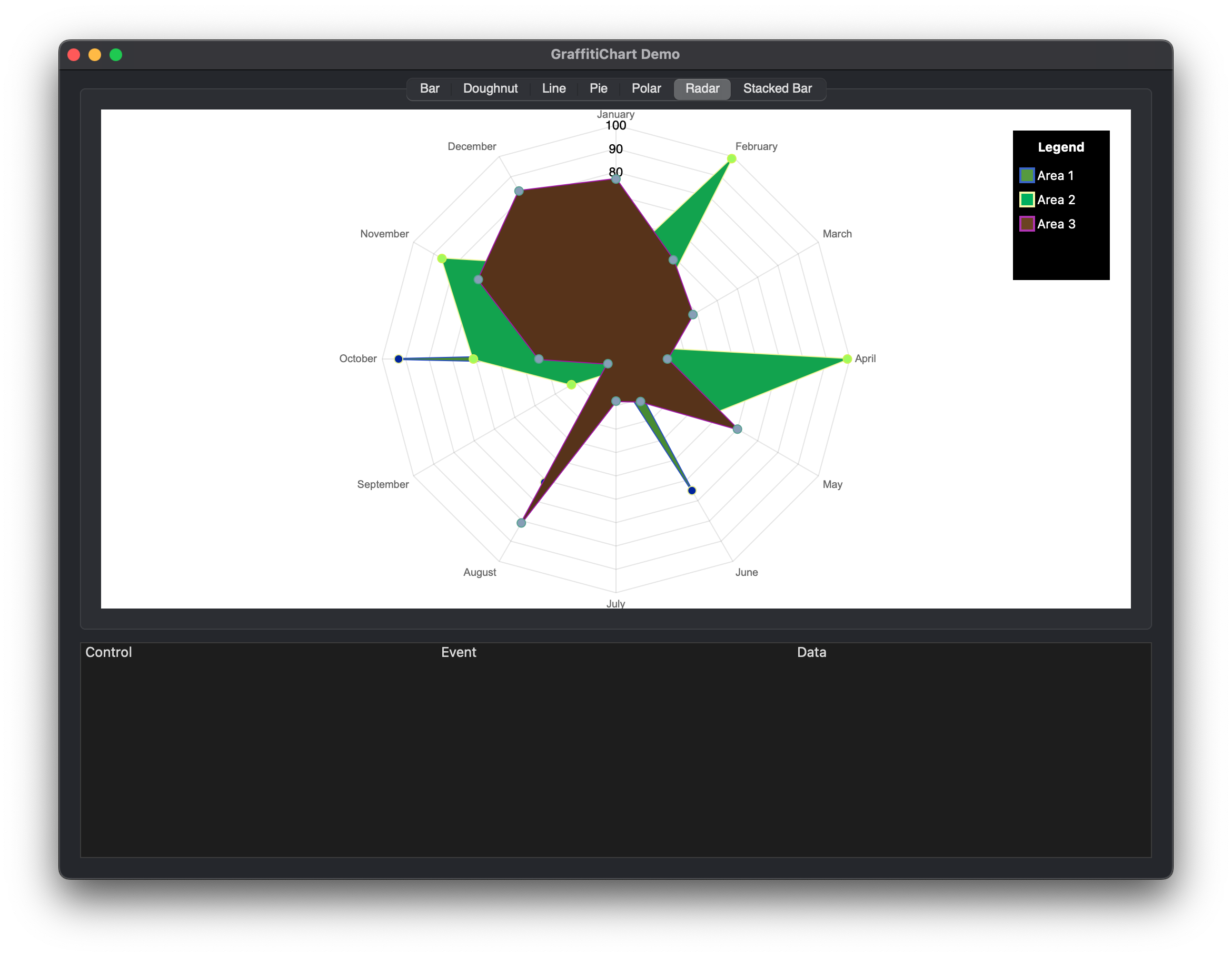
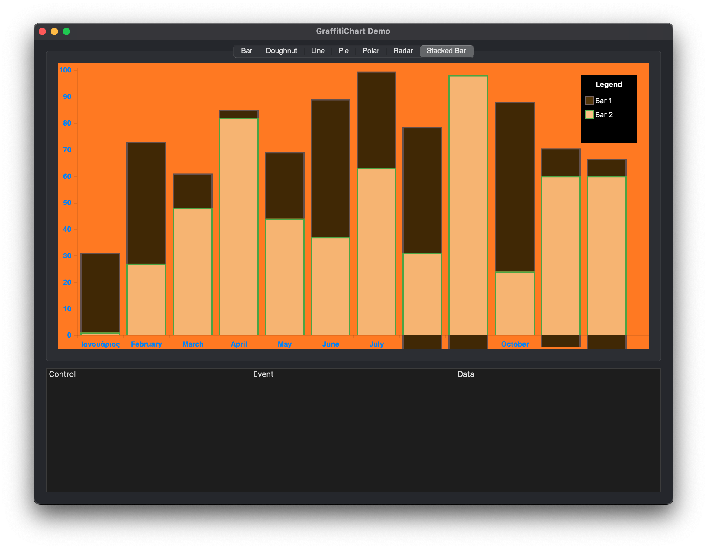
GraffitiChart is a simple yet effective charting solution for Desktop applications. With support for custom tooltip formatting, image export, and full style control, GraffitiChart can enhance any project.Supported Charts:
*
Bar
*
Line
*
Radar
*
Doughnut
*
Pie
*
StackBar
*
Polar
## Preview
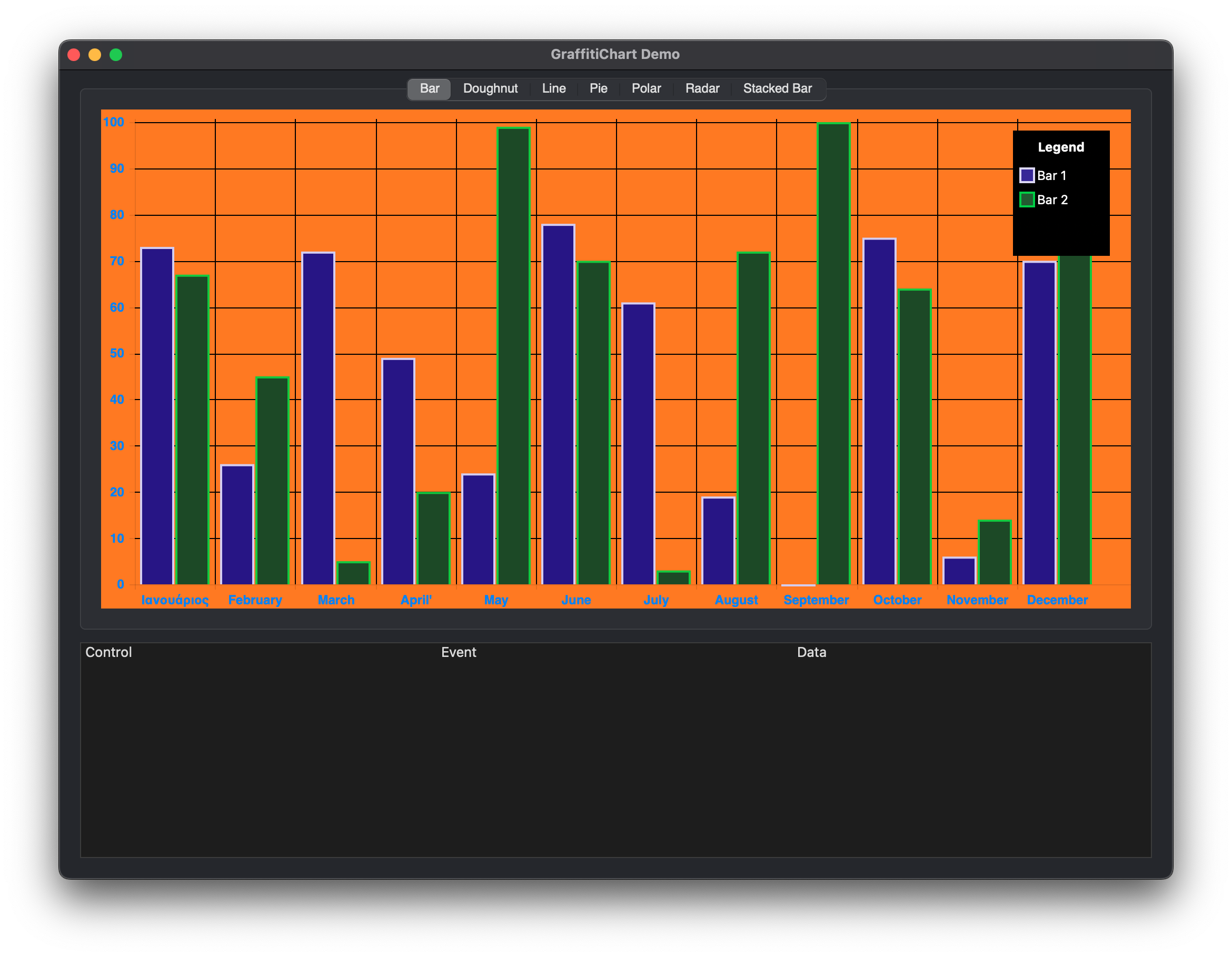
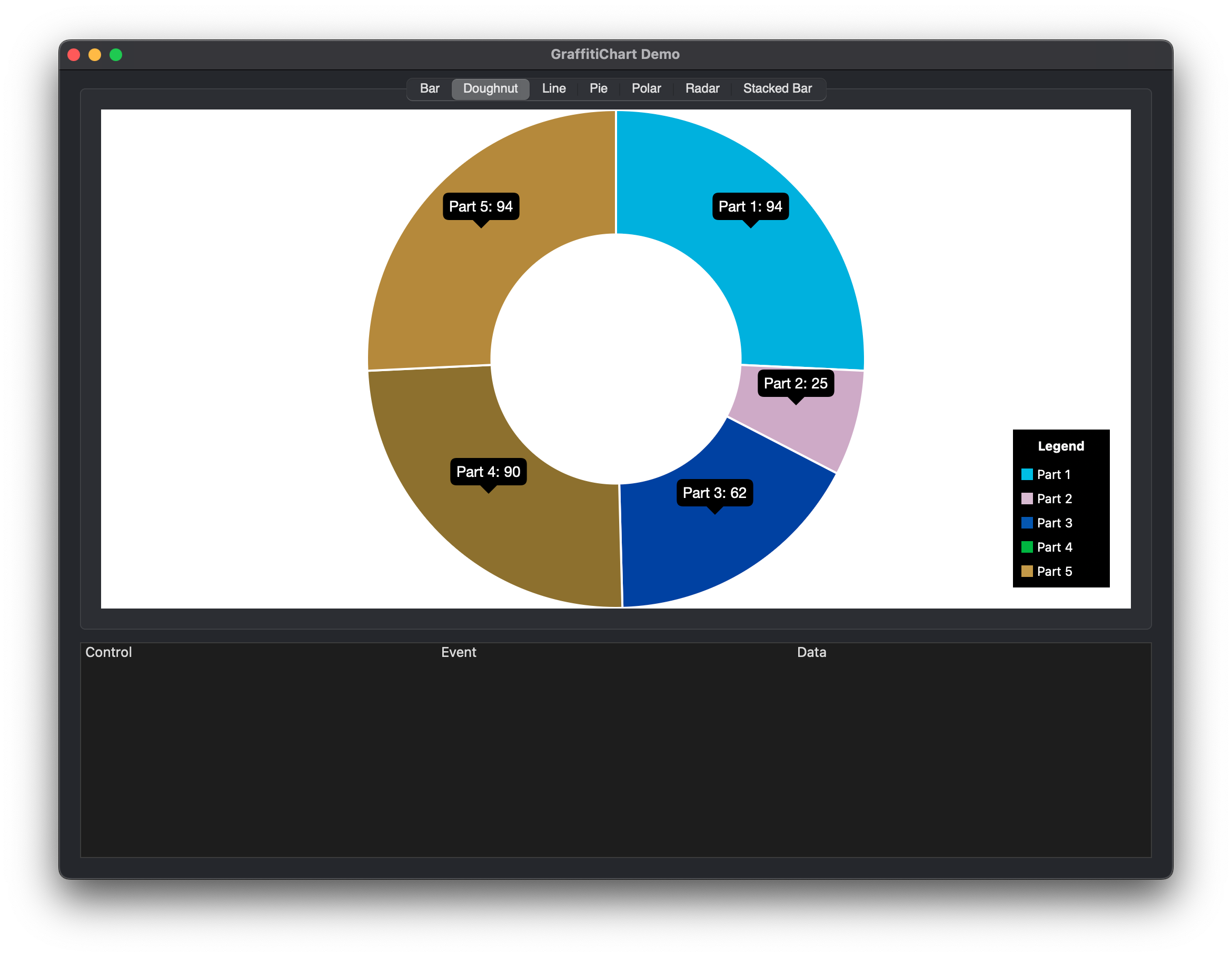
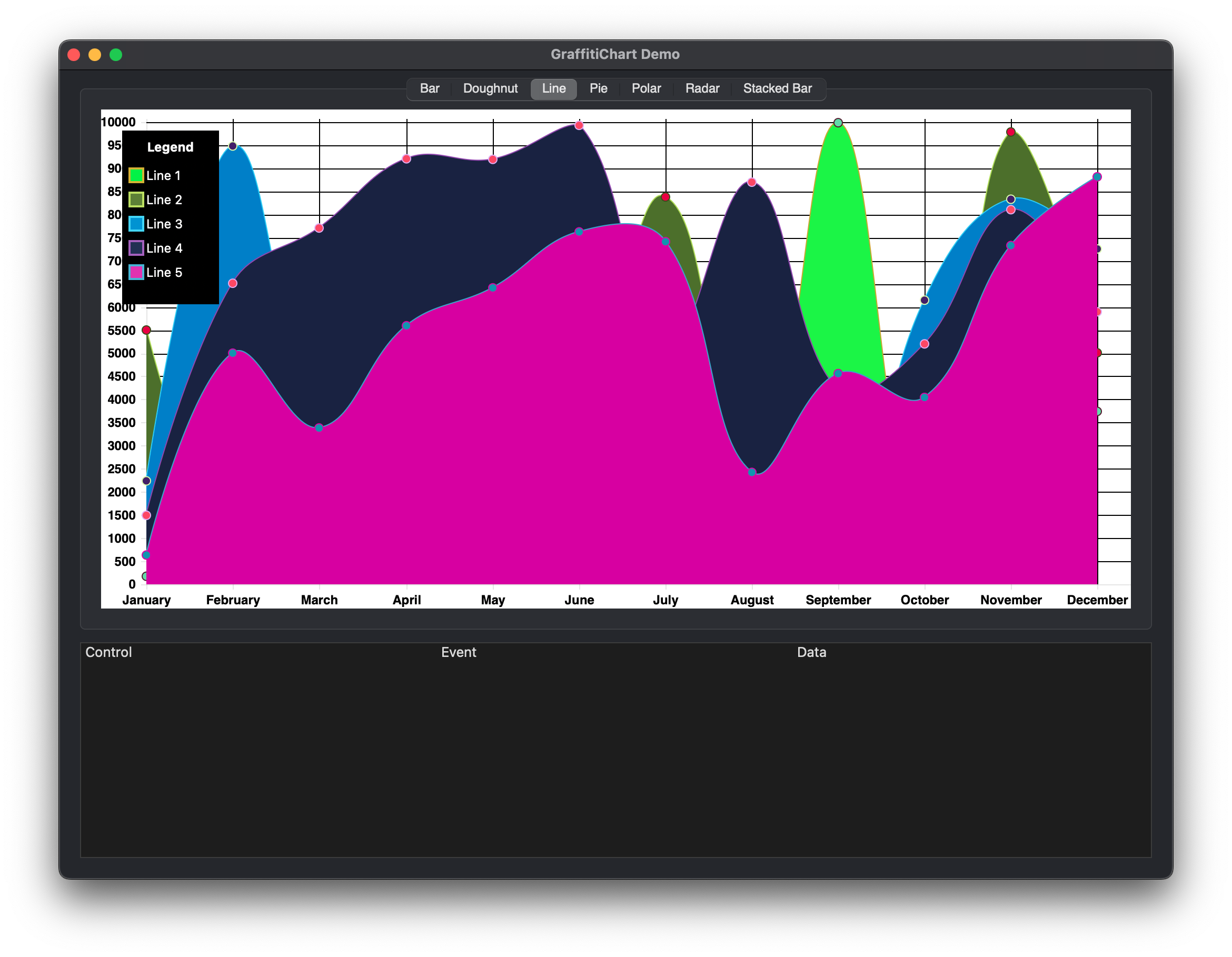
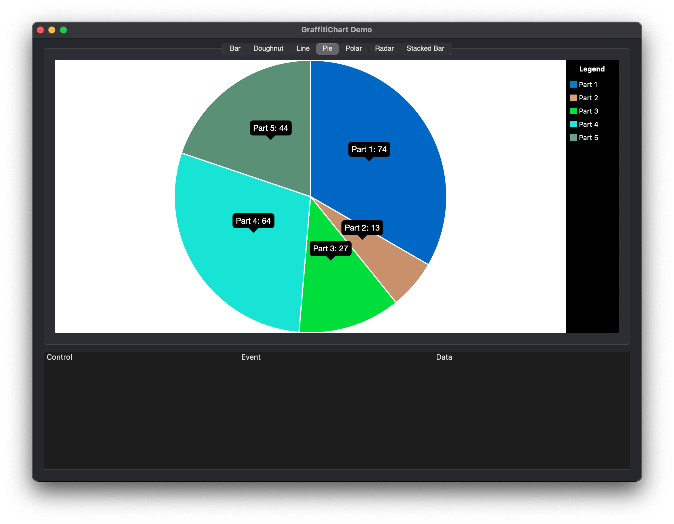
Previous
Next
## Compatibility
### Framework API Version
| 1.0 | 2.0 |
| :---: | :---: |
| True | True |
### Desktop
| 32-Bit | 64-Bit |
| :---: | :---: |
| True | True |
## Enumerations
| Name | Value | Description |
| --- | :---: | --- |
| ChartTypes | Bar <br > Line <br > Radar <br > Doughnut <br > Pie <br > StackedBar <br > Polar | (None) |
| Easings | linear <br > easeInBack <br > easeInBounce <br > easeInCirc <br > easeInCubic <br > easeInElastic <br > easeInExpo <br > easeInQuad <br > easeInQuart <br > easeInQuint <br > easeInSine <br > easeOutBack <br > easeOutBounce <br > easeOutCirc <br > easeOutCubic <br > easeOutElastic <br > easeOutExpo <br > easeOutQuad <br > easeOutQuart <br > easeOutQuint <br > easeOutSine <br > easeInOutBack <br > easeInOutBounce <br > easeInOutCirc <br > easeInOutCubic <br > easeInOutElastic <br > easeInOutExpo <br > easeInOutQuad <br > easeInOutQuart <br > easeInOutQuint <br > easeInOutSine | (None) |
| FontStyles | Normal <br > Bold <br > Italic <br > BoldItalic | (None) |
## Event Definitions
| Name | Parameters | Return Type | Description |
| --- | :---: | :---: | --- |
| AnimationComplete | (None) | (None) | Raised when the chart's animation has completed. |
| ContextClick | (None) | (None) | Raised when the user right-clicks the chart. |
| DataPointClicked | Datapoint as GraffitiChartPoint | (None) | Raised when the user clicks a data point. |
| Opening | (None) | (None) | (None) |
| Shown | (None) | (None) | (None) |
## Methods
| Name | Parameters | Return Type | Description |
| --- | :---: | :---: | --- |
| AddDataset | newDataset as GraffitiChartDataset <br> newIndex as Integer = -1 | (None) | Adds a the provided dataset at the position signified by newIndex. If newIndex is less than zero, the item is appended to the end of the array. |
| DataSet | index as Integer | GraffitiChartDataset | Returns that DataSet at the specified index. |
| DeleteAll | (None) | (None) | Removes all datasets. |
| DoResize | (None) | (None) | This method forces the chart to update its display. Most commonly would be used when resizing the control. Should not need to be called, but it's there if you need it. |
| Label | index as Integer | String | Returns the label at the specified index. |
| LastDataSetIndex | (None) | Integer | Returns the index of the final dataset. |
| LastLabelIndex | (None) | Integer | Returns the index of the final label. |
| RemoveDataset | DataIndex as Integer | (None) | Removes the dataset signified by DataIndex. |
| RemoveLabel | index as Integer | (None) | Removes the label at the specified index. |
| SetBarFill | DatasetIndex as Integer <br> BarIndex as Integer <br> NewColor as Color | (None) | Changes the bar fill color for the specified bar. |
| SetBarHighlightFill | DatasetIndex as Integer <br> BarIndex as Integer <br> NewColor as Color | (None) | Changes the bar fill highlight color for the specified bar. |
| SetBarHighlightStroke | DatasetIndex as Integer <br> BarIndex as Integer <br> NewColor as Color | (None) | Changes the bar stroke highlight color for the specified bar. |
| SetBarStroke | DatasetIndex as Integer <br> BarIndex as Integer <br> NewColor as Color | (None) | Changes the bar stroke color for specified bar. |
## Properties
| Name | Type | Default Value | Description |
| --- | :---: | :---: | --- |
| Animation | Boolean | (None) | When true, the chart will animate changes to data. |
| AnimationEasing | Easings | (None) | The motion style to use for animating chart elements. |
| AnimationSteps | Integer | (None) | Determines the number of frames to use for animating the chart. |
| BackgroundColor | Color | (None) | If True applies a background color to the chart display. This color is not applied to the image returned by ImageData. |
| BezierCurve | Boolean | (None) | When True, lines will be curved using a bezier algorithm. |
| BezierCurveTension | Double | (None) | The tension on the curved line. |
| ChartType | ChartTypes | (None) | The type of chart to be displayed. |
| DatasetFill | Boolean | (None) | When using line charts, this will cause the data to display the background color associated with the dataset. |
| Datasets() | GraffitiChartDataset | (None) | The array containing the datasets for the current chart. |
| DatasetStroke | Boolean | (None) | Show the stroke line of the dataset. |
| DatasetStrokeWidth | Integer | (None) | The pixel width of the dataset stroke. |
| GridLineColor | Color | (None) | The color used to draw the grid lines of the chart. |
| GridLineWidth | Integer | (None) | The pixel width of the grid line. |
| Image | Picture | (None) | A picture representation of the chart that is created when the AnimationComplete event fires. |
| ImageData | String | (None) | A base64-encoded image string of the currently displayed chart. |
| isAnimating | Boolean | (None) | (None) |
| LabelFontColor | Color | (None) | Color applied to labels. |
| LabelFontFamily | String | (None) | Font family (or name) applied to labels. |
| LabelFontSize | Integer | (None) | Size of labels to use for chart axes. |
| LabelFontStyle | FontStyles | (None) | Style applied to applied to label text. |
| Labels() | String | (None) | The array of dataset labels to use in the chart. |
| LabelsVisible | Boolean | (None) | Determines whether axis labels are displayed. |
| LockUpdate | Boolean | (None) | (None) |
| MultiTooltipTemplate | String | (None) | Template to use for displaying tooltips for multiple overlapping datapoints. |
| PointDotRadius | Integer | (None) | The size of the circle for each data point in applicable charts. |
| PointDotStrokeWidth | Integer | (None) | The width of the Point Dot's Stroke. |
| PointHitDetectionRadius | Integer | (None) | The pixel distance in which the data point will be hovered / clicked. |
| ScaleOverride | Boolean | (None) | If True, the chart will use the values in the other Scale properties for determining the scale of the chart, rather than automatically assigning values. |
| ScaleStart | Integer | (None) | The starting value of the Y-axis. |
| ScaleSteps | Integer | (None) | The number of steps in the Y-axis. |
| ScaleStepWidth | Integer | (None) | The width of the scale's individual steps. See Examples below for more information. |
| ShowGridLines | Boolean | (None) | Determines whether the grid lines will be displayed. |
| ShowPointDot | Boolean | (None) | If True, applicable charts will draw a circle over each data point in each dataset. |
| ShowTooltips | Boolean | (None) | If True, tooltips will be shown when hovering over data points. |
| TooltipAlwaysVisible | Boolean | (None) | If True, tooltips will always be visible. |
| TooltipFillColor | Color | (None) | The background color for the displayed tooltips. |
| TooltipFontColor | Color | (None) | The text color for the displayed tooltips. |
| TooltipTemplate | String | (None) | Template for tooltip text. |
| TooltipTitleFontColor | Color | (None) | The text color used in displaying titles on the tooltips. |
## Examples
### Chart Y-Axis Scaling
Let's say we want our bar chart to draw only a scale between 0 and 100, with steps each 10 points. We would set the properties of the chart instance as follows (either in the inspector or programmatically in the Open event):
```
chartInstance.ScaleOverride = True '// Override the default scale
chartInstance.ScaleStart = 0 '// Set our starting position to 0
chartInstance.ScaleSteps = 10 '// We want 10 total steps between 0 and 100
chartInstance.ScaleWidth = 10 '// Add an axis point every 10 values between 0 and 100 (0..10..20..30)
```
### Random Bar Chart
```
dim r as new Random
for intDataset as Integer = 1 to 2
dim cFillColor as Color = RGB( r.InRange( 0, 255 ), r.InRange( 0, 255 ), r.InRange( 0, 255 ), r.InRange( 0, 255 ) )
dim cStrokeColor as Color = RGB( r.InRange( 0, 255 ), r.InRange( 0, 255 ), r.InRange( 0, 255 ), r.InRange( 0, 255 ) )
dim cPointColor as Color = RGB( r.InRange( 0, 255 ), r.InRange( 0, 255 ), r.InRange( 0, 255 ), r.InRange( 0, 255 ) )
dim cPointStrokeColor as Color = RGB( r.InRange( 0, 255 ), r.InRange( 0, 255 ), r.InRange( 0, 255 ), r.InRange( 0, 255 ) )
dim cHighlightFill as Color = RGB( r.InRange( 0, 255 ), r.InRange( 0, 255 ), r.InRange( 0, 255 ), r.InRange( 0, 255 ) )
dim cHighlightStroke as Color = RGB( r.InRange( 0, 255 ), r.InRange( 0, 255 ), r.InRange( 0, 255 ), r.InRange( 0, 255 ) )
dim cPointHighlightColor as Color = RGB( r.InRange( 0, 255 ), r.InRange( 0, 255 ), r.InRange( 0, 255 ), r.InRange( 0, 255 ) )
dim cPointHighlightStrokeColor as Color = RGB( r.InRange( 0, 255 ), r.InRange( 0, 255 ), r.InRange( 0, 255 ), r.InRange( 0, 255 ) )
dim dataPoints() as Double
for intCycle as Integer = 1 to 12
dataPoints.Append( r.InRange( 0, 100 ) )
next
dim newData as GraffitiChartDataset = new GraffitiChartDataset( "Bar " + Format( intDataset, "#" ), cFillColor, cStrokeColor, cHighlightFill, cHighlightStroke, cPointColor, cPointStrokeColor, cPointHighlightColor, cPointHighlightStrokeColor, dataPoints() )
me.Datasets.Append( newData )
next
me.Labels = Array( "January", "February", "March", "April", "May", "June", "July", "August", "September", "October", "November", "December" )
me.ChartType = GraffitiChart.TypeBar
```
### Random Doughnut Chart
```
dim newData as GraffitiChartDataset
dim cFillColor as Color
dim cHighlightFill as Color
dim r as new Random
for intCycle as Integer = 1 to 5
cFillColor = RGB( r.InRange( 0, 255 ), r.InRange( 0, 255 ), r.InRange( 0, 255 ) )
cHighlightFill = RGB( r.InRange( 0, 255 ), r.InRange( 0, 255 ), r.InRange( 0, 255 ) )
newData = new GraffitiChartDataset( "Part " + Format( intCycle, "#" ), r.InRange( 0, 100 ), cFillColor, cHighlightFill )
me.Datasets.Append( newData )
next
me.ChartType = GraffitiChart.TypeDoughnut
```
### Tooltip Templates
Anything in between <% and %> will be executed as JavaScript. For example:
`
<% if (label) { %> and later <% } %>
`
. Using
`
<%= expr %>
`
will print the value of the variable named by
`
expr
`
into the tooltip.The available variables to print into the tooltip depends on the chart type. In general, the following variables are available:
Variable
Description
| --- | --- |
value
value of the data point
label
label for the position the data point is at
datasetLabel
label for the dataset the point is from
strokeColor
stroke color for the dataset
fillColor
fill color for the dataset
highlightFill
highlight fill color for the dataset
highlightStroke
highlight stroke color for the dataset
