# GraffitiSwitch
Class Inherits GraffitiSuite.BaseCanvas
## About
A simple, yet elegant boolean switch. Can be customized for nearly any UI.Features:
*
Animated value switching
*
Define custom value text
*
Define custom colors
## Preview
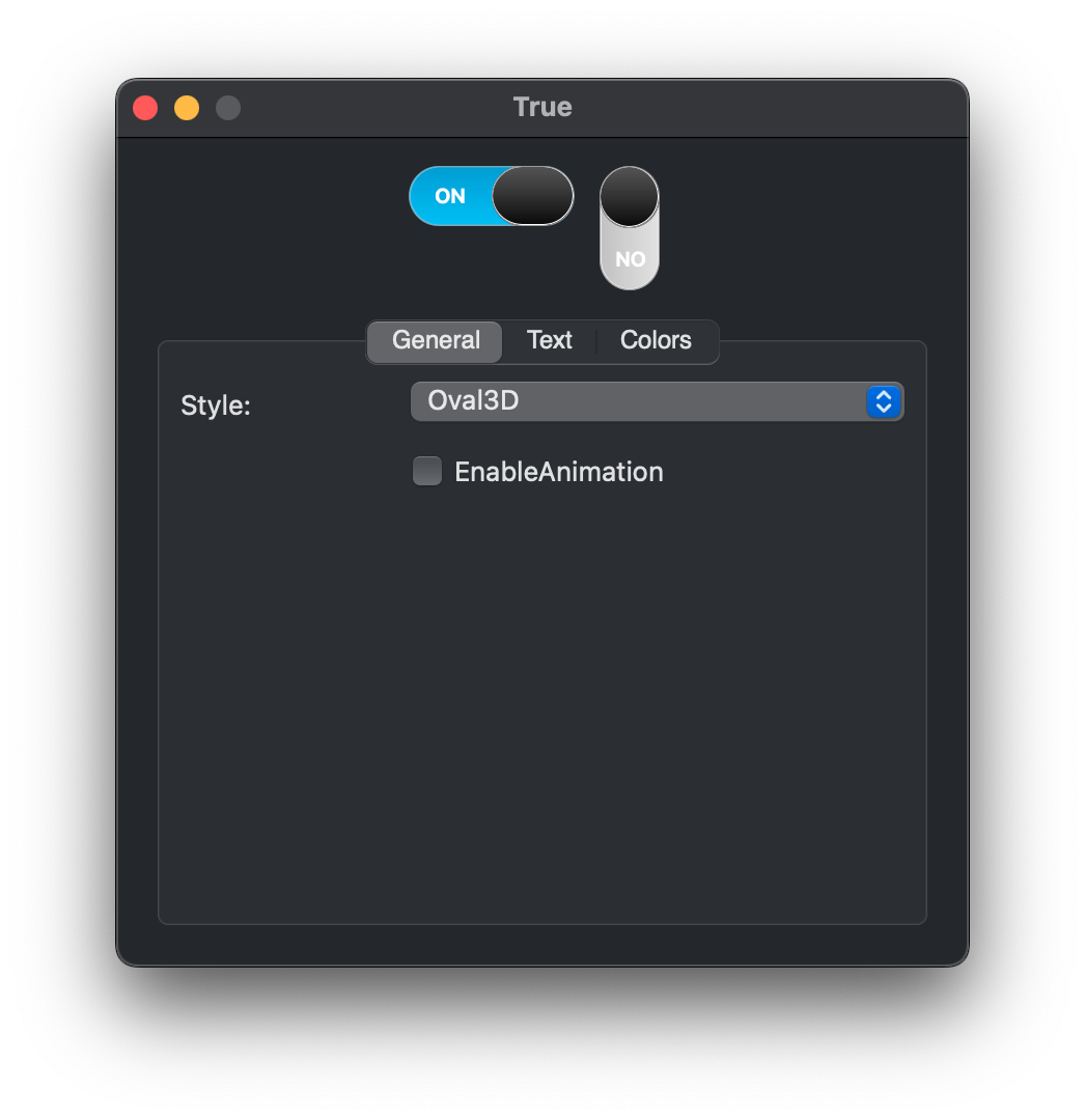
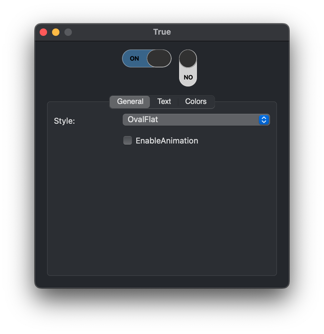
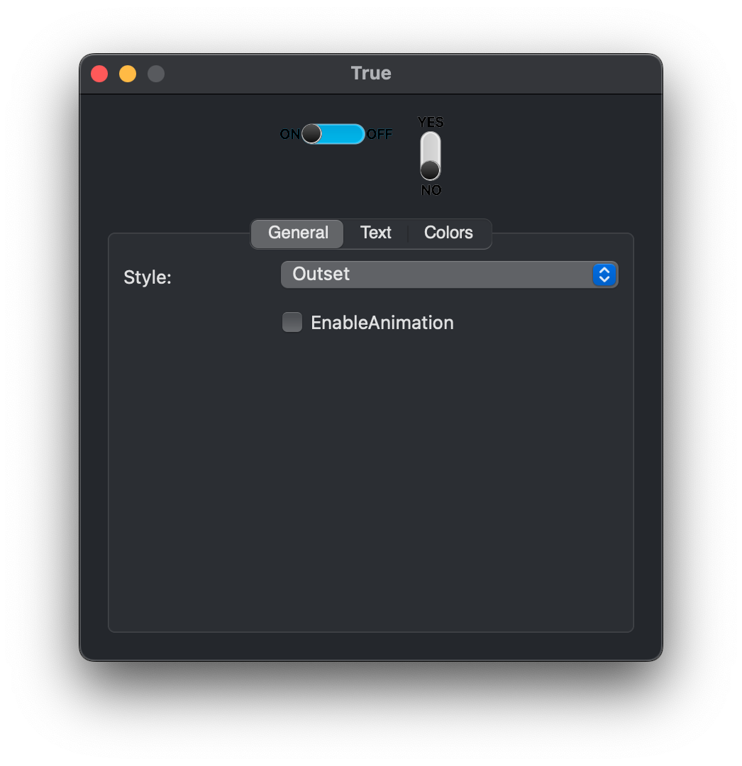
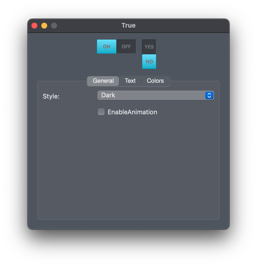
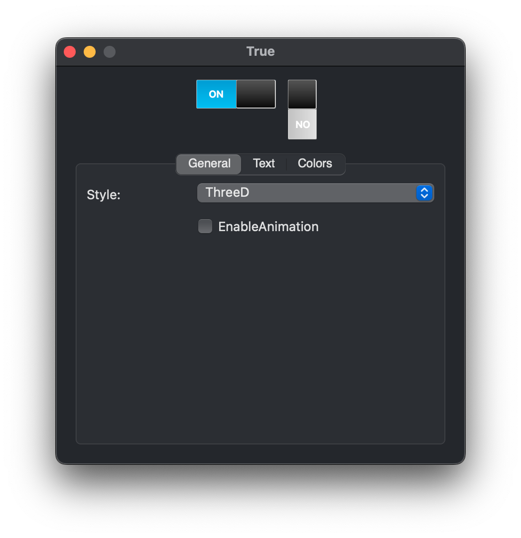
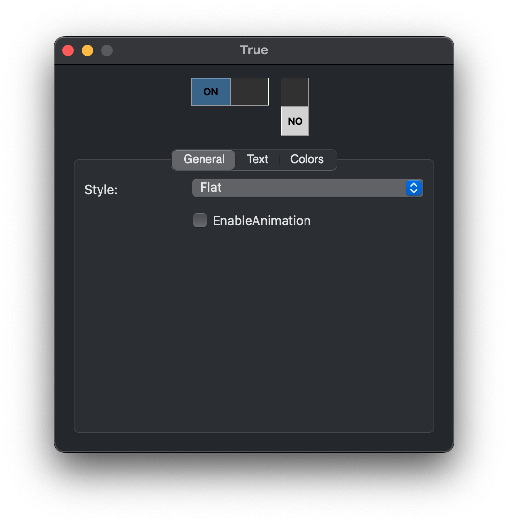
Previous
Next
## Compatibility
### Framework API Version
| 1.0 | 2.0 |
| :---: | :---: |
| True | True |
### Desktop
| 32-Bit | 64-Bit |
| :---: | :---: |
| True | True |
## Attributes
| Name | Value |
| --- | --- |
| DefaultEvent | "ValueChange" |
## Enumerations
| Name | Value | Description |
| --- | :---: | --- |
| Styles | ThreeD <br > Flat <br > Oval3D <br > OvalFlat <br > Outset <br > Dark | Supported drawing styles. |
## Event Definitions
| Name | Parameters | Return Type | Description |
| --- | :---: | :---: | --- |
| ValueChange | (None) | (None) | Fired when the value is changed. |
## Properties
| Name | Type | Default Value | Description |
| --- | :---: | :---: | --- |
| Bold | Boolean | (None) | Determines whether the value text is drawn in bold. |
| BorderColorDark | Color | (None) | Determines the dark border color when UseCustomColors is True. |
| BorderColorLight | Color | (None) | Determines the light border color when UseCustomColors is True. |
| EnableAnimation | Boolean | (None) | Sets whether the class value change is animated. |
| FalseBGColor | Color | (None) | Sets the background color of the False value. |
| FalseText | String | (None) | The text display in the False value. |
| Italic | Boolean | (None) | Determines whether the values’ text is drawn in italics. |
| Style | Styles | (None) | Determines the visual style of the class. |
| SwitchColor | Color | (None) | Determines the color of the value switch when UseCustomColors is True. |
| TextColor | Color | (None) | Sets the color of the value text when UseCustomColors is True. |
| TextFont | String | (None) | Sets the font face of the value text. |
| TextSize | Integer | (None) | Sets the size of the value text font. |
| TrueBGColor | Color | (None) | Determines the background color of the True value when UseCustomColors is True. |
| TrueText | String | (None) | The text displayed as the True value. |
| Underline | Boolean | (None) | Sets whether the values’ text is displayed with an underline. |
| UseCustomColors | Boolean | (None) | Sets whether the class is displayed used the colors defined in properties, or with their defaults. |
| Value | Boolean | (None) | The current value of the Switch. |
