# GraffitiGradientSelector
Class Inherits GraffitiSuite.BaseCanvas
## About
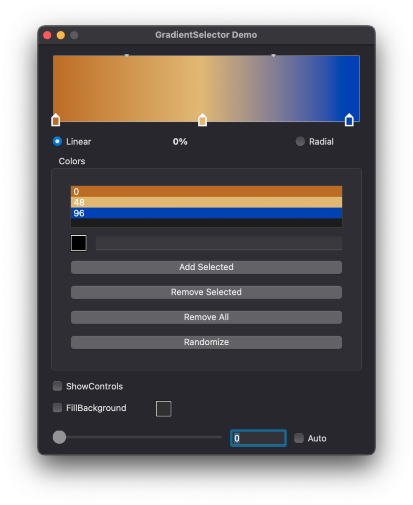
GraffitiGradientSelector is GraffitiFadePanel on steroids. It can be used to display entirely custom gradated color schemes or for selection of such schemes.
Features:
*
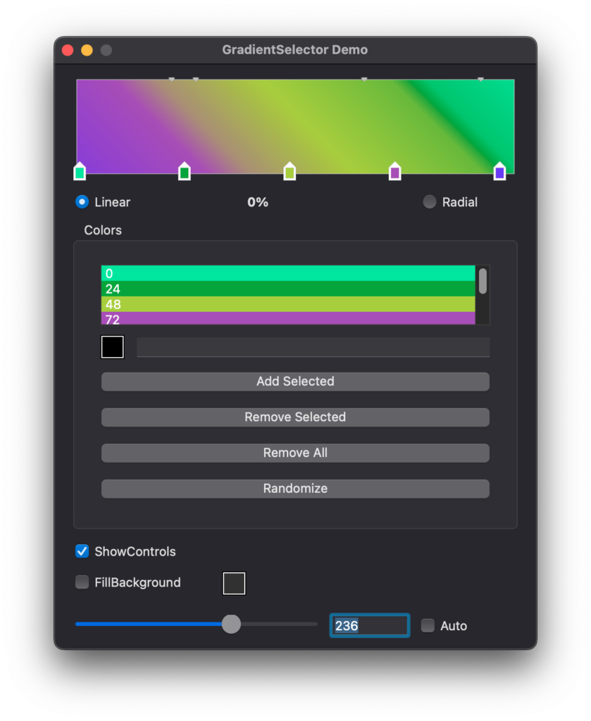
Controls for managing color position and scale.
*
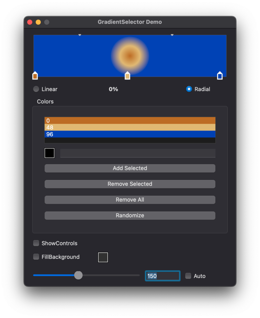
Linear or Radial display styles.
*
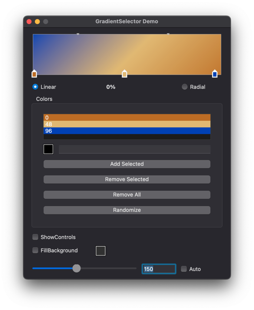
Definable rotation for linear style gradients.
*
Full cursor interactivity.
## Preview
Previous
Next
## Compatibility
### Framework API Version
| 1.0 | 2.0 |
| :---: | :---: |
| True | True |
### Desktop
| 32-Bit | 64-Bit |
| :---: | :---: |
| True | True |
## Enumerations
| Name | Value | Description |
| --- | :---: | --- |
| Styles | Linear <br > Radial | Supported gradient drawing styles. |
## Event Definitions
| Name | Parameters | Return Type | Description |
| --- | :---: | :---: | --- |
| AddMarker | MarkerPosition as Integer <br> byRef MarkerColor as Color | Boolean | When a marker is added to the display by the user, this event will fire with the relevant information. |
| MarkerClick | Marker as GSColor | (None) | This event fires when the user clicks a color marker on the display. |
| MarkerDrag | Marker as GSColor <br> PreviousPosition as Integer | (None) | Fired when the user is performing a drag operation on a marker. |
| MarkerMoved | Marker as GSColor <br> PreviousPositon as Integer | (None) | Fires when the user has released the mouse after a drag operation. |
| MarkerRemoved | Marker as GSColor <br> PreviousPosition as Integer | (None) | Fires when the user drags a marker from the display, removing it. |
| MarkerScaleChanged | Marker as GSColor <br> PreviousScale as Integer | (None) | Fires the user has changed the gradient scale for the specified marker. |
## Methods
| Name | Parameters | Return Type | Description |
| --- | :---: | :---: | --- |
| AddValue | newColor as Color <br> newPosition as Integer <br> newScale as Integer = 50 | (None) | Used to add a new color to the display at a specified position and with a specified scale. |
| AddValue | newValue as GSColor | (None) | Used to add a new color to the display at a specified position and with a specified scale. |
| DeleteAll | (None) | (None) | Removes all colors from the display. |
| DeleteValue | thisValue as GSColor | (None) | Removes a color from the display by index or object. |
| DeleteValue | intIndex as Integer | (None) | Removes a color from the display by index or object. |
| FindMarker | MarkerValue as Color <br> MarkerPosition as Integer | Integer | Find a value within the array of color values by the specified criteria. |
| FindMarker | Marker as GSColor | Integer | Find a value within the array of color values by the specified criteria. |
| FromBrush | brush as GraphicsBrush | (None) | Parses a Linear or RadialGraphicsBrush object to populate the control. |
| InsertValue | intIndex as Integer <br> newColor as Color <br> newPosition as Integer | (None) | Adds a color to the display at the defined point in the array. |
| InsertValue | intIndex as Integer <br> newValue as GSColor | (None) | Adds a color to the display at the defined point in the array. |
| ToBrush | includeScaleValues as Boolean = True | GraphicsBrush | Returns a Linear or RadialGraphicsBrush containing the control's values. If includeScaleValues is True, colors are inserted to create the scaled color effects. |
| UpdateValue | intIndex as Integer <br> newColor as Color | (None) | Updates the given color value’s properties. |
| UpdateValue | intIndex as Integer <br> newColor as Color <br> newPosition as Integer | (None) | Updates the given color value’s properties. |
| UpdateValue | intIndex as Integer <br> newPosition as Integer | (None) | Updates the given color value’s properties. |
## Properties
| Name | Type | Default Value | Description |
| --- | :---: | :---: | --- |
| Angle | Integer | (None) | The angle of the gradient (0-359) |
| AntiAliasRadial | Boolean | (None) | Determines whether a radial gradient is anti-aliased, thus removing the potentially jagged look. |
| BGColor | Color | (None) | The background color of the control. |
| BorderColor | Color | (None) | The color used for the border of the display. |
| ExcludeMarker | GSColor | (None) | Used to hide a marker from the display. |
| FillBackground | Boolean | (None) | Determines whether the class will draw a solid color behind the display and markers. |
| FillBackgroundColor | Color | (None) | Determines the color used if FillBackground is equal to True. |
| MarkerBGColor | Color | (None) | Determines the background color of the display markers. |
| MarkerBorderColor | Color | (None) | Determines the border color of the display markers. |
| NoUpdate | Boolean | (None) | Used to signal that the display should not refresh for any reason. |
| ScaleMarkerBGColor | Color | (None) | The background color used to display scale markers on the display. |
| ShowControls | Boolean | (None) | Determines whether markers are shown on the display. |
| Style | Styles | (None) | Determines the style of the gradient to be displayed. Constant values |
