# GraffitiFieldLabel
Class Inherits GraffitiSuite.BaseCanvas
## About
GraffitiFieldLabel is a TextField parent designed to make your forms both easier to manage and look great! With a wide array of features, you can accomplish many things that would take hundreds or thousands of hours to code and implement yourself!
Features:
*
Autocomplete by Line
*
Autocomplete by Word
*
Label positioning left or right
*
Automatic or static label width
*
Clear button
*
Icon support in Label
GraffitiFieldLabelContainer embed containers within a similar UI to GraffitiFieldLabel for consistent representation across your project.
## Preview
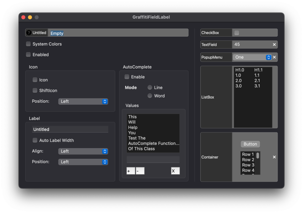
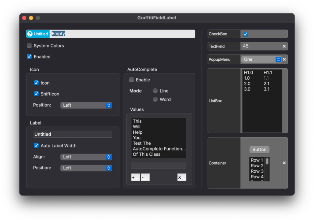
Previous
Next
## Compatibility
### Framework API Version
| 1.0 | 2.0 |
| :---: | :---: |
| True | True |
### Desktop
| 32-Bit | 64-Bit |
| :---: | :---: |
| True | True |
## Attributes
| Name | Value |
| --- | --- |
| DefaultEvent | "TextChanged" |
## Enumerations
| Name | Value | Description |
| --- | :---: | --- |
| Alignments | Left <br > Center <br > Right | Possible element alignment values. |
| Positions | Left <br > Right | Possible element position values. |
| VerticalAlignments | Middle <br > Top <br > Bottom | Possible element vertical alignment values. |
## Constants
| Name | Type | Default Value | Description |
| --- | :---: | :---: | --- |
| kModeLine | Double | 0 | Autocomplete mode by line. |
| kModeWord | Double | 1 | Autocomplete mode by word. |
## Event Definitions
| Name | Parameters | Return Type | Description |
| --- | :---: | :---: | --- |
| ClearClicked | (None) | (None) | Fired when the user clicks the clear button. |
| Closing | (None) | (None) | (None) |
| DoSearch | SearchFor as String | (None) | Fired when the users presses Enter or Return in the field. |
| LabelClicked | (None) | (None) | Fired when the user clicks the label. |
| PositionControl | byRef position as Xojo.Rect | (None) | Fired when the control is being positioned. Modify the values of the rect to alter its position. |
| TextChanged | (None) | (None) | Raised when the hosted control is a TextField or TextArea and its value changes. |
## Properties
| Name | Type | Default Value | Description |
| --- | :---: | :---: | --- |
| AutoComplete | Boolean | (None) | When True, the control will attempt to autocomplete the text as it is typed. |
| AutoCompleteMode | Integer | (None) | The mode to use for autocompleting entered text. |
| AutoCompleteValues() | String | (None) | Array of values used for autocompleting. |
| BorderColor | Color | (None) | Color used to draw the border of the component when SystemColors = False. |
| BorderRadius | Double | (None) | Radius of control corners. |
| ClearIcon | Picture | (None) | If supplied, will override the default clear icon. For best results, use scaled images that are no larger than 64 pixels by 64 pixels. |
| Enabled | Boolean | (None) | (None) |
| Field | DesktopUIControl | (None) | The UI element instance to incorporate. |
| FieldBackColor | Color | (None) | Color used to draw the backcolor of the component and apply to the TextField when SystemColors = False. |
| FieldTextColor | Color | (None) | Color applied to the TextField's text when SystemColors = False. |
| FieldTextFont | String | (None) | Font applied to the TextField's text. |
| FieldTextSize | Integer | (None) | Size of the text in the TextField. |
| Icon | Picture | (None) | Icon draw in the label portion. |
| IconPosition | Positions | (None) | Position of icon in the label. |
| Label | String | (None) | Label text. |
| LabelBackColor | Color | (None) | Color applied to the label segment when SystemColors = False. |
| LabelPosition | Positions | (None) | Position of the label in relation to the TextField. |
| LabelTextAlignment | Alignments | (None) | Position of the label's content. |
| LabelTextAlignmentVertical | VerticalAlignments | (None) | Position of the label's content. |
| LabelTextBold | Boolean | (None) | Font weight of the label text. |
| LabelTextColor | Color | (None) | Color applied to the label text when SystemColors = False. |
| LabelTextFont | String | (None) | Font used to draw label text. |
| LabelTextItalic | Boolean | (None) | Determines whether the label's text will be drawn italicized. |
| LabelTextSize | Integer | (None) | Font size of label text. |
| LabelTextUnderline | Boolean | (None) | Underline decoration for label text. |
| LabelWidth | Integer | (None) | Width of the label area. Use -1 for auto. |
| ResizeFieldHeight | Boolean | True | When True, will resize the contained control to fill the area. |
| ResizeFieldWidth | Boolean | True | When True, will resize the contained control to fill the area. |
| ShiftClearIcon | Boolean | (None) | When True, the clear icon will be color shifted to match the current system theme. |
| ShiftIcon | Boolean | (None) | When True, the component will attempt to shift the icon's colors. Use transparent icons for best effect. |
| ShowClearButton | Boolean | (None) | If True, the clear button x will be shown in the field on the opposite side of the TextField from the label. |
| SystemColors | Boolean | (None) | When False, the component will use the colors assigned to the various properties. When True, the control attempts to use the system defined colors. Dark Mode adaptive. |
| Text | String | (None) | Returns the value of the control when it is of type DesktopTextField or DesktopTextArea. Read-only. |
