# GraffitiSegButton
Class Inherits GraffitiSuite.BaseCanvas
## About
GraffitiSegButton is a powerful segmented button component that can double as a BevelButton, toolbar replacement, and much more!
**
Features:
**
*
Immersive coloring for Windows and macOS
*
AutoWidth and AutoCollapse
*
Icons + Text with alignment
*
Attached popup menus
*
None, Single, or Multiple selection modes
*
Per-button focus rects
## Preview

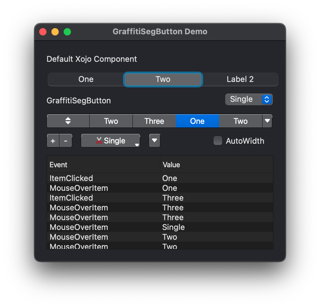

Previous
Next
## Attributes
| Name | Value |
| --- | --- |
| DefaultEvent | "ItemClicked" |
## Enumerations
| Name | Value | Description |
| --- | :---: | --- |
| Alignments | Left <br> Right | Supported horizontal alignments. |
| SelectionTypes | Single <br> Multiple <br> None | Supported selection models. |
## Event Definitions
| Name | Parameters | Return Type | Description |
| --- | :---: | :---: | --- |
| ItemClicked | item as GraffitiSegButtonItem | (None) | Fires when the user has clicked an item in the display. |
| ItemMenuClicked | item as GraffitiSegButtonItem <br> m as DesktopMenuItem | (None) | Raised when the user clicks selects a menu item from an item's menu. |
| MouseOverItem | item as GraffitiSegButtonItem | Boolean | Raised when the user moves their cursor over an item. |
| Opening | (None) | (None) | |
| WidthChanged | (None) | (None) | Fired when the width of the control has changed. Only applicable when AutoWidth = True. |
## Methods
| Name | Parameters | Return Type | Description |
| --- | :---: | :---: | --- |
| Sub | AddItem | (None) | Adds the specified item to the component. |
| Sub | AddItem | (None) | Adds the specified item to the component. |
| Sub | Constructor | (None) | Creates a new instance of the class. |
| Sub | InsertItem | (None) | Inserts the specified item at the given index. |
| Function | Item | As | Returns the item at the given index. |
| Function | ItemCount | As | Returns the number of items in the component. This equates to last item index + 1. |
| Sub | RemoveAll | (None) | Removes all items from the component. |
| Sub | RemoveItem | (None) | Removes the item at the specified index. |
## Properties
| Name | Type | Default Value | Description |
| --- | :---: | :---: | --- |
| AutoWidth | Boolean | Nil | When True, the component will resize in an attempt to fit all items comfortably. |
| Bold | Boolean | Nil | When True, items will default to Bold text. |
| IconAlignment | Alignments | Nil | Position of the icon relative to the text for items. |
| InitialValue | String | Nil | A tab-delimited string of buttons to add by default. |
| Italic | Boolean | Nil | When True, items will default to displaying text italicized. |
| Private | As | Nil | |
| Private | As | Nil | |
| Private | As | = | |
| Private | As | = | |
| Private | As | Nil | |
| Private | As | Nil | |
| Private | As | Nil | |
| Private | As | Nil | |
| Private | As | = | |
| Private | As | Nil | |
| Private | As | Nil | |
| Private | As | Nil | |
| Private | As | Nil | |
| Private | As | Nil | |
| Private | As | Nil | |
| Private | As | Nil | |
| Private | As | Nil | |
| Private | As | Nil | |
| Private | As | Nil | |
| Private | As | Nil | |
| Private | As | Nil | |
| Private | | GraffitiSegButtonItem | |
| SelectionType | SelectionTypes | Nil | Selection behavior when the user clicks on an item. |
| TextFont | String | Nil | Font face used to draw item text. |
| TextSize | Integer | Nil | Font size used to draw item text. |
| Underline | Boolean | Nil | When True, item text will be drawn underlined. |
