# GraffitiProgress
Class Inherits GraffitiSuite.BaseCanvas
## About
GraffitiProgress is a cross-platform style-mimicking progress bar class. With styles for Windows, OS X, and Linux, your application will look right at home.
**
Features:
**
*
Horizontal or Vertical Styling
*
Filled or Blocked Styling
*
Custom Percentage text
*
Custom Percentage symbol
*
Custom Color Properties
*
Windows 9x Flat style
*
Windows 9x 3D style
*
Windows XP Style
*
Mac OS X style
*
KDE style
*
Windows Vista style
*
A custom gel style called “GelCore”
*
A Dark style
*
A Gradient style
## Preview
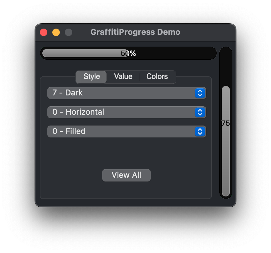

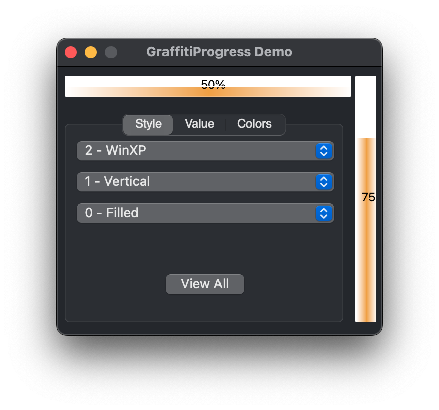
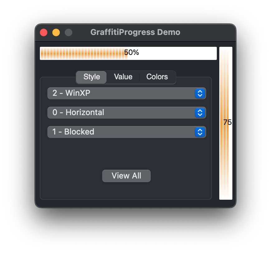
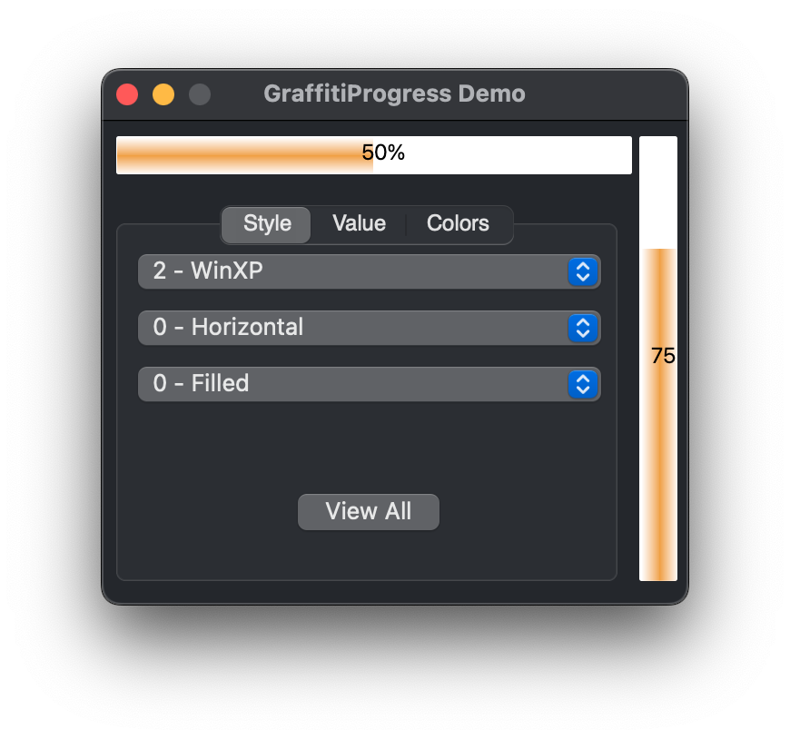
Previous
Next
## Compatibility
### Framework API Version
| 1.0 | 2.0 |
| :---: | :---: |
| True | True |
### Desktop
| 32-Bit | 64-Bit |
| :---: | :---: |
| True | True |
## Enumerations
| Name | Value | Description |
| --- | :---: | --- |
| Directions | Horizontal <br> Vertical | Supported drawing orientations. |
| FillStyles | Solid <br> Blocked | Supported progress value fill styles. |
| Styles | Win9xFlat <br> Win9x3D <br> WinXP <br> MacOSX <br> KDE <br> WinVista <br> GelCore <br> Dark <br> Gradient | Supported overall drawing styles. |
## Event Definitions
| Name | Parameters | Return Type | Description |
| --- | :---: | :---: | --- |
| Opening | (None) | (None) | |
## Methods
| Name | Parameters | Return Type | Description |
| --- | :---: | :---: | --- |
| Function | StyleCount | As | Returns the number of styles supported. |
| Function | StyleName | As | Returns the style name at the index specified. |
## Properties
| Name | Type | Default Value | Description |
| --- | :---: | :---: | --- |
| BGColorDark | Color | Nil | The dark background color of the control. |
| BGColorLight | Color | Nil | The light background color of the control. |
| Bold | Boolean | Nil | Determines the font weight of the text shown. |
| BorderColor | Color | Nil | Color used to draw the control's border. |
| BorderRadius | Double | Nil | Determines the thickness of the control's border. |
| CustomText | String | Nil | Used for displaying text other than a numerical percentage. |
| Direction | Directions | Nil | Determines whether the control is drawn horizontally or vertically. |
| GradientReflected | Boolean | Nil | |
| Italic | Boolean | Nil | Determines whether the text is displayed in italics. |
| LockUpdate | Boolean | Nil | |
| MaximumValue | Integer | Nil | The maximum displayed value. |
| MinimumValue | Integer | Nil | The minimum displayed value. |
| PercentSign | String | Nil | Allows you to determine what text is displayed after the number value, ie: 50%, 50.00, 50#, 50!!!!YAY!!! |
| Private | As | Nil | |
| Private | As | Nil | |
| Private | As | Nil | |
| Private | As | Nil | |
| Private | As | Nil | |
| Private | As | Nil | |
| Private | As | Nil | |
| Private | As | Nil | |
| Private | As | Nil | |
| Private | As | Nil | |
| Private | As | Nil | |
| Private | As | Nil | |
| Private | As | Nil | |
| Private | As | Nil | |
| Private | As | Nil | |
| Private | As | Nil | |
| Private | As | Nil | |
| Private | As | Nil | |
| Private | As | Nil | |
| Private | As | = | |
| Private | As | Nil | |
| Private | As | Nil | |
| Private | As | = | |
| Private | As | Nil | |
| Private | As | Nil | |
| Private | As | Nil | |
| Private | As | Nil | |
| Private | As | = | |
| ProgressColorDark | Color | Nil | Dark color of the filled progress area. |
| ProgressColorLight | Color | Nil | Light color of the filled progress area. |
| ProgressStyle | FillStyles | Nil | Determines the visual appearance of the filled progress area. |
| ProgressTextColorDark | Color | Nil | Dark color of the progress text. |
| ProgressTextColorLight | Color | Nil | Light color of the progress text. |
| ProgressTextFont | String | Nil | Font face used to draw the progress text. |
| ProgressTextSize | Integer | Nil | Size of the font used to draw the progress text. |
| ShowProgressText | Boolean | Nil | Sets whether the control will show any progress text. |
| Style | Styles | Nil | Determines the visual style to be displayed. |
| Underline | Boolean | Nil | Sets the text decoration. |
| UseCustomScheme | Boolean | Nil | Determines whether the control will use custom colors |
| Value | Integer | Nil | Sets the numeric value of the control. Accepts integers from 0-100. To calculate percentage, use the following formula: (DoneSoFar / TotalToDo) * 100. |
