# GraffitiRadialProgress
Class Inherits GraffitiSuite.BaseCanvas
## About
GraffitiRadialProgress is a round progress indicator based on modern implementations of the concept as seen in many popular applications and websites.
Features:
*
Display as percentage or Done/Total
*
Fully-customizable color palettes
*
Nine styles from which to choose
## Preview
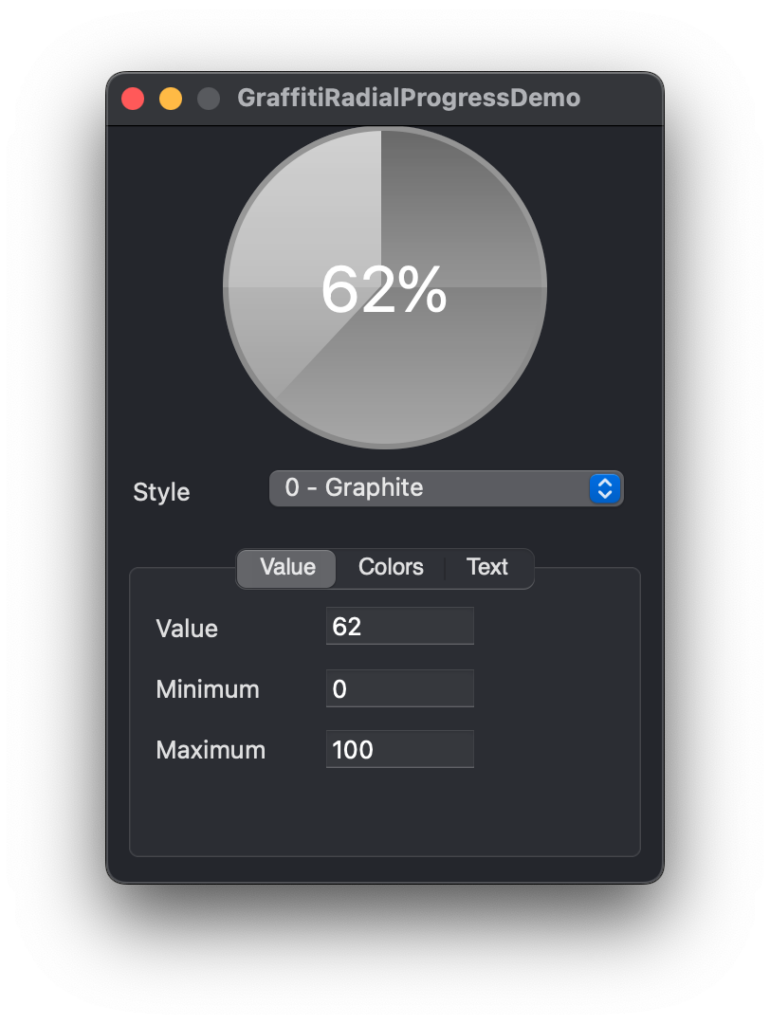
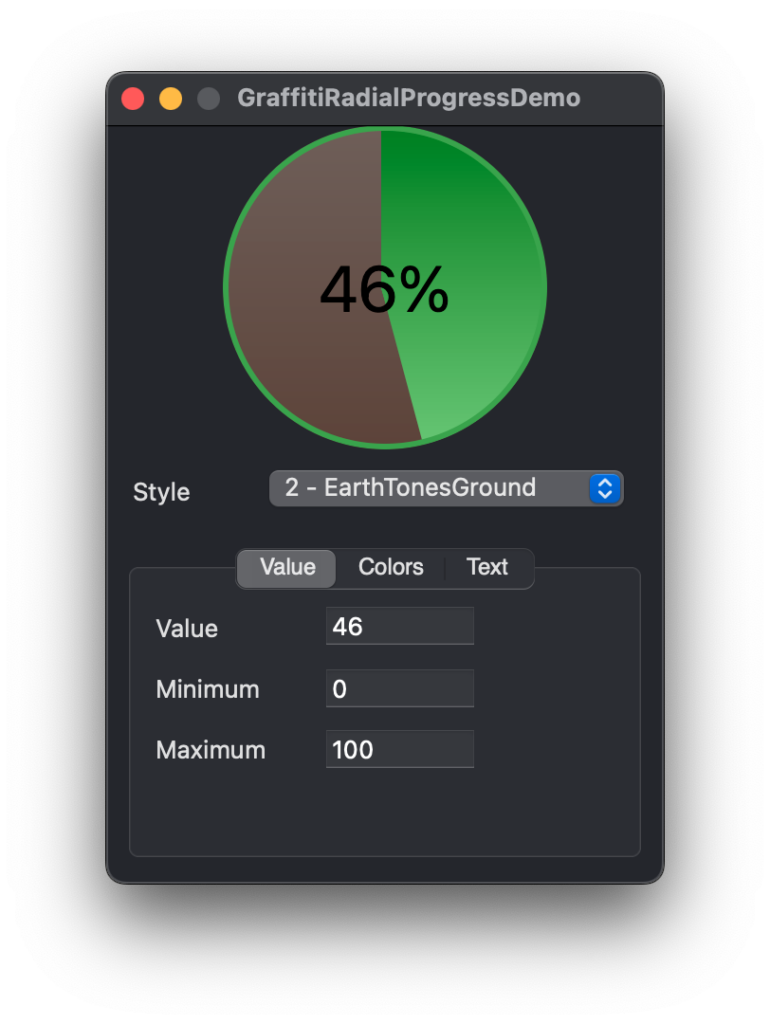
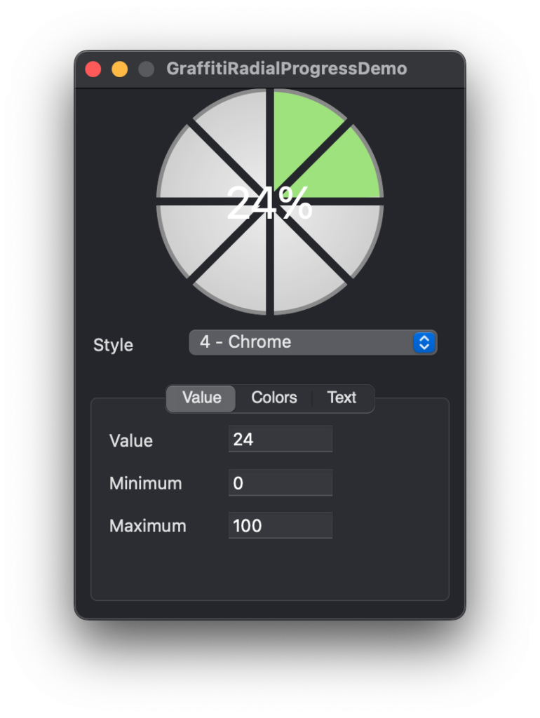
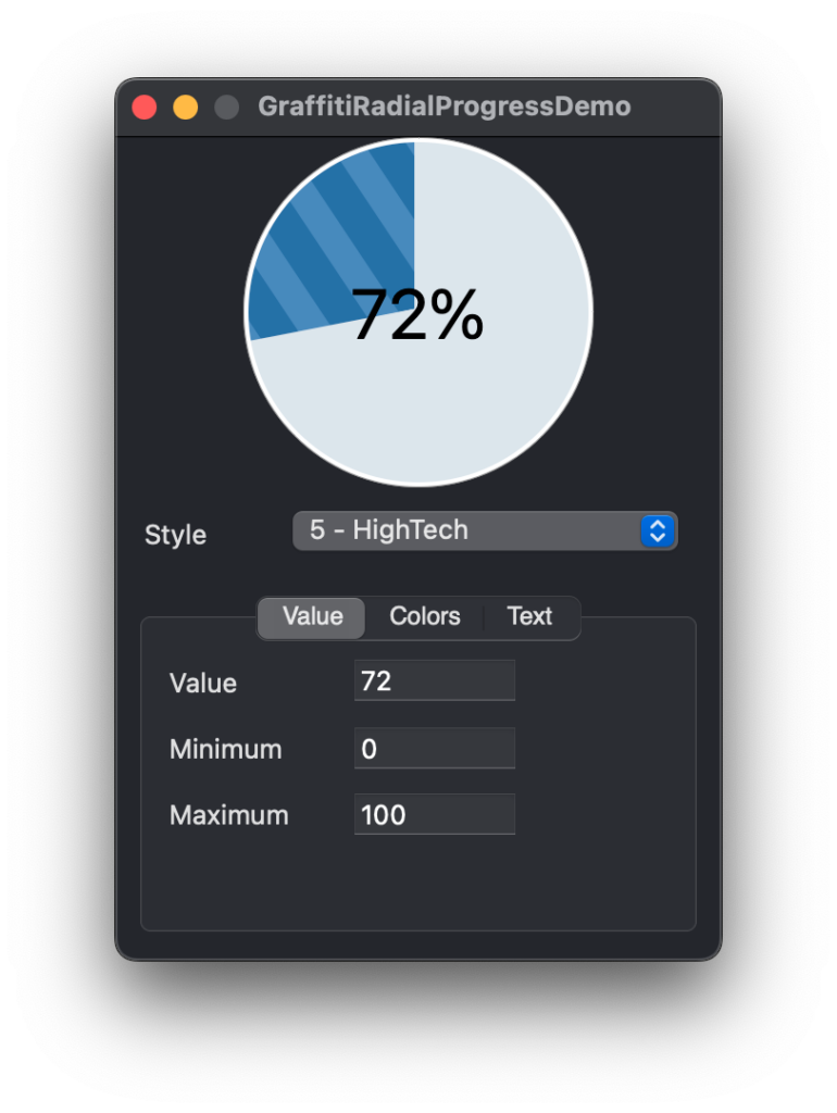
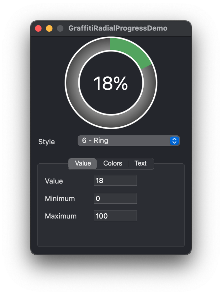
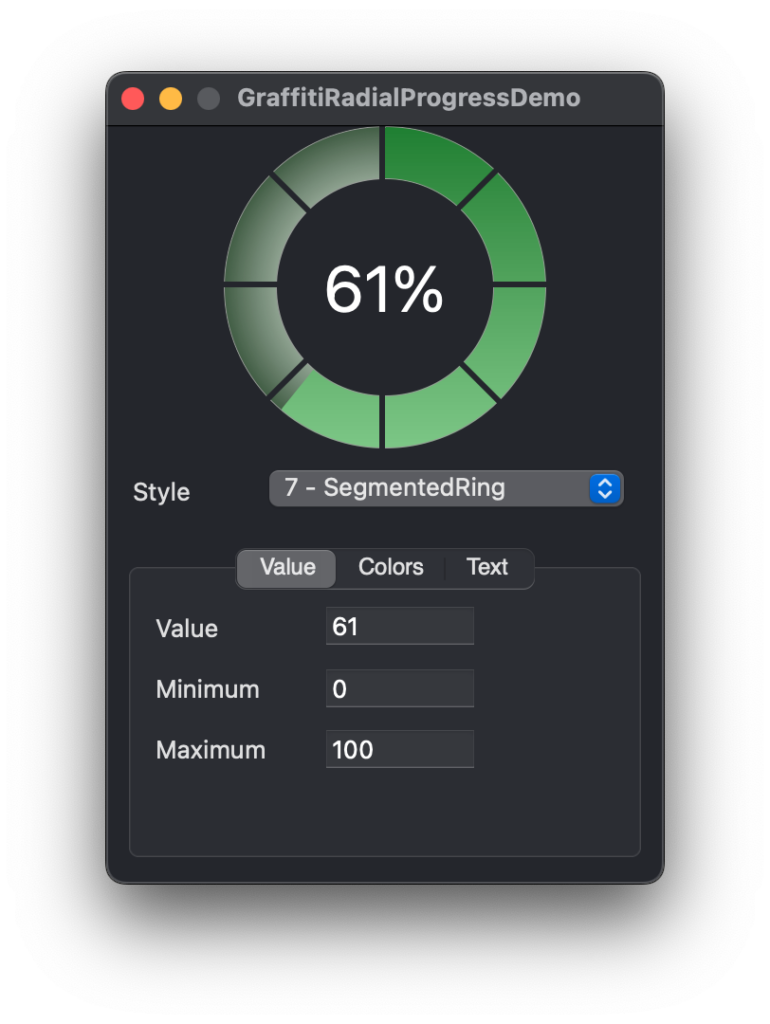
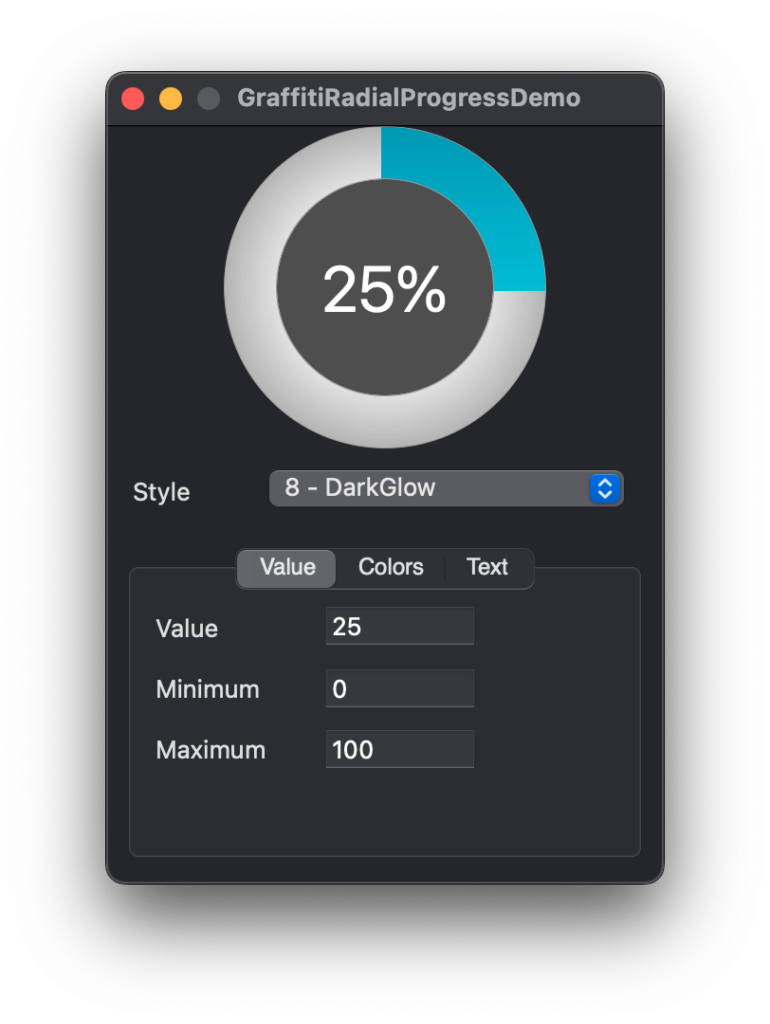
Previous
Next
## Compatibility
### Framework API Version
| 1.0 | 2.0 |
| :---: | :---: |
| True | True |
### Desktop
| 32-Bit | 64-Bit |
| :---: | :---: |
| False | True |
## Enumerations
| Name | Value | Description |
| --- | :---: | --- |
| Styles | Graphite <br> Simple <br> EarthTonesGround <br> EarthTonesSky <br> Chrome <br> HighTech <br> Ring <br> SegmentedRing <br> DarkGlow | Supported drawing styles. |
## Methods
| Name | Parameters | Return Type | Description |
| --- | :---: | :---: | --- |
| Function | StyleCount | As | Returns the number of visual styles available. |
| Function | StyleName | As | Returns the name of the style represented by Index. |
## Properties
| Name | Type | Default Value | Description |
| --- | :---: | :---: | --- |
| BGColor | Color | Nil | The background color of the progress display. |
| Bold | Boolean | Nil | Sets the font weight of the progress text. |
| BorderColor | Color | Nil | Sets the border color for the progress display. |
| Italic | Boolean | Nil | Determines whether the progress text is displayed in italics. |
| Maximum | Integer | Nil | The maximum possible value (positive or negative). |
| Minimum | Integer | Nil | The minimum possible value (positive or negative). |
| Private | As | Nil | |
| Private | As | Nil | |
| Private | As | Nil | |
| Private | As | Nil | |
| Private | As | Nil | |
| Private | As | = | |
| Private | As | = | |
| Private | As | Nil | |
| Private | As | = | |
| Private | As | = | |
| Private | As | Nil | |
| Private | As | Nil | |
| Private | As | Nil | |
| Private | As | = | |
| Private | As | = | |
| Private | As | Nil | |
| Private | As | Nil | |
| Private | As | Nil | |
| Private | As | Nil | |
| ShowText | Boolean | Nil | Sets whether the progress text is visible. |
| Style | Styles | Nil | Sets the visual style of the progress class. |
| TextColor | Color | Nil | Sets the color of the progress text. |
| TextFont | String | Nil | Sets the font of the progress text. |
| TextSize | Integer | Nil | Sets the size of the progress text’s font. When Value = -1, the text of the component will automatically size to fill the progress area. |
| TextSizeConstraint | Integer | Nil | Will constrain the text size to the percentage specified relative to the progress area. |
| Underline | Boolean | Nil | Determines whether the text is displayed with an underline. |
| UseCustomColors | Boolean | Nil | Determines whether the progress area is drawn using custom colors. |
| Value | Integer | Nil | The current integer value. |
| ValueCaption | String | Nil | Caption drawn in place of the value percentage. |
| ValueColor | Color | Nil | Sets the color of the “completed” progress area when UseCustomColors is True. |
