# GraffitiAccordion
Class Inherits GraffitiSuite.BaseCanvas
## About
GraffitiAccordion allows for easy and compact representation of UI elements within container controls.
**
Features:
**
*
Drawing events for greater customization
*
Includes a Scrollable ContainerControl
*
Definable custom colors
*
Automatically handles placement of containers at runtime
*
Smooth animation
*
Custom element placement
*
Single or multiple view
## Preview
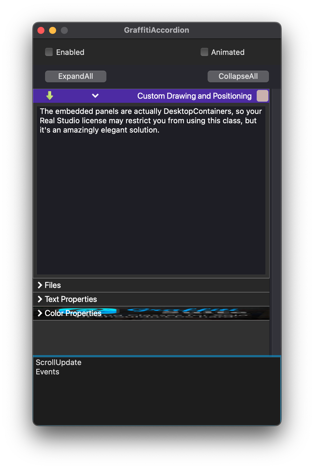
Previous
Next
## Compatibility
### Framework API Version
| 1.0 | 2.0 |
| :---: | :---: |
| True | True |
### Desktop
| 32-Bit | 64-Bit |
| :---: | :---: |
| True | True |
## Attributes
| Name | Value |
| --- | --- |
| DefaultEvent | "Opening" |
## Event Definitions
| Name | Parameters | Return Type | Description |
| --- | :---: | :---: | --- |
| DrawItemBackground | g as Graphics <br> item as GraffitiAccordionItem <br> byRef headerBounds as Xojo.Rect | Boolean | Raised when drawing the item header's background. |
| DrawItemExpander | g as Graphics <br> item as GraffitiAccordionItem <br> byRef bounds as Xojo.Rect | Boolean | Raised when drawing the item header's expander icon. |
| DrawItemText | g as Graphics <br> item as GraffitiAccordionItem <br> byRef bounds as Xojo.Rect | Boolean | Raised when drawing the item header's text. |
| ItemClick | item as GraffitiAccordionItem <br> X as Integer <br> Y as Integer | Boolean | Raised when the user clicks an item's header. |
| ItemCollapsed | Item as GraffitiAccordionItem | (None) | Raised when an item has been collapsed. |
| ItemExpanded | item as GraffitiAccordionItem | (None) | Raised when an item has been expanded. |
| ItemMouseEnter | item as GraffitiAccordionItem | (None) | Raised when the mouse enters the header of an AccordionItem. |
| ItemMouseExit | Item as GraffitiAccordionItem | (None) | Raised when the mouse exits the header of an AccordionItem. |
| Opening | (None) | (None) | |
| ScrollUpdate | (None) | (None) | Raised when an item is expanded, collapsed, added or removed. Use this event to update your scrollbar. |
## Methods
| Name | Parameters | Return Type | Description |
| --- | :---: | :---: | --- |
| Sub | AddItem | (None) | Adds a new item to the accordion. |
| Sub | CollapseAll | (None) | Collapses all accordion items. |
| Sub | ExpandAll | (None) | Expands all accordion items. |
| Sub | InsertItem | (None) | Inserts a new item at the given index. |
| Function | Item | As | Returns the item at the specified index. |
| Function | ItemCount | As | Returns the number of items currently added to the accordion. |
| Sub | Refresh | (None) | |
| Sub | RemoveAll | (None) | Removes all items from the accordion. |
| Sub | RemoveItem | (None) | Removes the item at the given index. |
## Properties
| Name | Type | Default Value | Description |
| --- | :---: | :---: | --- |
| Animated | Boolean | Nil | If False, panel expanding and collapsing will be immediate rather than linearly animated. |
| AnimationTime | Integer | Nil | Time in milliseconds that panel changes will animate when Animated = True. |
| BackColor | Color | Nil | The background color of the control. |
| Bold | Boolean | Nil | Determines whether the accordion items are shown with bold text. |
| BorderColor | Color | Nil | Determines the border color of the class when UseCustomColors is True. |
| HeaderHeight | Integer | Nil | The height of the accordion items. |
| Italic | Boolean | Nil | Determines whether the accordion items are shown with italic text. |
| ItemBackColor | Color | Nil | Determines the background color of header items when UseCustomColors is True. |
| ItemBackColorExpanded | Color | Nil | Determines the background color of expanded items. |
| ItemBackColorOver | Color | Nil | Determines the background color of header items that the mouse is hovering over when UseCustomColors is True. |
| Items() | GraffitiAccordionItem | Nil | |
| Private | | Dictionary | |
| Private | As | Nil | |
| Private | As | Nil | |
| Private | As | Nil | |
| Private | As | Nil | |
| Private | As | = | |
| Private | As | Nil | |
| Private | As | Nil | |
| Private | As | Nil | |
| Private | As | Nil | |
| Private | As | Nil | |
| Private | As | Nil | |
| Private | As | Nil | |
| Private | As | Nil | |
| Private | As | Nil | |
| Private | As | Nil | |
| Private | As | Nil | |
| Private | As | Nil | |
| Private | As | Nil | |
| Private | As | Nil | |
| Private | As | = | |
| Private | As | = | |
| Private | As | Nil | |
| Private | As | Nil | |
| Private | As | Nil | |
| Private | As | = | |
| Private | As | Nil | |
| Private | As | Nil | |
| Private | As | Nil | |
| ScrollMax | Integer | Nil | The maximum scroll value. |
| ScrollPosition | Integer | Nil | The current scroll value. |
| TextColor | Color | Nil | Determines the color of the text when UseCustomColors is True. |
| TextColorExpanded | Color | Nil | Determines the color of the header text when the item is expanded. |
| TextColorOver | Color | Nil | Determines the color of the text when the mouse is hovering over items and UseCustomColors is True. |
| TextFont | String | Nil | The font used to draw the text for the items. |
| TextSize | Integer | Nil | The size of the text used to draw the items. |
| Underline | Boolean | Nil | Determines if header text is underlined. |
| UseCustomColors | Boolean | Nil | Draws items using the defined colors in the class’s properties. |
## Examples
### Updating ScrollBar
Use the ScrollIUpdate event to update your scrollbar's value and maximum.
```
scroller.Maximum = me.ScrollMax
scroller.Value = me.ScrollPosition
```
